What Makes the ABC Poster Different
The ABC poster by Kajsa Hagelin turns the alphabet into a warm, playful illustration. Brown letters float against a beige background, designed with a child's imagination in mind. It works both as a learning tool and as a subtle interior detail—no bright cartoons, just soft earthy tones that blend into a calm room.
The catalog describes it as "based on a child's mind," which means the letters feel organic and whimsical rather than rigid. The accompanying line—"A, Bee, Cee, Dee. How many letters can you see?"—invites interaction, making it a natural fit for a nursery, playroom, or preschool corner.
ABC Poster at a Glance
-
ABC: Playful illustration on the alphabet painted in brown colors against a beige background. The neutral palette means the poster won't clash with existing room colors—ideal for parents who want educational decor without visual clutter.
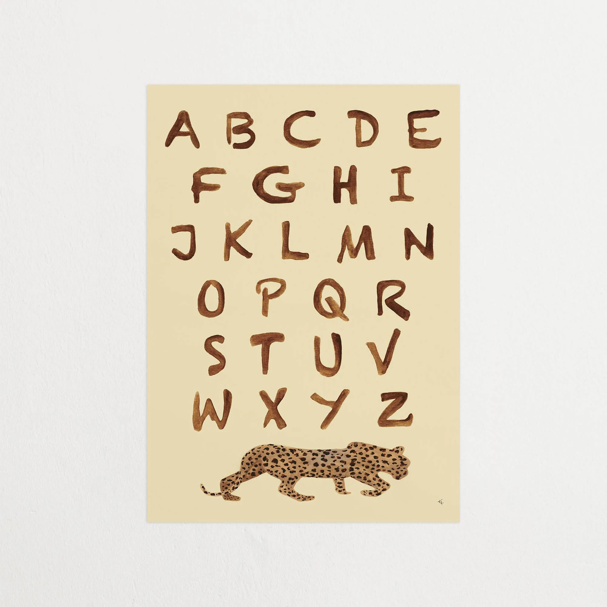
ABC
-
ABC: The painting is designed based on a child's mind and fits perfectly in a children's room, both to practice the alphabet or as an interior detail! This dual purpose justifies the purchase: it's not just a poster, but a functional learning aid that also adds character to the wall.
-
ABC: "A, Bee, Cee, Dee. How many letters can you see?" - Kajsa Hagelin The quote hints at an interactive element—you can use it as a game to help kids recognize letters, reinforcing early literacy in a playful way.
Choosing the Right Size
The ABC poster comes in three sizes: 30x40, 40x50, and 50x70 cm. Your choice depends on the wall space and the child's age. A 30x40 cm print works well above a low shelf or changing table, while 50x70 cm becomes a focal point above a bed or desk. For a group display (like a gallery wall of learning posters), stick to 40x50 cm for consistency.
Because the illustration is playful rather than detailed, all sizes keep their charm. No critical sizing trade-offs—just pick the one that fits your wall and your child's view distance.
Where the ABC Poster Fits Best
The catalog explicitly recommends a children's room, but the brown-and-beige palette also suits a neutral-toned nursery or a minimalist playroom. It pairs well with wooden furniture, soft textiles, and other educational prints.
One trade-off: the poster is purely illustrative—no grid, no uppercase/lowercase pairing, no numbers. If you need a strict learning chart, this may not replace a traditional alphabet strip. But as a piece of art that happens to teach, it's hard to beat.
What the Catalog Doesn't Settle
The supplied information does not include care instructions, hanging hardware, or paper weight. For a poster in a child's room, consider framing it behind glass or acrylic to protect against curious hands. The catalog also doesn't specify whether the print is matte or glossy—if that matters to you, it's worth checking before you buy.
These gaps don't make the product less appealing, but they do mean you'll need to plan your own display solution.