Quick answer
Choose Beige 10 if you want a warm, subtle beige that makes a room feel calm and nurturing without turning yellow or pink. It suits living rooms, bedrooms, and hallways where you want a dependable neutral that works with wood, linen, and soft white trim.
Why Beige 10 reads warmer than many neutrals
Beige 10 carries both red and yellow undertones, which gives it a gentle warmth rather than a cool, grey cast. That combination is what creates its nurturing quality: the red keeps it from feeling flat or institutional, while the yellow stops it from tipping too far into blush. In a north-facing room, this warmth can make the space feel less chilly; in a very sunny south-facing room, it may appear slightly more saturated during golden hour.
Where Beige 10 works best—and where it can disappoint
Beige 10 is at its most reliable in rooms used for rest and gathering: living rooms, bedrooms, and quiet hallways. It pairs naturally with oak, walnut, rattan, and off-white linens. However, if your room already has strong yellow or red elements—such as terracotta tiles, warm oak floors, or red-toned brick—the undertones can amplify each other and make the whole space feel overly warm. In that case, test a sample first or consider a cooler neutral from the range.
Because Beige 10 is subtle, it may look almost white in very bright, sun-filled rooms. If you want a clearly beige wall, you may need to go a shade deeper or use it on adjacent walls to create contrast with white trim.
How finish and location change the result
Beige 10 is available in multiple finishes, sizes, and location options. Finish matters more than many people expect: a matt finish softens the colour and hides imperfections, making it a good choice for bedrooms and living rooms. A more durable finish can suit hallways and kitchens, but it may reflect more light and make the beige appear slightly lighter. Always check the available options for your chosen product before ordering, and remember that the same colour can look different on a ceiling, trim, or exterior surface.
Decision rules for choosing Beige 10
- Match the light before you commit: Order a sample and paint a large piece of card or directly on the wall. View it at different times of day: morning, midday, and evening. If the room gets little natural light, Beige 10 will appear warmer and slightly deeper; in a very bright room, it may look closer to off-white. Test in the actual room, not under store lighting.
- Check your existing fixed finishes: Look at your floor, tiles, and kitchen cabinets. If they are strongly yellow, orange, or red, Beige 10 may intensify that warmth. If they are cool grey or stark white, Beige 10 will add a welcome softness. When in doubt, compare a sample against your fixed elements. Your floor and tiles are part of the colour scheme.
- Decide on contrast with trim and ceilings: Beige 10 is subtle, so it needs contrast to avoid looking flat. Pair it with a clean white trim and ceiling for a crisp edge, or use a deeper beige on adjacent walls for a tonal look. If you want a strong beige statement, consider using Beige 10 on all walls and adding texture through furnishings. Plan trim and ceiling colours at the same time as the wall colour.
- Choose finish by room function: For low-traffic, restful rooms, a matt finish enhances the soft, calming quality. For busy areas, choose a more durable finish if available, but be aware that increased sheen can make the colour appear slightly lighter. Always confirm the finish options for your selected size and location. Finish affects both durability and perceived colour.
Product facts
-
Beige 10: A warm subtle beige with red and yellow undertones. These undertones create a calming, nurturing feel, so the colour is more forgiving in rooms that need warmth without going yellow or pink.
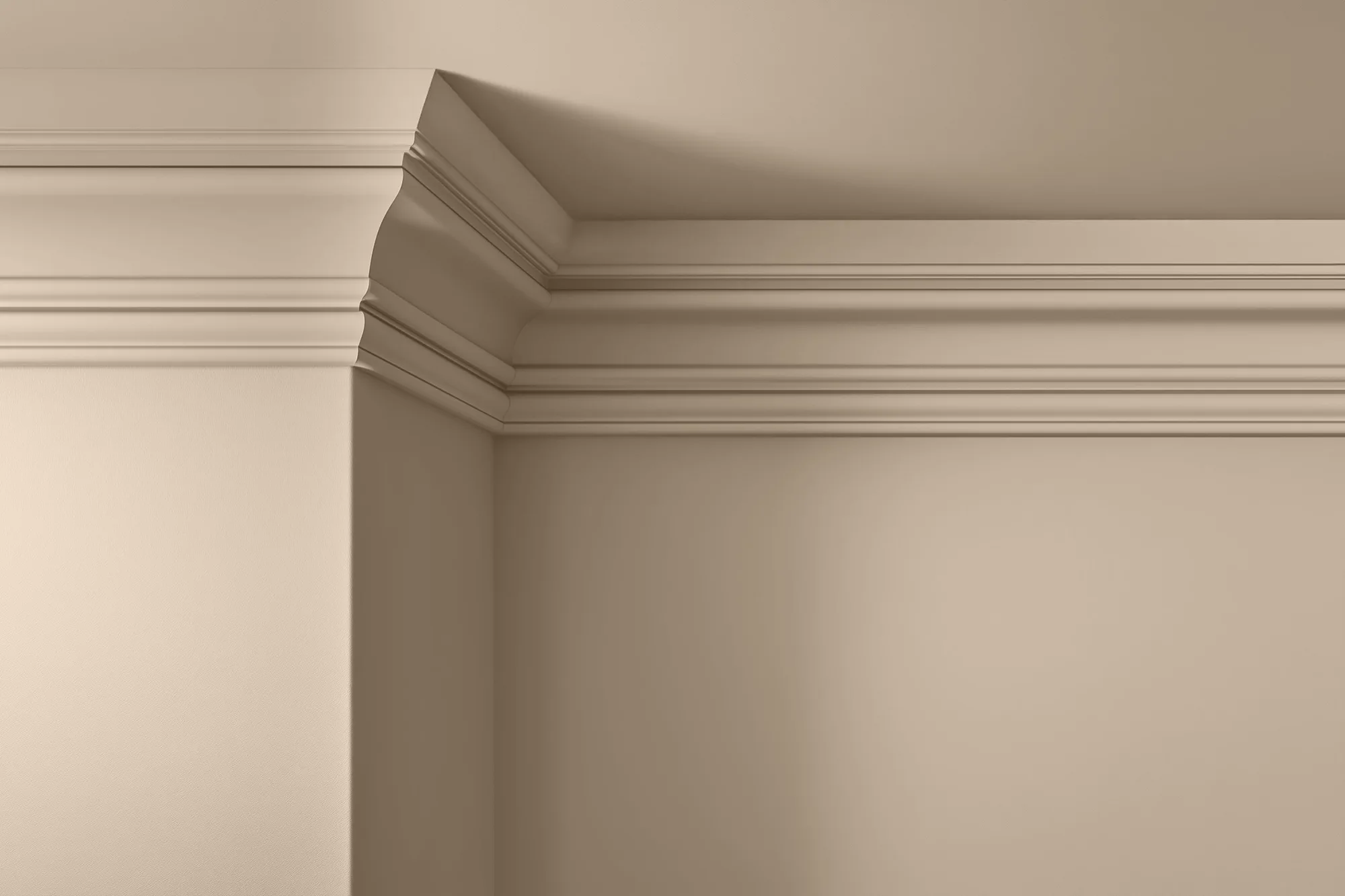
Beige 10
Is Beige 10 right for you?
Best for
- Living rooms and bedrooms where you want a calming, warm neutral
- Rooms with cool grey or stark white fixed elements that need softening
- Schemes built around oak, rattan, linen, and soft white trim
Not for
- Rooms with strong yellow, orange, or red fixed elements that could be amplified
- Very bright, sun-filled rooms where you want a clearly beige wall colour
- Spaces where you need a strong, saturated colour statement