Quick Recommendation
If you need a bold statement and high‑energy vibe, go with bright stickers. For subtle, soothing décor, pastel stickers are the better choice.
Choosing a sticker color isn’t just about personal taste; it shapes how a room feels and how the artwork is perceived. Bright colors inject energy, draw the eye, and can become focal points, while pastel tones blend softly into a backdrop, creating a calm atmosphere.
In this comparison we look at the visual impact of bright versus pastel stickers, discuss practical trade‑offs, and give guidance on which option fits different décor goals.
Visual Energy
Bright stickers typically use saturated hues that command attention. The high contrast makes the design pop, especially in well‑lit areas or on neutral walls. This can be ideal for accent walls, lockers, or any surface where you want an instant visual cue.
Pastel stickers rely on muted tones that soften the overall look. They tend to recede slightly, allowing surrounding elements to share the spotlight. In spaces with multiple décor layers, pastel stickers add texture without overwhelming the palette.
- Test a sample on your wall before committing – lighting can shift perceived brightness.
Mood & Atmosphere
Vibrant colors are linked to excitement and creativity. If a room needs a boost—like a home office, a teen bedroom, or a creative studio—bright stickers can stimulate energy and focus.
Pastel hues are associated with calmness and relaxation. They work well in bedrooms, meditation corners, or any area where a soothing ambiance is desired.
- Match the sticker mood to the room’s primary function for cohesive feel.
Design Flexibility
Because bright stickers stand out, they pair best with simple backgrounds or monochrome furnishings. Too many competing colors can create visual clutter.
Pastel stickers blend more easily with patterned or colorful surroundings, offering flexibility when you already have a lively décor scheme.
- Consider the existing color scheme; use bright stickers as accents, pastel stickers as fillers.
Balancing Color Choices
- Intensity vs Subtlety: Bright stickers deliver high visual intensity; pastel stickers provide subtle nuance. Choose intensity for focal points, subtlety for background harmony.
- Visibility in Light: Vibrant hues stay vivid under bright lighting; pastels may appear washed out in strong sunlight. Match sticker brightness to the lighting conditions of the space.
- Compatibility with Décor Themes: Bold colors complement minimalist or modern themes; muted tones fit eclectic or cozy interiors. Align sticker color with overall décor style for cohesive look.
Sticker Specs at a Glance
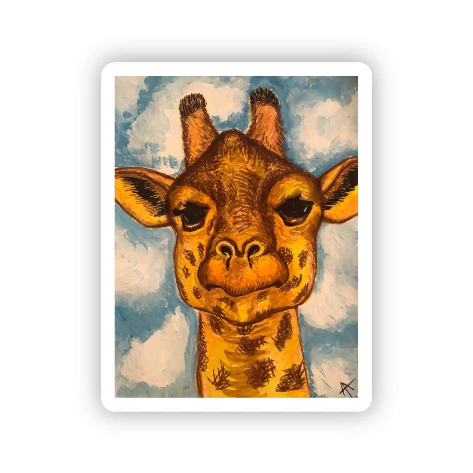
- Hello, Giraffe Sticker: 1.6" x 2.0" Die Cut Waterproof Sticker The modest size keeps the design prominent without overwhelming a small surface, and waterproof material ensures longevity even in humid rooms.
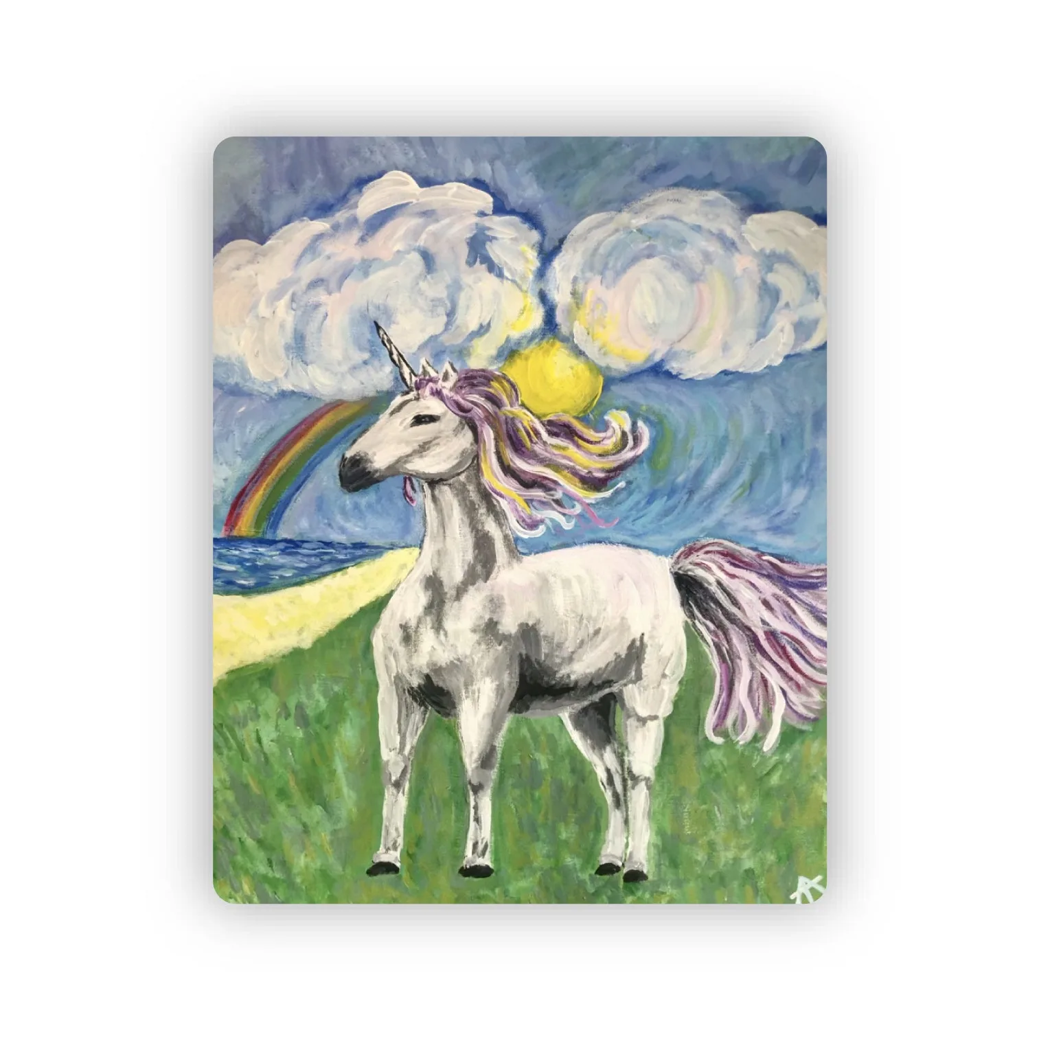
- Whimsical Unicorn Sticker: 1.6" x 2" Die Cut Waterproof Sticker Similar dimensions make it easy to mix with other stickers, while the waterproof finish protects the soft pastel artwork from spills.
Which Color Works Best for You
Best For
- Bold décor statements that need immediate visual impact
- Kids’ rooms or creative spaces seeking energetic vibes
Not Ideal For
- Minimalist environments where a calm, understated look is preferred
- Professional settings that require neutral or subdued décor
Both bright and pastel stickers have distinct strengths. Match the color intensity to the mood you want to create, and let the sticker’s size and waterproof finish ensure lasting visual appeal.