Start with the Artwork's Character
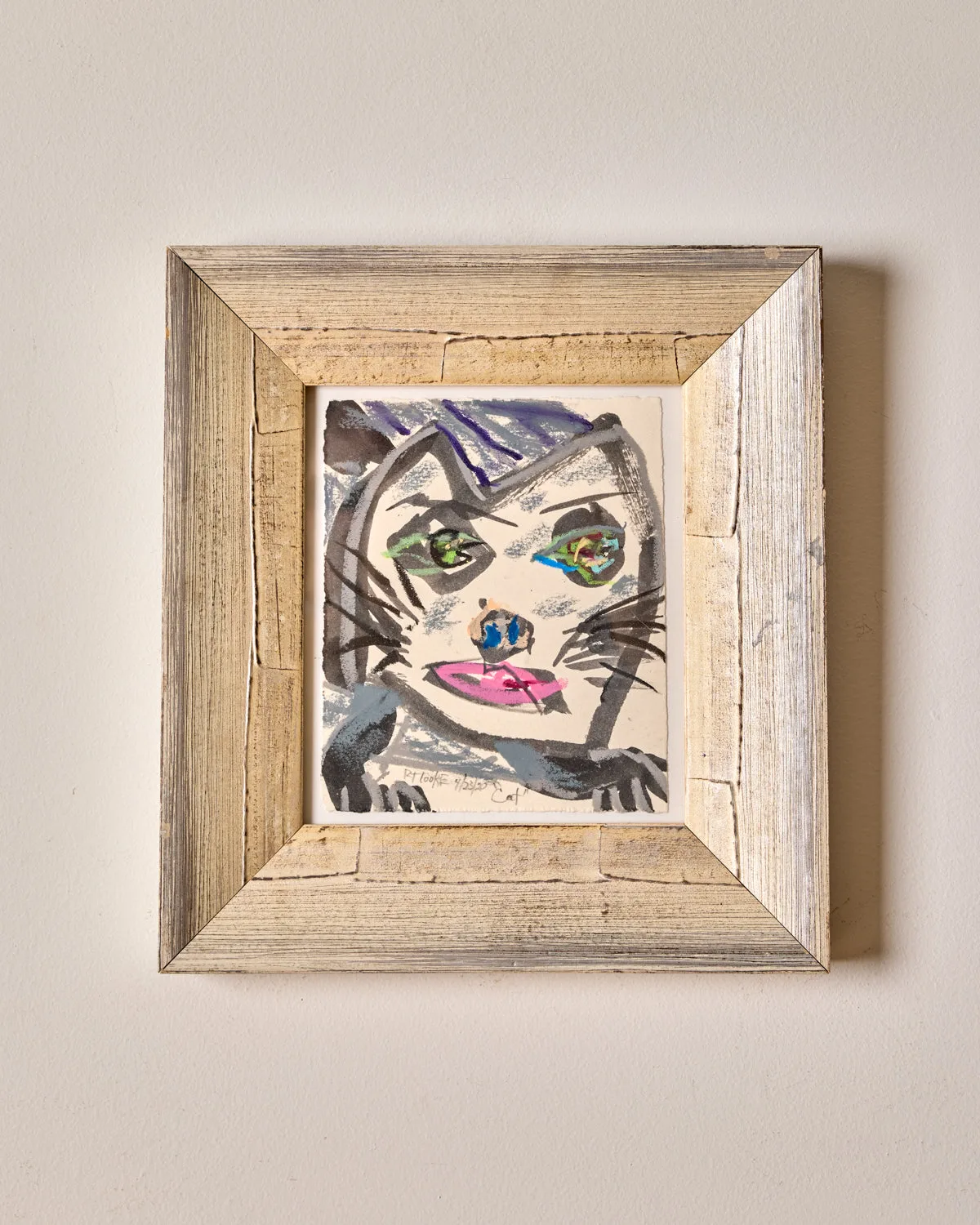
Robert T. Cooke's "Cat" is an expressive portrait that draws attention with its layered grays and blues, bright green eyes, and vivid pink mouth. The cat's paws extend subtly below the face, adding a sense of presence and personality. The surface shows visible layers of color and brushwork, giving the piece depth and intensity. Understanding these visual qualities helps you decide where and how to place it for maximum impact.
Choosing a Wall That Complements the Palette
The cool grays and blues in the painting pair well with neutral or warm-toned walls. A soft white, warm beige, or light gray background lets the bright green eyes and pink mouth stand out without competition. Avoid walls with strong patterns or bold colors that might clash with the layered brushwork. A simple, matte frame (not supplied with the artwork) can help the piece feel cohesive in any room.
Since the artwork is signed, titled, and dated April 23, 2020, it carries a contemporary yet collected feel. Consider placing it in a space where you can appreciate the details up close, such as a reading nook, hallway, or above a console table.
What the Catalog Confirms About the Artwork
-
"Cat": The surface shows visible layers of color and brushwork, giving the piece depth and intensity. This texture means the artwork rewards close viewing and should be placed where natural or directed light can reveal the brushwork without causing glare.
"Cat"
-
"Cat": Bright green eyes and a vivid pink mouth bring a striking contrast to the composition. These accent colors can be echoed in nearby decor items like a vase, throw pillow, or small sculpture to create a cohesive look.
Pairing Cat Art with Other Decor
To create a balanced arrangement, pair "Cat" with objects that share its color story or mood. A small ceramic vase in soft gray or pale blue can sit on a nearby shelf. A simple green plant or a pink-toned accent pillow can echo the eyes and mouth without overwhelming the composition.
Avoid placing competing patterns or busy artwork next to this piece. The expressive brushwork and strong contrast need visual breathing room. If you hang it in a gallery wall, give it a prominent central spot and surround it with simpler, smaller works or neutral frames.
Lighting and Display Considerations
Good lighting enhances the visible layers of color and brushwork. A picture light or adjustable track light aimed at the artwork can bring out the depth. Avoid direct sunlight, which may cause fading over time. The artwork is final sale and non-returnable, so inspect the surface and colors carefully before purchasing.
Since the catalog does not specify hanging hardware or frame dimensions, plan to use standard picture-hanging methods suitable for the artwork's weight. Consider consulting a professional framer for custom framing and mounting advice.