Quick answer
Choose Classic for a clean, modern beige that stays consistent in any light. Choose On Point for a dynamic neutral that shifts from bright to medium depending on the room's natural light.
How lighting affects your choice
Classic is the lightest beige from Clare and brings a clean, modern feel to any space. It stays true to its shade whether the room gets morning sun or evening shadows.
On Point changes character with light. In bright, natural light it looks brighter; in darker corners it appears more medium. This makes it a flexible choice if you want a color that adapts to different times of day.
The trade-off between consistency and adaptability
Classic is the safer bet for rooms with inconsistent lighting or for a uniform look across multiple walls. Its even tone means you won't get surprises when the sun shifts.
On Point rewards rooms that get plenty of natural light. The color shift can add subtle interest, but it might feel unpredictable if you need a fixed neutral for furnishings or artwork.
How to decide between Classic and On Point
- Classic: Pick Classic if you want a light beige that stays consistent in every light condition. It's the simplest way to get a clean, modern look without surprises.
- On Point: Pick On Point if your room gets strong natural light and you want a color that shifts from bright to medium throughout the day. It adds subtle dynamism to a neutral palette.
- Test before you commit: Order a swatch of each and paint a 2x2 foot section on different walls. Observe them at different times of day and under artificial light. This is the only way to see how each color behaves in your specific space. Testing with real swatches removes guesswork and ensures you love the final result.
Paint color details
-
Classic - Swatch: Some things never go out of style and this chic beige is one of them. The lightest of our beiges, it brings a clean, modern feel to any space. Classic's consistent tone works well in hallways, open plans, or rooms with mixed lighting where you want a reliable neutral.
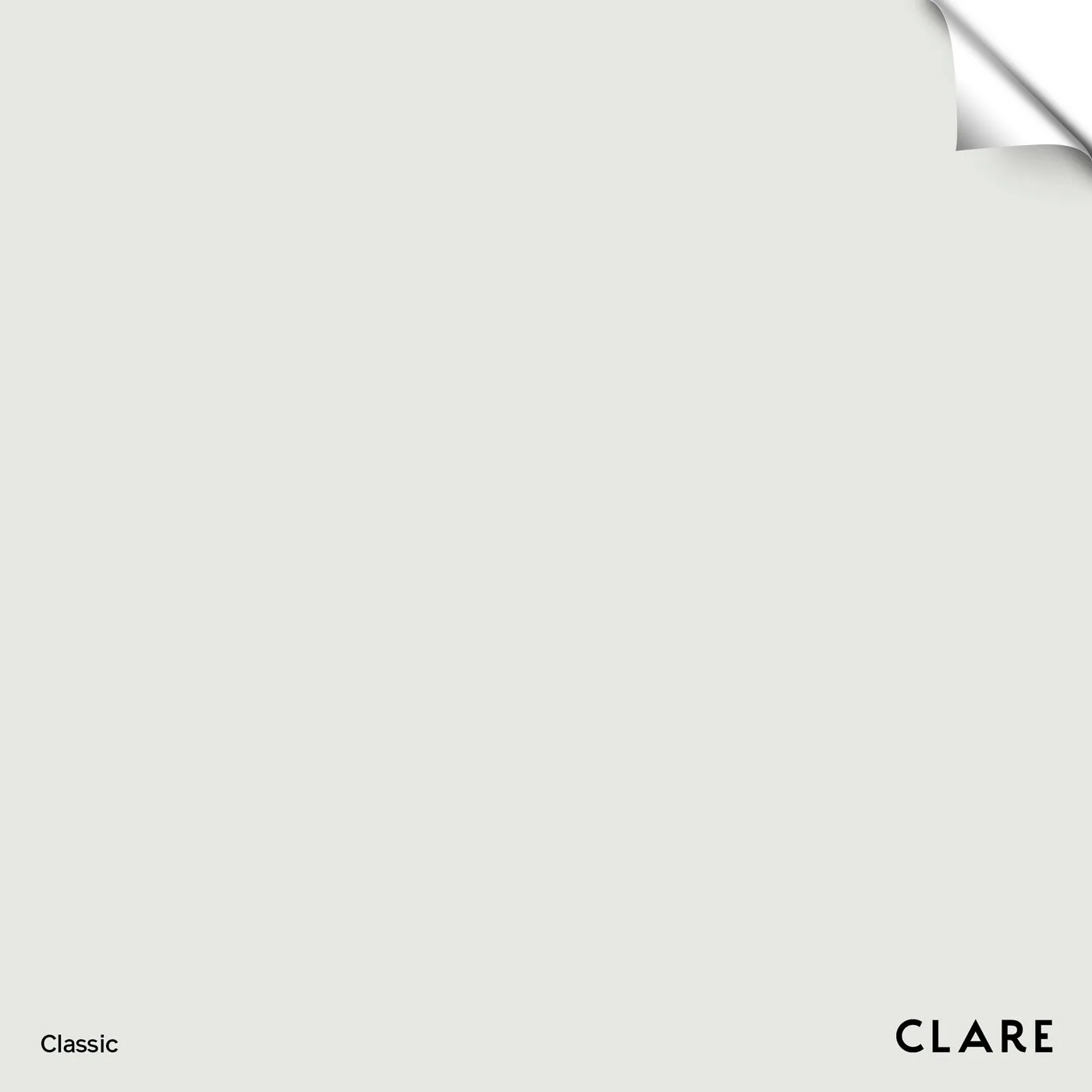
Classic - Swatch
-
On Point - Swatch: So on point it does double duty. This color looks brighter with the help of clean, natural light, and appears more medium hued in darker spaces. On Point's dual personality lets you use one color to create two different moods in the same room depending on the time of day.

On Point - Swatch
Which one should you choose?
Best for
- Rooms with mixed or inconsistent lighting (Classic)
- Open floor plans needing a uniform neutral (Classic)
- Spaces that get abundant natural light and could use a color that changes with the sun (On Point)
Not ideal for
- If you need a fixed, predictable neutral regardless of light (avoid On Point)
- If you want a color that adds visual interest through subtle shifts (avoid Classic)