Why this sunset needs a plan before the first brushstroke
The Fire In The Sky scene is built around contrast: fiery autumn leaves against azure blues, viewed from below so the canopy feels like it is opening above you. That upward perspective is the reason a random approach can go muddy. You are not painting a flat horizon sunset; you are painting a sky that wraps overhead, with warm foliage cutting into cool blue.
The catalog describes the scene as looking up into changing autumn leaves, with a perspective lesson built into the project. Treat the sky as the calm background and the leaves as the warm interruptions. If you blend the blues first and add the fiery hues afterward, you keep the gradient clean and the contrast deliberate.
What the Fire In The Sky kit actually gives you
-
Fire In The Sky: Fire In The Sky is a Painting Kit priced at USD 35.49 in the catalog, with a catalog comparison price of USD 49.99. The catalog price is a reference point for comparing kit tiers; check the current listing before you buy.
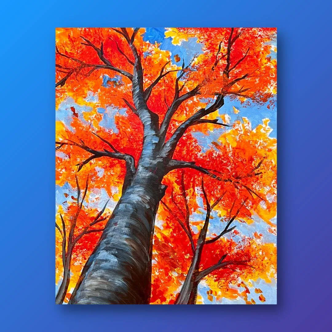
Fire In The Sky
-
Fire In The Sky: The scene shows changing autumn leaves in fiery hues against azure blues, with a perspective that feels like looking up into the sky. This tells you the two color families you will blend and why the composition is vertical rather than a flat horizon.
-
Fire In The Sky: A Fire In The Sky Sample Tutorial is available. Use the tutorial as your process reference for this specific scene rather than guessing at brush order.
A beginner-friendly order for the acrylic sunset gradient
The steps below assume you are working on the supplied canvas with the kit materials. They describe a general acrylic blending approach for this scene, not a manufacturer procedure; follow the sample tutorial for any specific brush or layer guidance it provides.
- Block in the azure blue field first: Cover the open sky area with your blue before any warm color goes down. A clean, even blue base gives the fiery leaves something cool to sit against and prevents warm paint from smearing into the sky later.
- Soften the blue with a slightly lighter or deeper blue: While the blue is still workable, pull a second blue into it at the edges where the canopy will overlap. This keeps the sky from reading as one flat color and supports the sense of depth the perspective is meant to create.
- Place the warm foliage shapes before refining them: Block in the fiery leaf clusters as simple shapes rather than individual leaves. The catalog describes changing autumn leaves, so variety in warm hues matters more than precise leaf outlines at this stage.
- Blend warm into warm, not warm into blue: Keep your warm color gradients within the leaf areas. Where a warm edge meets the blue sky, decide whether you want a crisp edge or a soft one, and blend accordingly. Mixing warm and cool too aggressively in one pass is the fastest route to a muddy transition.
- Refine the canopy edges last: Once the sky and the main warm masses are in place, add smaller leaf shapes and sharpen selected edges. This is where the upward-looking perspective becomes convincing, because the leaves closest to the viewer can be defined more tightly than the ones receding into blue.
Warm color gradient habits that keep the sunset dramatic
- Keep a clean water or medium cup: Warm gradients dull quickly when blue residue gets into them. Rinse between color families so the fiery hues stay saturated against the azure background.
- Work from light warm to deep warm: Start with the brighter warm tones and add deeper warm tones into them. Building in that direction makes it easier to judge how dramatic the contrast is against the blue.
- Blend while the paint is still movable: Acrylics set quickly. If an edge has already dried, rewetting and scrubbing can lift texture, so plan each warm passage and blend it before moving on.
- Step back to check the sky-to-leaf balance: The scene works when the azure reads as sky and the warm hues read as foliage. If the warm shapes start to dominate the whole canvas, add more blue breathing room around them.
Which Fire In The Sky kit tier fits your blending session
The catalog lists four options for this scene. Choose based on whether you need supplies, a refresher, or just the video.
- Studio Kit ($49.99): The fullest listed option. Choose it if you want the complete studio setup for a sunset blending session and do not already own the materials.
- Essentials Kit ($39.99): A middle tier for painters who want the core kit without the full studio package. Compare the listed contents against what you already own before deciding.
- Refill Kit ($24.99): Best if you have painted this scene before or already have the tools and only need to restock. The catalog does not detail refill contents, so confirm what is included.
- Video Only ($14.99): For painters who already have their own acrylics, brushes, and canvas and only want the Fire In The Sky tutorial. This is the leanest way to get the process guidance.
What the supplied information does not settle
The catalog does not list canvas dimensions, the exact paint colors included, brush sizes, or drying times for this kit. It also does not provide step-by-step written instructions beyond the sample tutorial reference. That means you should check the current product listing and the tutorial itself for those specifics rather than assuming a particular canvas size or palette.
The absence of those details is a limit of the supplied catalog information, not a statement that the kit lacks them. If canvas size or color selection matters to your setup, confirm before ordering.