Quick Answer
Choose a Curator Palette sleeve color that complements your game's artwork, enhances card readability, and fits the mood you want at the table—like Ochre for warm, earthy tones.
Why Color Matters More Than You Think
The color of your sleeves isn't just about looks. It affects how easily you can read cards, how quickly you can spot them on the table, and even how your game feels. A well-chosen color can reduce eye strain during long sessions and make your game more immersive.
For example, warm colors like Ochre can make a game feel cozy and grounded, while cooler tones might suit a more serene or strategic atmosphere. Think about the mood you want to create.
Matching Sleeve Colors to Your Game's Artwork
Look at the dominant colors in your game's artwork. If the cards feature earthy tones, a sleeve like Ochre will blend harmoniously. If the art is cool and oceanic, a blue or green sleeve might be a better match. The goal is to complement, not clash.
Also consider the table surface. Dark sleeves stand out on light tables, while light sleeves pop on dark surfaces. Think about where you usually play.
Practical Trade-offs: Light vs. Dark Sleeves
Light sleeves show dirt and wear more easily, but they can make dark card backs look striking. Dark sleeves hide grime but may show scratches more visibly. There's no perfect choice—it's about your priorities.
If you play frequently, consider how much handling your sleeves will endure. A practical player might prefer darker shades for longevity, while a collector might prioritize aesthetics.
Your Color Decision Rules
- Match the dominant art tone: Pick a sleeve color that shares a hue with the main colors in your game's artwork. For earthy art, choose Ochre; for cool art, go with a blue or green. Hold a card next to the sleeve color before committing.
- Consider table contrast: If your table is light, choose a darker sleeve for visibility; if dark, go lighter. This helps you spot cards quickly during play. Test a single sleeve on your usual table surface.
- Think about mood and feel: Warm colors like Ochre create a cozy, grounded atmosphere; cool colors feel more serene or strategic. Choose based on the experience you want. Ask yourself: what feeling should the game evoke?
Curator Palette Sleeves at a Glance
-
Curator™ Palette Sleeves: Ochre: Ochre (#CA7639) is a swatch from the Curator™ Palette Series, featuring solid-colored sleeve backs curated by designers. This warm, earthy shade adds a grounded, gallery-like feel to your game and pairs well with nature-inspired artwork.
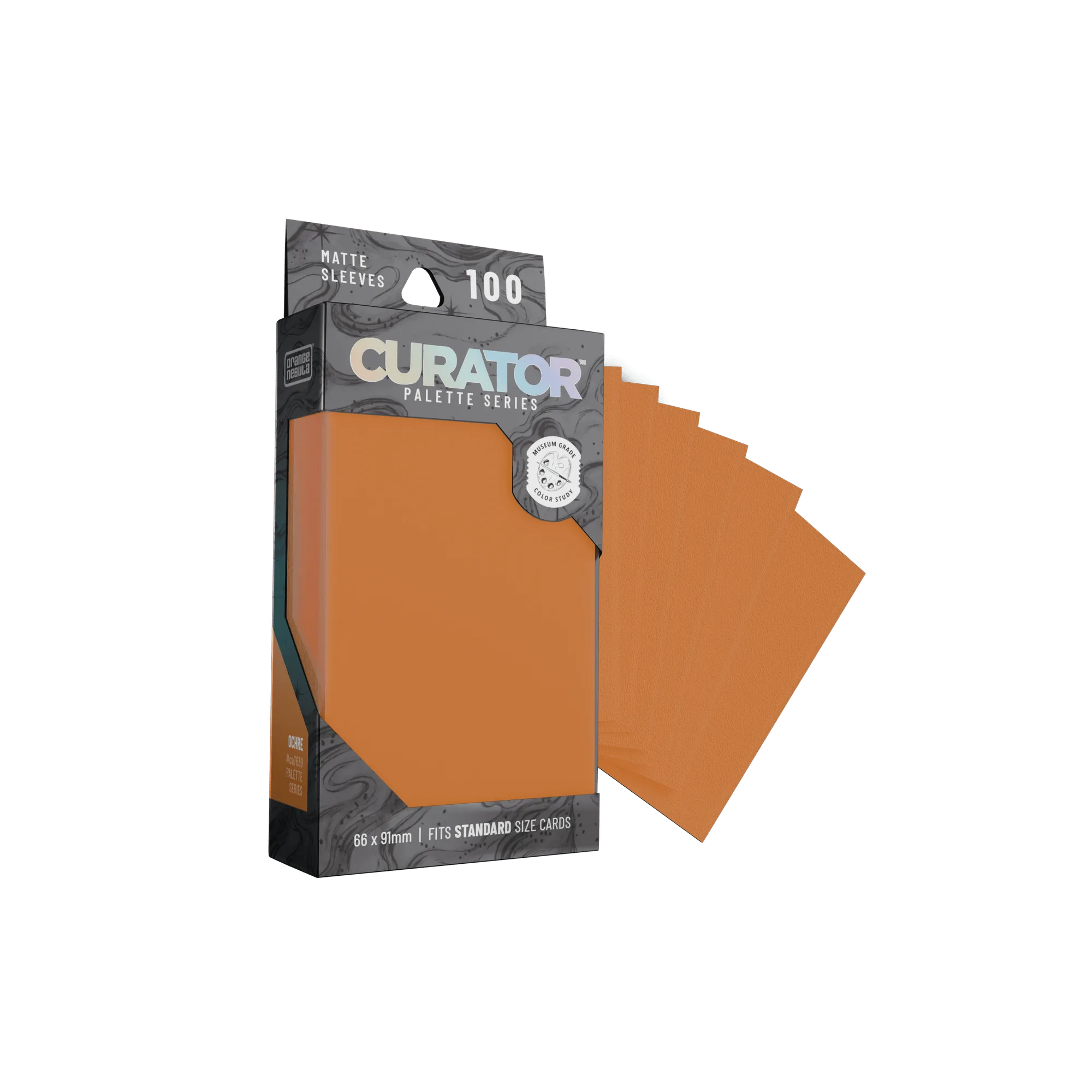
Curator™ Palette Sleeves: Ochre
Who Should Choose Which
Best for
- Players who want sleeves that blend seamlessly with warm, earthy game artwork
- Those who prefer a grounded, gallery-like aesthetic on the table
Not for
- Players seeking cool-toned sleeves to match blue or green artwork
- Those who prioritize maximum durability over color aesthetics