Quick answer
Start by matching the artwork's dominant colors to your room's palette, then choose a size that fills 50-70% of your wall space. Abstract canvas art works best when it contrasts gently with your furniture and repeats an accent tone from your decor.
Color harmony: warm vs. cool abstract tones
Abstract canvas prints often lean warm (browns, mustards, pinks) or cool (grays, blues, greens). A warm-toned print can make a room feel cozy and grounded, while a cooler piece keeps a space airy and calm. The key is to pick a piece whose dominant hue already appears somewhere in your room—pillows, rug, or a throw—so the art feels intentional rather than random.
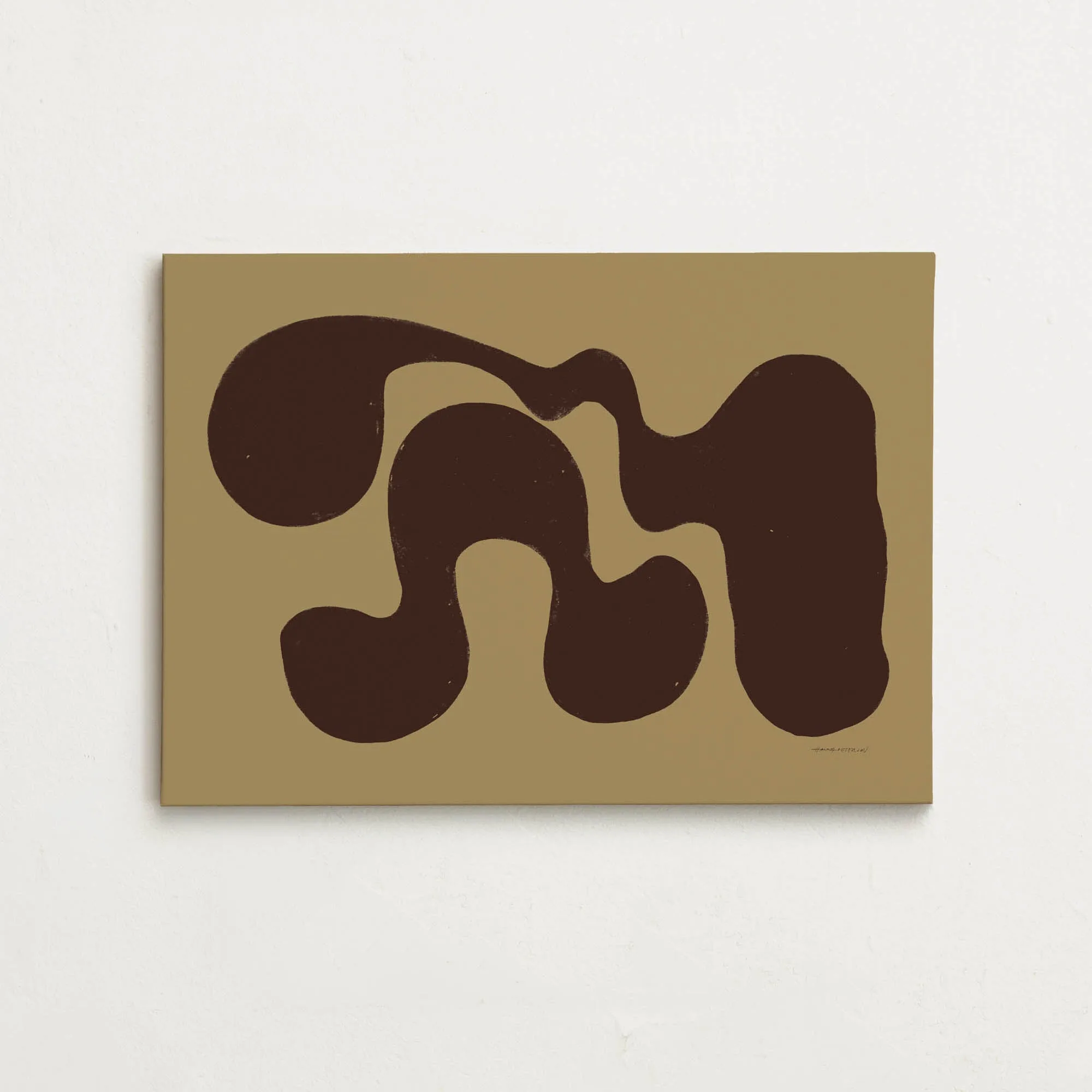
If your room has neutral walls (white, beige, gray), you have more freedom. A piece like Canvas - Embrace Walnut brings earthy browns against a muted green-yellow background, adding warmth without clashing. For a room with strong existing colors, look for a print that pulls from those shades rather than introducing a completely new palette.
Scale and placement: bigger is usually better
A common mistake is choosing an abstract canvas that is too small for the wall. Above a sofa or bed, the print should span roughly two-thirds of the furniture width. In a hallway or entryway, a single large piece (like 70x100 cm or larger) creates a stronger focal point than a cluster of small ones.
Canvas - Nexus Dawn is available in sizes up to 100x150 cm, making it a solid choice for a large wall. If your space is tight, a 30x40 cm or 40x50 cm print can work above a desk or narrow console. Measure your wall before you shop, and use painter's tape to outline the proposed size—this helps you visualize the final look.
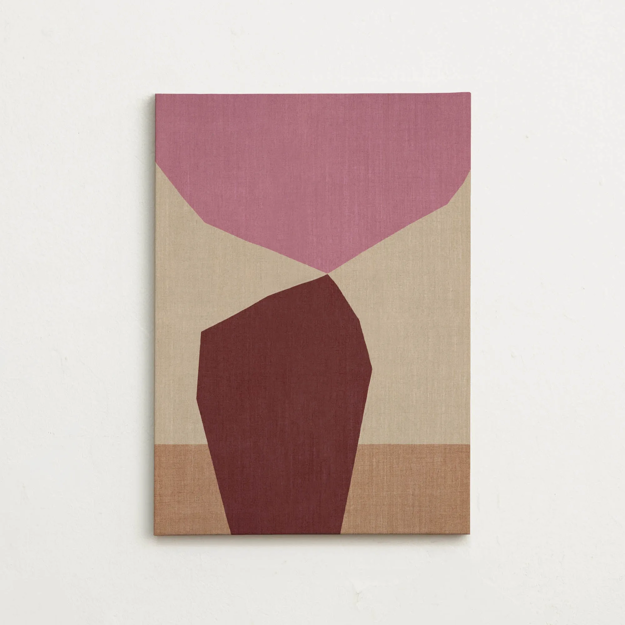
Canvas - Nexus Dawn
Abstract style: organic vs. graphic
Abstract art ranges from soft, flowing forms to sharp, graphic lines. Organic abstracts (like those in Canvas - Nexus Brown) work well in relaxed, natural spaces—think bedrooms, reading nooks, or living rooms with plants and wood textures. Graphic abstracts (like Canvas - Sloppy Swirls Mustard) suit modern or minimalist interiors where clean lines and bold color blocks are already present.
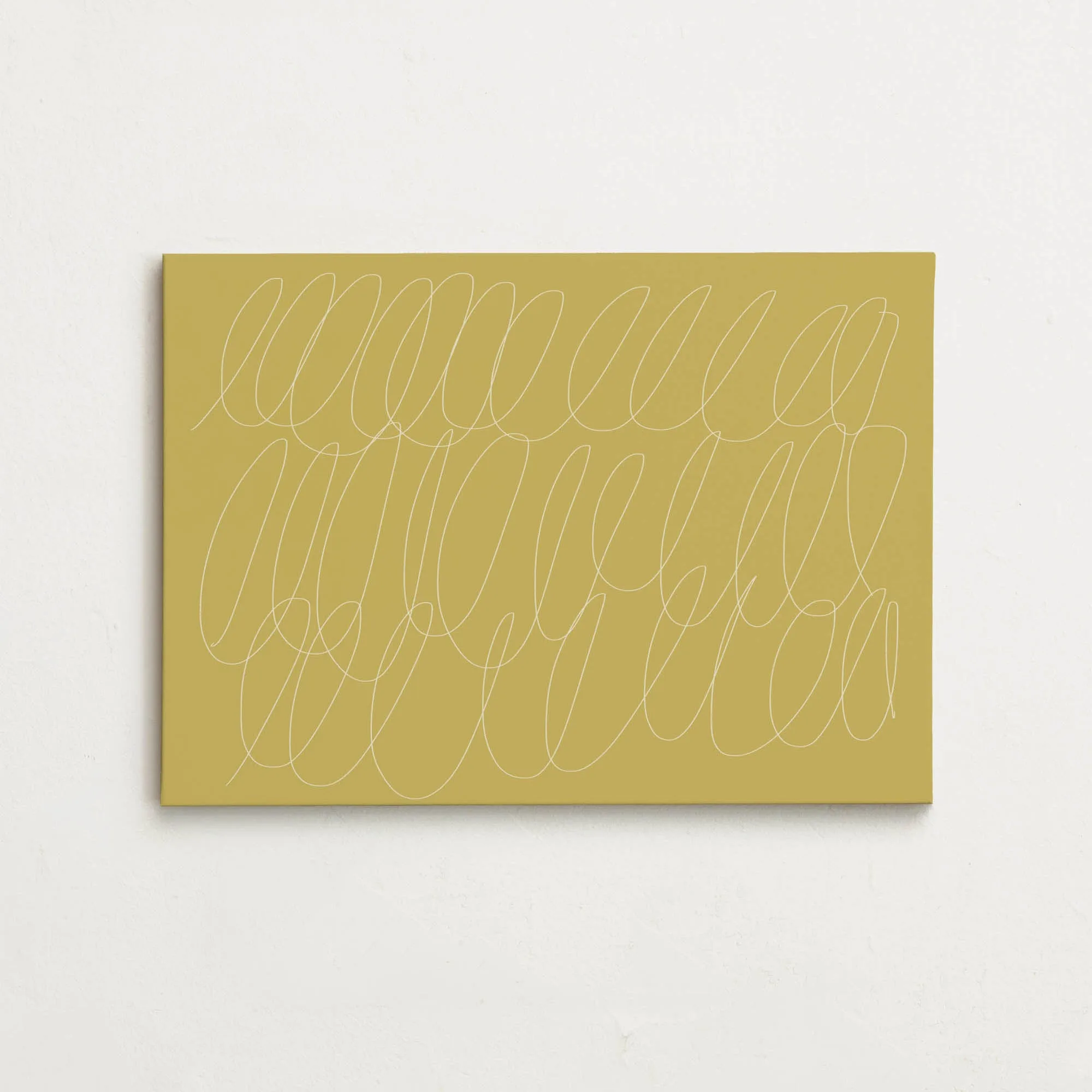
Canvas - Sloppy Swirls Mustard
There's no wrong choice, but mixing an organic print into a very structured room can add a welcome softness, while a graphic piece can energize a neutral space. Let your existing furniture style guide you: curved, plush pieces pair nicely with flowing abstracts; angular, sleek furniture matches better with graphic motifs.
Your decision rules for abstract canvas art
- Match the dominant color: Identify the main color in the print and check that it repeats a color already in your room (wall, furniture, or decor). If the print introduces a new color, it should be an accent tone that appears in at least one other item nearby.
- Size to the wall, not the furniture: Measure your wall width and height. For a single canvas, the print width should be 50-70% of the wall width. For a grouping, treat the total width the same way. Above furniture, leave 15-20 cm of wall visible on each side. Use painter's tape to mark the dimensions before buying.
- Choose organic or graphic based on room mood: Soft, flowing abstracts (organic) suit calm, natural spaces. Sharp lines and bold colors (graphic) fit modern, minimalist rooms. If your room mixes styles, pick an organic print with a few graphic elements or a graphic print with a soft background.
- Consider the finish and material: Canvas prints come with a gallery-quality finish that reduces glare and gives a matte look. This works well in rooms with natural light. If your space is very bright, a canvas print will stay readable without reflections.
Abstract canvas options to consider
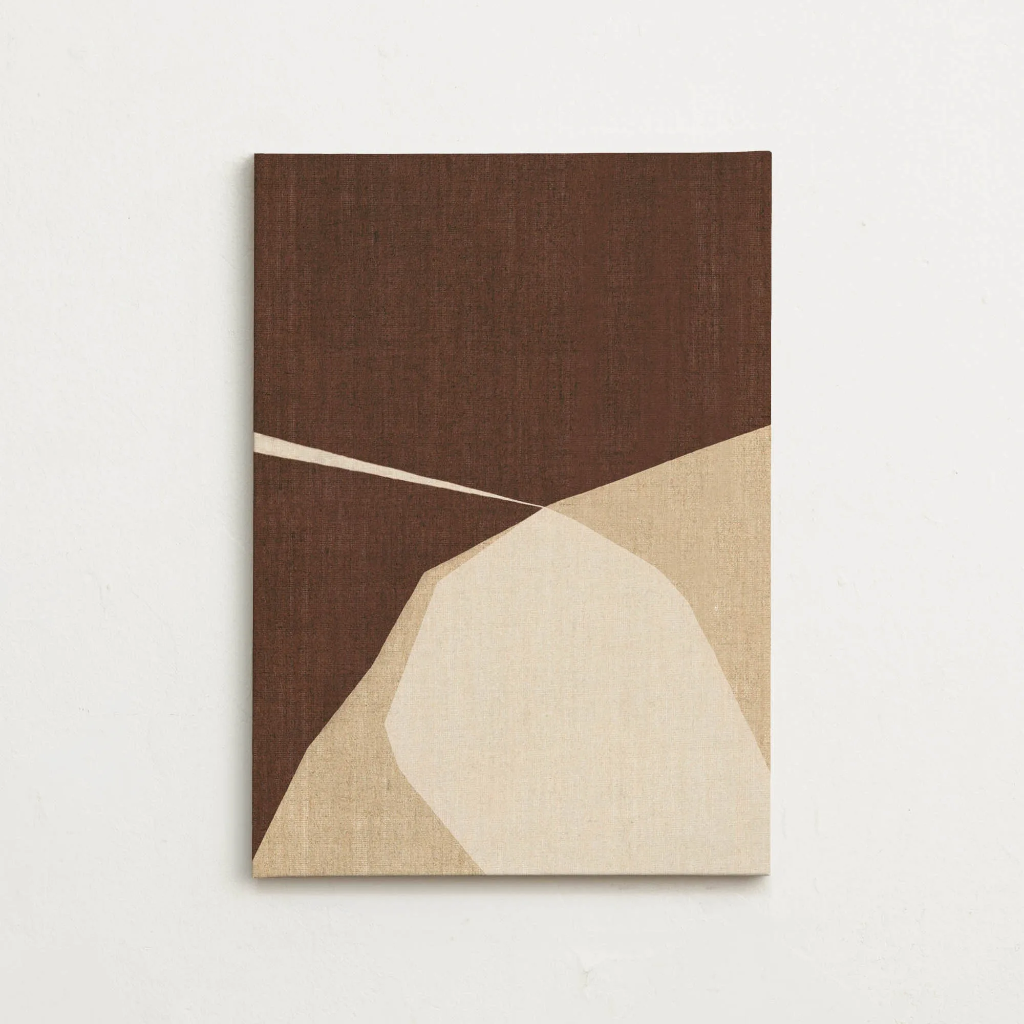
- Canvas - Nexus Brown: Canvas art print with soft, flowing forms in brown, beige and white. An abstract and minimalist artwork in an earthy color palette. Its warm, organic shapes make it a natural fit for cozy living rooms or bedrooms with wood and neutral tones.
- Canvas - Embrace Walnut: Canvas art print with abstract, soft forms in brown tones against a muted green-yellow background. A stylish motif with a warm color palette and an organic feel. The muted green-yellow backdrop adds a subtle color accent that can tie together decor with earthy or botanical elements.
Who this guide is for
Best for
- First-time buyers who want a clear, repeatable method to pick abstract art
- Decorators looking to match canvas prints to an existing room palette
Not for
- Shoppers who already know their exact size and color and just need to browse
- Collectors seeking rare or limited-edition abstract pieces