Quick answer
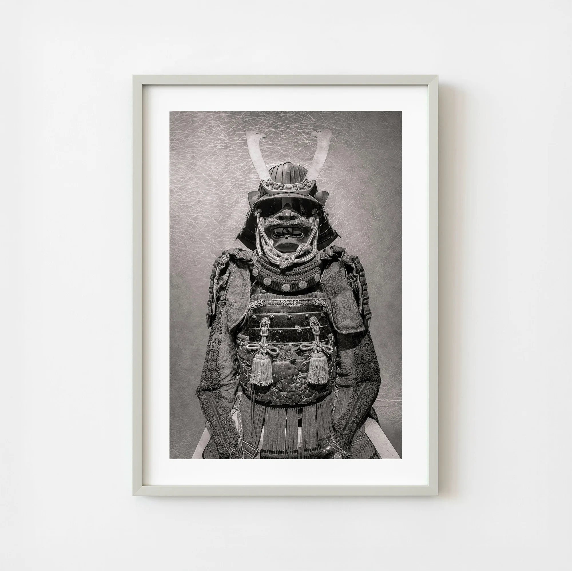
Place your limited edition monochrome samurai print at eye level in a room with neutral walls and indirect lighting. Use a simple black or dark wood frame to let the ornate crescent crest and layered textile details stand out.
Why a monochrome palette works for samurai art
Monochrome samurai prints bring a sense of quiet drama to any room. The lack of color shifts focus to the texture, composition, and ceremonial details—like the crescent-shaped helmet crest and richly decorated fittings. This makes the print feel more like a museum piece than a decorative poster.
A black-and-white or sepia-toned print also gives you flexibility. It pairs easily with existing furniture, from mid-century modern to industrial loft styles, without clashing with your color scheme.
Trade-offs: bold vs. subtle display
A large monochrome print can dominate a wall. That is the point if you want a focal point. But if your room already has strong patterns or a busy layout, the print may compete. In that case, choose a smaller dimension or group it with one or two simple pieces.
The limited edition status adds value, so avoid placing the print in direct sunlight or high-humidity areas like bathrooms. The ornate fittings and textile elements are best preserved in stable indoor conditions.
Steps to style your monochrome samurai print
- Choose the right wall and height: Select a wall with a neutral background—white, light gray, or warm beige. Hang the print so its center is 57–60 inches from the floor, which matches average eye level. Common mistake: hanging too high above furniture, which makes the print feel disconnected. Measure twice before hammering a nail.
- Pick a frame that complements the ornate crest: A slim black metal or dark wood frame keeps attention on the print's ceremonial details. Avoid ornate gold or carved frames that compete with the crescent crest and layered textile elements. Common mistake: using a frame with glass that creates glare under direct light. Opt for non-glare acrylic or museum glass if you can.
- Light to highlight the monochrome contrast: Use a picture light mounted above the frame, or a directional ceiling spot. Aim for a warm white bulb (2700–3000K) that brings out the silver-gray tones without washing out the dark areas. Common mistake: relying on overhead ceiling lights that cast shadows on the print. Test the light at different times of day before finalizing the angle.
- Balance the print with surrounding decor: Keep the nearby wall simple—one or two small accessories, like a ceramic vase or a stack of art books. Avoid busy patterns or multiple frames next to the samurai print. Common mistake: cluttering the wall with too many small items that dilute the print's impact. Let the print breathe; less is more.
Product spotlight
-
Japan Tokyo Ancient Samurai Armor Ornate Crescent Crest Portrait Moody Monochrome Still Life Wall Art | Limited Edition of 10: This final suit in the series is defined not just by its crescent-shaped helmet crest, but by the extraordinary level of ornamentation and ceremonial detail woven into every surface. The rich detailing means the print rewards close viewing, so place it where guests can step near—like a hallway or reading nook—not just across the room.
Japan Tokyo Ancient Samurai Armor Ornate Crescent Crest Portrait Moody Monochrome Still Life Wall Art | Limited Edition of 10