Start with the Print's Story
Framing a limited edition wildlife print isn't just about protecting paper—it's about preserving the moment the photographer captured. For a piece like Dan Kosmayer's "Zebra Portrait in Serengeti Light," the frame should honor the quiet encounter, not overpower it. This guide walks through the key decisions: size, frame material, glazing, and placement, all grounded in what the catalog actually confirms about this print.
What This Print Offers
-
Zebra Portrait in Serengeti Light | Limited Edition of 10: Limited edition of 10, hand-signed by Dan Kosmayer. The small edition size means the print is collectible; framing should protect it for the long term.
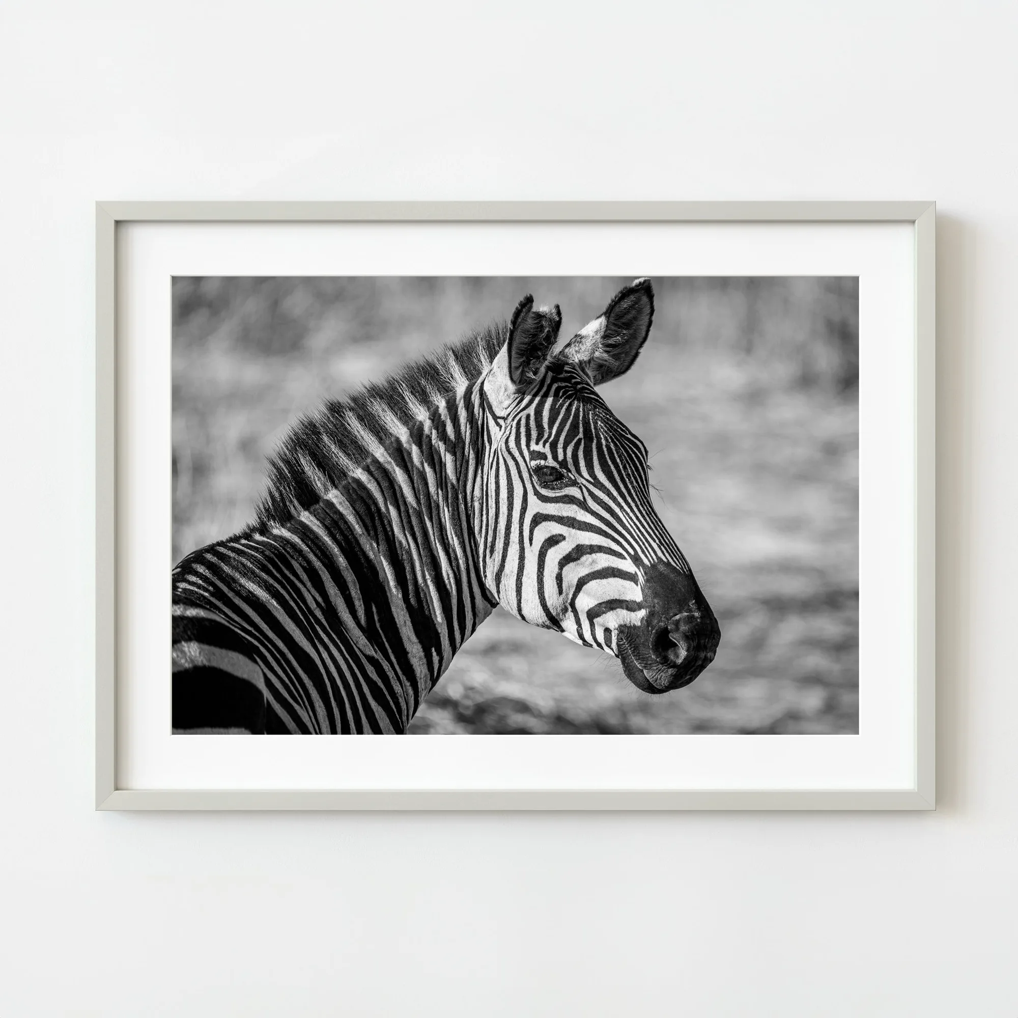
Zebra Portrait in Serengeti Light | Limited Edition of 10
-
Zebra Portrait in Serengeti Light | Limited Edition of 10: Available in sizes from 8×10 inches (20.3×25.4 cm) up to 30×40 inches (76.2×101.6 cm), plus A4 through A1. Size directly affects framing cost and wall impact. A smaller print may suit a gallery wall; a larger one becomes a focal point.
-
Zebra Portrait in Serengeti Light | Limited Edition of 10: Shot at 600mm to isolate the zebra against soft bokeh, with a deliberately minimalist composition. The clean background means a simple, non-distracting frame works best—avoid ornate patterns that compete with the image.
Choose the Right Size for Your Wall
The catalog confirms 11 size options for this print. Measure your wall space before deciding. A common mistake is choosing a print that's too small for the room or too large for the available wall.
For a typical living room or office wall, a 16×20 or 20×24 inch print offers strong presence without overwhelming. If you're building a gallery wall, the 8×10 or A4 sizes work well as part of a set.
- Small (8×10, A4): Best for desks, shelves, or grouped arrangements. Framing is relatively inexpensive.
- Medium (11×14, 12×16, 16×20, A3): Versatile for most walls. The 16×20 is a popular choice for a single statement piece.
- Large (20×24, 24×30, A2, A1): Creates a bold focal point. Requires a sturdy frame and careful wall placement.
- Extra Large (30×40): Best for spacious rooms with high ceilings. Framing costs will be higher due to custom sizing.
Select a Frame That Respects the Image
The zebra portrait is black and white with rich tonal range—deep shadows, bright whites, and subtle mid-tones. A frame that complements this palette is key.
A simple black or dark wood frame echoes the shadows without drawing attention away from the animal. A white or natural wood frame can work if your room is light, but it may compete with the bright highlights in the print. Avoid metallic or ornate frames; they clash with the raw, grounded feel of the Serengeti scene.
The catalog notes the image has "a subtle halo around the mane" and "light just brushing the curve of its ear." A frame with a mat (mount) in a neutral tone—like off-white or light gray—helps preserve those delicate highlights and prevents the glass from touching the print.
Glazing: Protect Without Distortion
Use UV-protective glazing to prevent fading over time. The catalog does not specify the paper or ink type, so assume standard fine-art paper that benefits from UV protection.
For a print with subtle tonal detail, choose anti-reflective glass or acrylic to avoid glare that can obscure the zebra's texture. Non-glare acrylic is lighter and safer for larger sizes, but it can slightly soften the image—trade-off worth considering for a piece where contrast matters.
Placement: Where the Quiet Encounter Works Best
The catalog describes this print as "about patience and presence"—a calm, observant moment. Place it where you can pause and take it in: a reading nook, a hallway with natural light, or above a desk where you work.
Avoid direct sunlight, which accelerates fading. A wall that receives indirect light or is opposite a window is ideal. The print's minimalist composition means it won't clash with busy decor, but it shines best on a wall with some breathing room.
What the Catalog Does Not Confirm
The catalog does not specify the paper type (e.g., archival, matte, or glossy) or the ink technology. For any limited edition print, assume standard fine-art paper unless stated otherwise. Use acid-free matting and backing to avoid long-term damage.
The catalog also does not provide care instructions beyond the fact that the print is hand-signed. If you have concerns about humidity or handling, consult a professional framer who works with fine art photography.