Quick answer
Start with a base layer of larger stickers, then add mid-sized accents, and finish with small details. Keep a consistent color palette and leave breathing room to avoid a cluttered look.
Why layering matters for journal cohesion
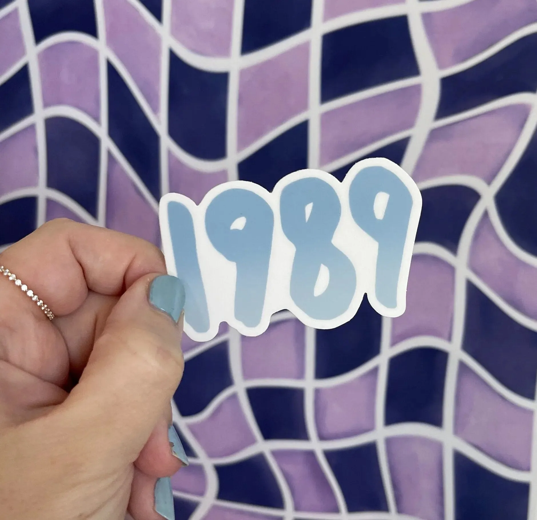
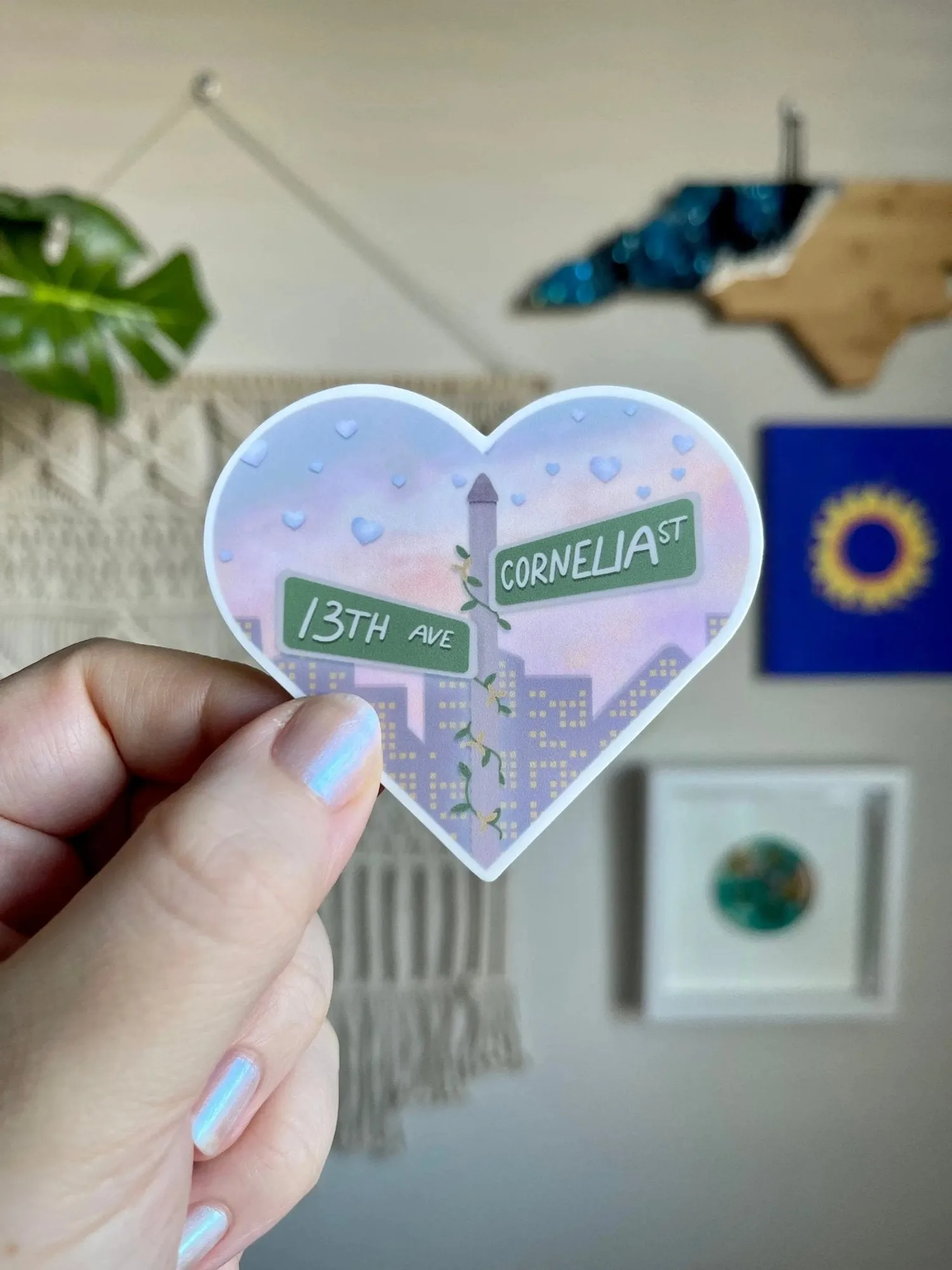
Layering stickers isn't just about piling them on — it's about creating depth and a unified theme. When every sticker shares a color story or mood, the page reads as intentional rather than chaotic. For example, the hand-lettered gradient on the 1989 sticker - blue (deep to pale blue) can anchor a cool-toned spread, while the soft pinks and silver in the Cornelia Street Sticker set a romantic tone.
Step-by-step layering process
- 1. Choose a color palette: Pick 2–3 colors that appear in your stickers. For a cohesive look, pull hues from one sticker — like the blue gradient of the 1989 sticker - blue — and repeat them in your background washi or pen accents. Common mistake: using every color in your sticker stash. Stick to a narrow palette.
- 2. Place the largest sticker first: This becomes your anchor. Stick it slightly off-center to leave room for smaller layers. The Cornelia Street Sticker works well here because its heart shape naturally draws the eye. Checkpoint: the anchor sticker should not touch the page edges — leave a margin.
- 3. Add mid-sized accents: Overlap the edge of your anchor sticker by about a quarter inch with a medium sticker or washi tape. This creates depth without hiding the main design. Common mistake: overlapping too much and burying the anchor sticker's key details.
- 4. Finish with small detail stickers: Tuck tiny stickers — like the I can do it with a broken heart sticker — near the anchor or in empty corners. These add surprise and narrative without overwhelming the layout. Checkpoint: if the page feels busy, remove one small sticker rather than adding more.
- 5. Let it rest before judging: Close your journal for an hour, then look at the spread with fresh eyes. You'll often spot an imbalance or a sticker that needs repositioning. Common mistake: over-correcting in the moment. A short break helps you see the layout clearly.
Stickers that layer well
-
1989 sticker - blue: The year is hand lettered in blue with a gradient that fades from deep to pale. Durable waterproof and weatherproof vinyl. Its single-color gradient makes it a strong base layer that won't compete with smaller accent stickers.
1989 sticker - blue
-
Cornelia Street Sticker: A heart shaped sticker with an ivy and floral wrapped street sign, a city skyline, and a cotton candy sky full of silver hearts. Durable waterproof and weatherproof vinyl. The heart shape and skyline details add a mid-sized focal point that pairs well with smaller text stickers.
Cornelia Street Sticker
-
I can do it with a broken heart sticker: Falling apart and hitting every deadline anyway — hand lettered inside an illustrated broken heart. Durable waterproof and weatherproof vinyl. Its compact design and strong sentiment work perfectly as a final detail layer that adds personality without bulk.