Quick answer
To match curtain panels to your room's colour story, start by identifying your room's dominant and accent colours, then choose panels that either blend with the walls for a calm look or introduce a contrasting pattern for a bold statement.
Why colour matching matters
Curtain panels are a major visual element in any room, so their colour can either tie the space together or create discord. Matching them to your existing palette ensures a cohesive, intentional look, while a deliberate contrast can add personality. The key is to make a conscious choice rather than letting the curtains clash by accident.
Trade-offs: blending vs. contrasting
Blending your curtain colour with the walls creates a seamless, calming backdrop, ideal for small rooms or spaces with busy furniture. Contrasting, on the other hand, makes the curtains a focal point, which works well in minimalist rooms that need a pop of colour. Consider the room's purpose: a serene bedroom might benefit from blending, while a lively living room could handle a bold stripe or floral.
Steps to match curtain panels to your colour story
- Identify your room's palette: Look at the dominant wall colour, flooring, and large furniture pieces. Note the undertones (warm, cool, or neutral) and pick out one or two accent colours from accessories or artwork. Check that the undertones of your chosen curtain colour match the room's undertones to avoid a mismatch.
- Decide on blend or contrast: If you want a calm, cohesive look, choose curtains in a shade close to your wall colour. For a bolder statement, pick a pattern or colour that contrasts with the walls but echoes an accent hue from the room. Take a photo of the room and view it in different lighting to see how the contrast works.
- Consider pattern scale: In small rooms, choose smaller-scale patterns like fine stripes or delicate florals to avoid overwhelming the space. Larger rooms can handle bigger, bolder prints. Hold the curtain fabric against your wall in natural light to see the pattern scale in context.
- Test with fabric swatches: Order or borrow fabric samples and pin them next to your window. Observe them at different times of day to see how they interact with your room's light and colours. Compare swatches side by side to ensure they complement each other, not just the walls.
- Balance with existing textures: If your room has many textured surfaces like wood or woven furniture, choose smoother fabrics for curtains to avoid visual clutter. Conversely, in a sleek room, textured curtains can add warmth. Run your hand over the fabric to gauge its texture and imagine it against your furniture.
Curtain panels to consider
-
Pretty Pansy Curtain Panel: The Pretty Pansy Curtain Panel adds floral charm and softness, designed to filter light while making a confident style statement. Its floral pattern works well as an accent in rooms with neutral walls, bringing in colour without overwhelming the space.
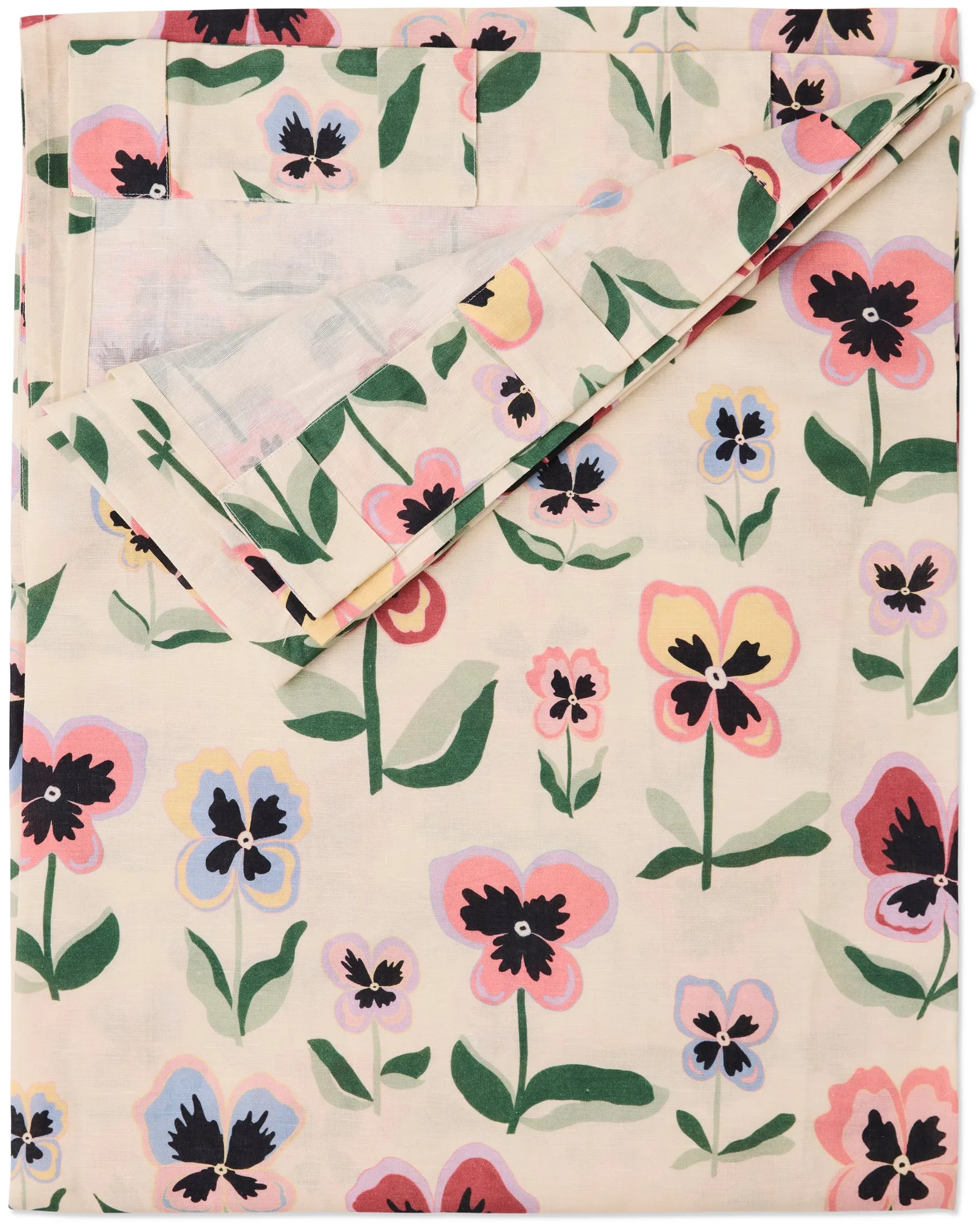
Pretty Pansy Curtain Panel
-
Wakame Crush Stripe Curtain Panel: The Wakame Crush Stripe Curtain Panel has a deep green base with fine woven red and purple stripes, made from a breathable linen-cotton blend. The subtle stripes add texture and depth, making it a versatile choice for rooms with earthy or jewel-toned palettes.
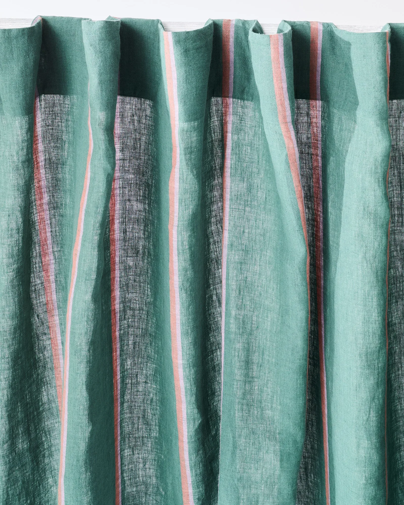
Wakame Crush Stripe Curtain Panel
-
Forever Floral Butter Curtain Panel: The Forever Floral Butter Curtain Panel features cheerful floral prints that brighten any room, letting light filter softly through. Its sunny yellow tones are perfect for adding warmth to rooms with cool or neutral colour schemes.