A beautifully patterned lamp shade can transform the entire feel of a room. The Blue Blockprint Shade, with its artisanal hand-blocked design and soft blue tones, is a versatile piece that adds character and warmth to any space. But to make the most of this stunning shade, you need to pair it with the right lamp base.
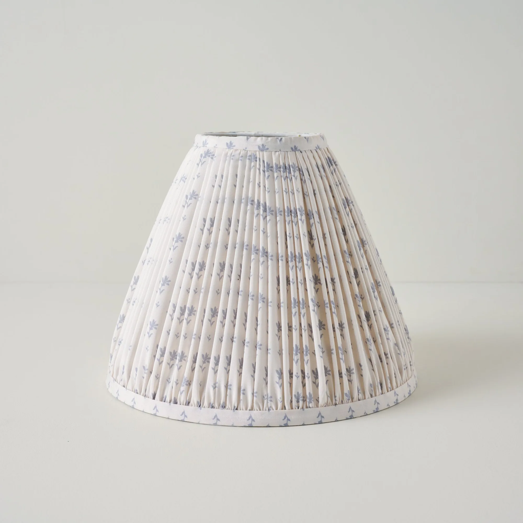
Blue Blockprint Shade
In this guide, we'll walk you through how to style the Blue Blockprint Shade with different table lamp bases — from classic ceramic to modern metal. Whether you're refreshing a reading nook or updating your living room decor, these tips will help you create a harmonious, eye-catching look that feels intentional and polished.
Understanding the Blue Blockprint Shade: Style and Material
Before choosing a lamp base, it helps to understand what makes the Blue Blockprint Shade unique. This shade features a hand-blocked print in shades of blue on a natural linen or cotton blend fabric. The pattern is organic and slightly irregular, giving it a handmade, artisan feel that pairs beautifully with both traditional and contemporary interiors.
The shade's soft blue color can read as a neutral, making it easy to mix with a wide range of base finishes — from warm brass and wood to cool silver and black. Its relaxed, bohemian vibe also means it works well in spaces that lean eclectic, coastal, or farmhouse. Knowing these qualities will guide your base selection.
- The Blue Blockprint Shade is typically made from natural fibers like linen or cotton, offering a soft, diffused light.
- Its hand-blocked pattern adds visual interest without overwhelming the room.
- The blue tones can complement both warm and cool color palettes.
Pairing with Ceramic and Pottery Lamp Bases
Ceramic and pottery lamp bases are a natural match for the Blue Blockprint Shade. The earthy texture of glazed or unglazed ceramic echoes the handmade quality of the blockprint pattern. Look for bases in neutral tones like cream, beige, or soft gray to let the shade stand out, or choose a base with a subtle blue glaze for a monochromatic look.
For a bolder statement, consider a base with a reactive glaze or speckled finish. The organic variation in the glaze will complement the irregular blockprint pattern. Place this combination on a side table or console to create a focal point that feels curated and artistic.
- Neutral ceramic bases (white, cream, taupe) keep the focus on the shade.
- Blue-toned ceramic bases create a cohesive, tonal look.
- Matte finishes pair better with the soft fabric of the shade than high-gloss.
Styling with Wood and Natural Fiber Bases
Wood lamp bases bring warmth and organic texture that harmonize beautifully with the Blue Blockprint Shade. Choose bases in light woods like oak or bamboo for a Scandinavian or coastal feel, or go with darker woods like walnut or mahogany for a richer, more traditional look. The natural grain of the wood adds depth without competing with the pattern.
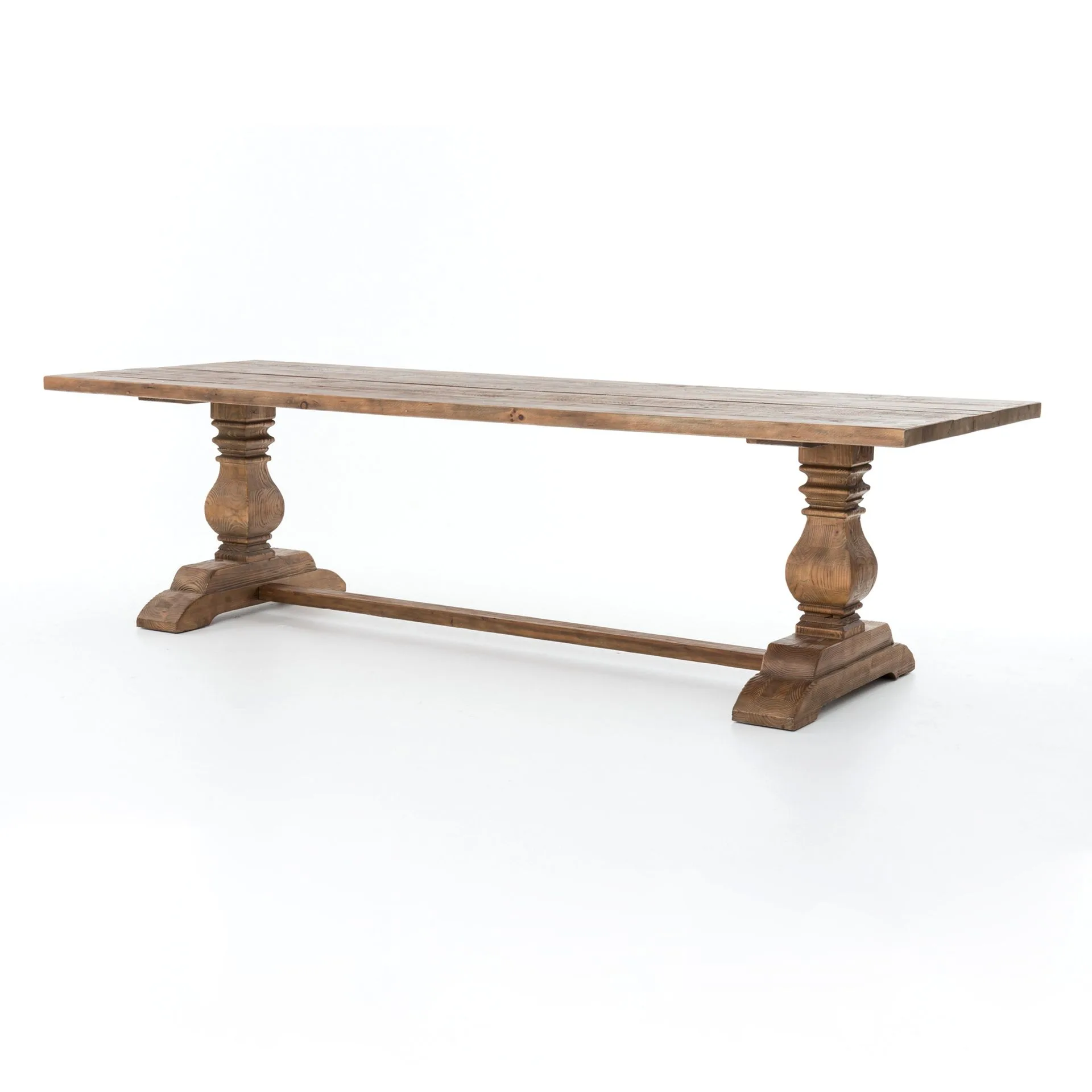
You can also explore bases made from turned wood or carved designs. A simple turned wood base in a mid-tone finish will let the shade's pattern take center stage. This pairing works especially well in living rooms or bedrooms where you want a relaxed, grounded aesthetic. Consider adding a wooden base next to a Lex Coffee Table for a cohesive natural material story.
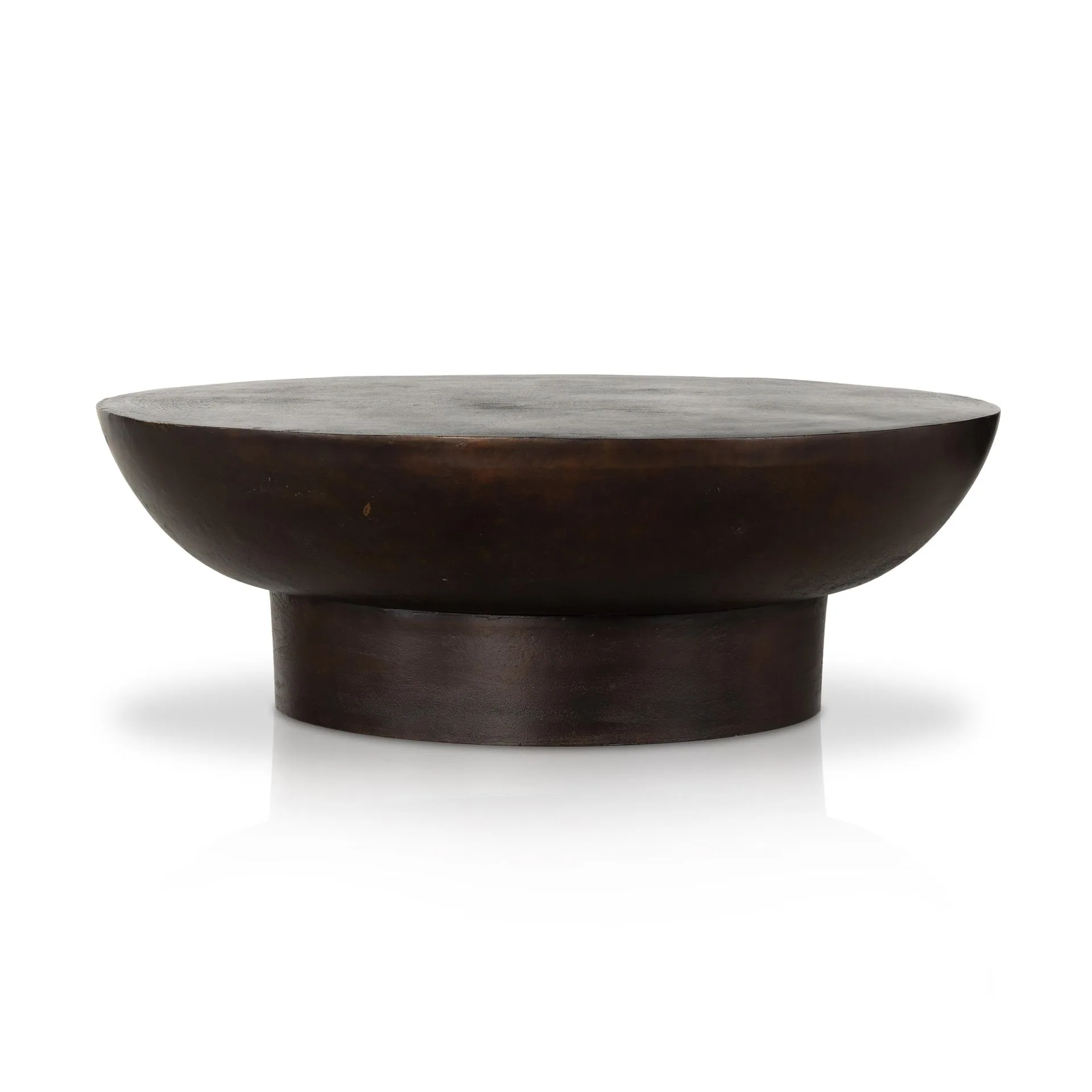
Lex Coffee Table
- Light wood bases (oak, bamboo) enhance the airy, bohemian feel.
- Dark wood bases (walnut, mahogany) add sophistication and contrast.
- Avoid highly polished wood finishes that may feel too formal.
Mixing with Metal Lamp Bases: Brass, Black, and Silver
Metal lamp bases offer a sleek, modern counterpoint to the soft, handcrafted look of the Blue Blockprint Shade. Brass and gold-toned bases are especially popular because the warm metallic hue complements the blue tones beautifully. A brass base with clean lines can elevate the shade from casual to elegant.
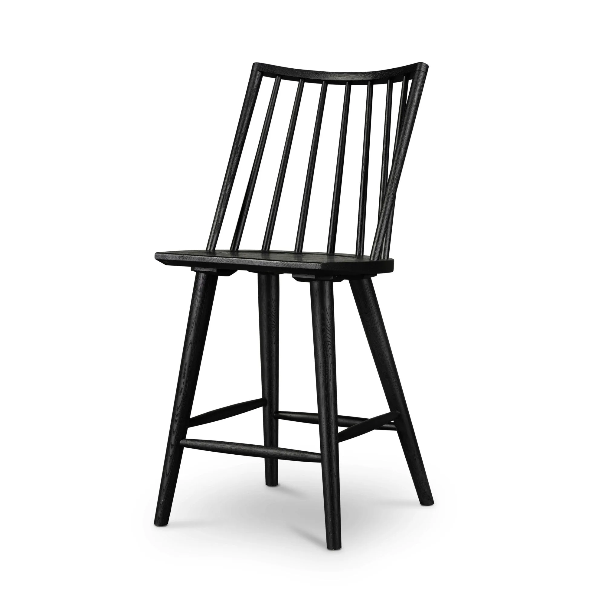
For a more industrial or contemporary vibe, black or dark bronze metal bases provide strong contrast. The dark silhouette anchors the light-colored shade and makes the pattern pop. Silver or chrome bases work well in cooler-toned rooms, but use them sparingly to avoid a sterile look. A metal base on a Daisy Bar Cart can create a stylish bar area with a touch of pattern.
- Brass and gold bases warm up the blue tones of the shade.
- Black or dark bronze bases create dramatic contrast.
- Silver/chrome bases are best in modern or minimalist spaces.
Scale and Proportion: Choosing the Right Base Height and Width
The size of your lamp base matters just as much as its color and material. A shade that is too large for its base will look top-heavy, while a shade that is too small can feel lost. As a general rule, the shade should be about two-thirds the height of the base for a balanced silhouette.
For the Blue Blockprint Shade, which is often a medium to large drum or bell shape, pair it with a base that has a substantial footprint. Avoid overly slender or delicate bases that may appear unstable. A sturdy ceramic or turned wood base in a medium height (18–24 inches) is usually a safe bet. Always measure your table or surface height to ensure the lamp doesn't overwhelm or underwhelm the space.
- Aim for the shade height to be roughly 2/3 of the base height.
- Choose a base with a wide enough base to support the shade's diameter.
- Consider the surface height: lower tables need shorter lamps, taller tables can take taller bases.
Creating a Cohesive Look: Color Palettes and Decor Themes
Once you've selected your lamp base, think about how the lamp will fit into your overall decor. The Blue Blockprint Shade pairs beautifully with neutral color palettes — think whites, creams, beiges, and soft grays. Add natural textures like jute, linen, and wood to reinforce the relaxed, artisan feel.
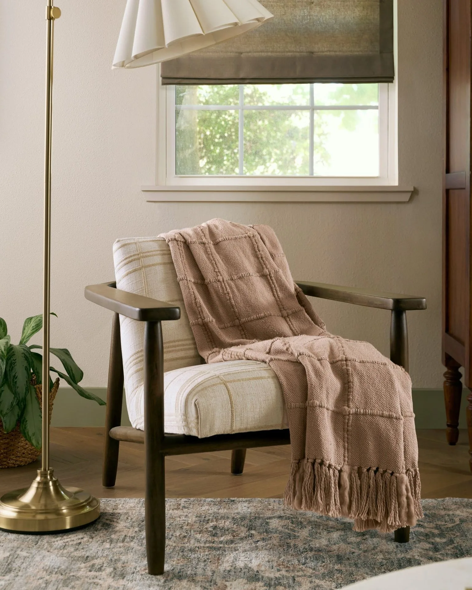
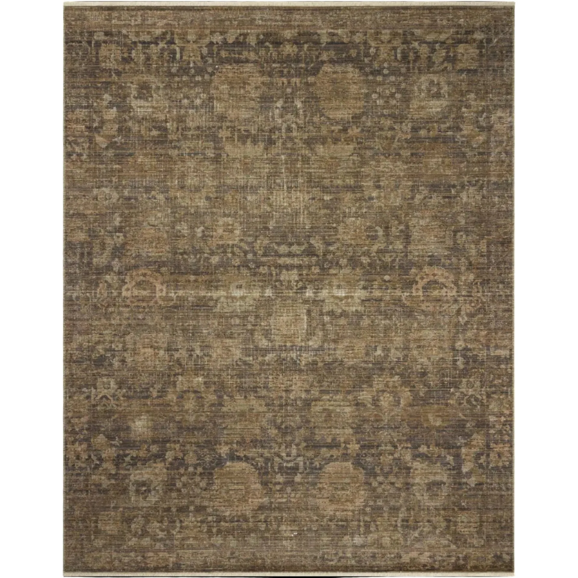
For a bolder approach, pull out the blue tones from the shade and use them in throw pillows, rugs, or artwork. This creates a cohesive color story without being matchy-matchy. The shade also works well in coastal, farmhouse, and eclectic interiors. You can even layer it with other patterned pieces, like a Brunette Dobby Plaid Napkin Set of 4 on a nearby table, for a collected-over-time look.
- Stick to neutral walls and furniture to let the lamp shine.
- Accent with blue or navy decor items for a pulled-together palette.
- Mix patterns carefully: pair blockprint with solids or subtle stripes.
Practical Tips for Placement and Lighting Effect
Where you place your lamp affects both the visual impact and the quality of light. The Blue Blockprint Shade diffuses light softly, making it ideal for ambient or mood lighting. Place it on a side table in a living room, on a nightstand in a bedroom, or on a console in an entryway. Avoid placing it directly in front of a window where the pattern may be lost against the bright daylight.
For task lighting, choose a base with a taller neck or a shade that directs light downward. The Blue Blockprint Shade is best for general illumination rather than focused reading light. If you need more directed light, consider pairing it with a swing-arm lamp base or adding a dimmer switch to control brightness.
- Use the lamp in areas where soft, ambient light is desired.
- Avoid direct sunlight on the shade to prevent fading over time.
- Pair with a warm LED bulb (2700K–3000K) to enhance the blue tones.
Styling a Blue Blockprint Shade with the right lamp base is a simple way to elevate your home decor. Whether you choose a warm ceramic base, a natural wood finish, or a sleek metal option, the key is to balance color, texture, and scale. Start experimenting with your own combinations, and don't forget to explore the Blue Blockprint Shade itself to see how it can transform your space. For more inspiration, check out our full collection of lamp shades and bases to find your perfect match.