Quick answer
Start by testing a Grayish paint swatch on your actual wall, then choose furniture with warm wood or textured neutrals to balance its cool green undertone. Layer lighting at three heights so the gray reads calm by day and soft at night.
Why Grayish behaves differently from a flat cool gray
Grayish is a light gray with subtle green undertones, so it shifts more than a pure cool gray when daylight changes. In north-facing rooms it can look quieter and slightly cooler; in warm afternoon light the green undertone becomes more visible. That is why furniture and lighting choices should be tested in the room, not chosen from a photo.
The practical consequence is that high-contrast black furniture can make Grayish feel colder, while all-white rooms can wash out its softness. A mix of warm wood, woven texture, and one deeper accent usually keeps the wall reading as a calm backdrop rather than a flat panel.
Where Grayish works best and where to slow down
This gray suits open, airy interiors and rooms where you want a neutral base that pairs with both warm and cool palettes. It is a strong choice for living rooms, bedrooms, and hallways that receive a mix of natural and artificial light.
If your room gets very little daylight or you want a dramatic, moody scheme, a light gray with green undertones may feel underpowered. In that case, treat Grayish as a ceiling or trim color, or plan stronger lighting layers before committing to all four walls.
Step-by-step: style a Grayish wall
- Test the swatch in the real room: Place the Grayish swatch on the wall you plan to paint and check it in morning, afternoon, and evening light. Common mistake: judging the color from a screen or from a single bright hour, which hides how the green undertone shifts. Keep the swatch up for at least a full day before buying paint.
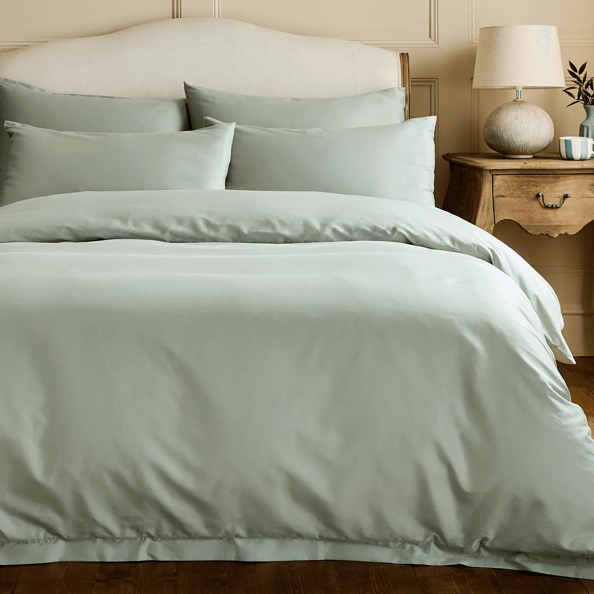
- Choose a warm-neutral furniture base: Anchor the room with warm wood tones, oatmeal, or soft taupe upholstery so the cool gray has something to balance against. Avoid filling the room with only cool grays and chrome, which can make the wall feel sterile. Pick one warm material to repeat at least twice in the room.
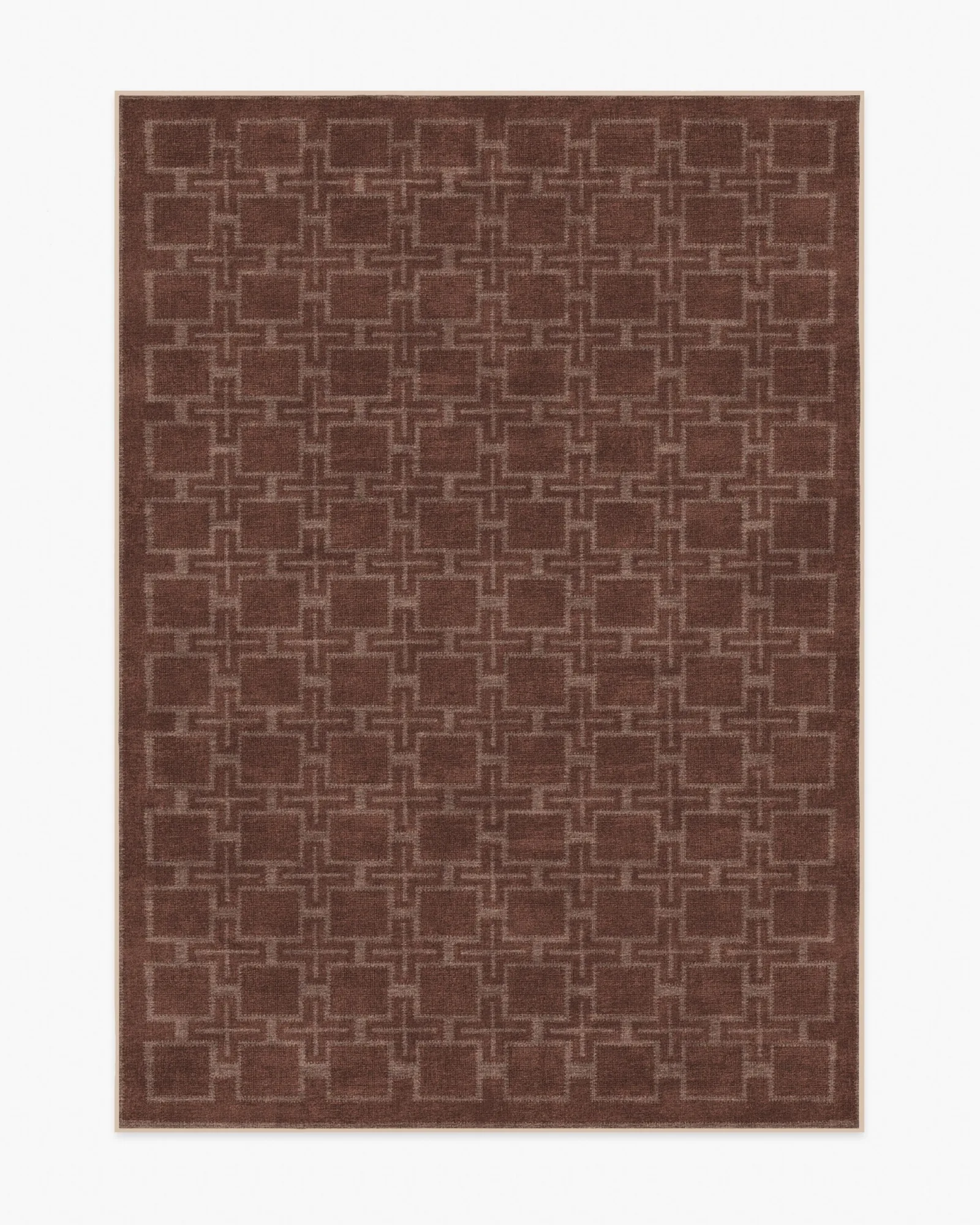
- Add texture instead of more color: Use a woven rug, linen curtains, or a nubby throw to give the flat gray wall depth. Common mistake: adding several bold colors at once, which competes with the subtle green undertone rather than supporting it. Limit yourself to one accent color and let texture do the rest.
- Layer lighting at three heights: Combine ceiling or floor light, a table lamp at seated height, and a low accent light such as a candle or picture light. This keeps gray rooms from looking flat after dark. Check that warm bulbs do not make the green undertone look muddy. Test bulbs at night before you finalize lamp shades and placements.
- Place art and mirrors with intention: Hang art with warm or natural tones slightly off-center from the main seating area, and use a mirror to bounce daylight across the gray wall. Common mistake: hanging a single small piece on a large gray expanse, which makes the wall feel unfinished. Scale art to the wall, not to the furniture below it.
- Review the room at the end of the day: Sit in the room at the hour you use it most and check whether the gray reads calm or cold. If it feels cold, add a warmer rug or a second warm light source rather than repainting immediately. Adjust furnishings and lighting first; repaint only if the swatch itself was wrong.
Product facts
-
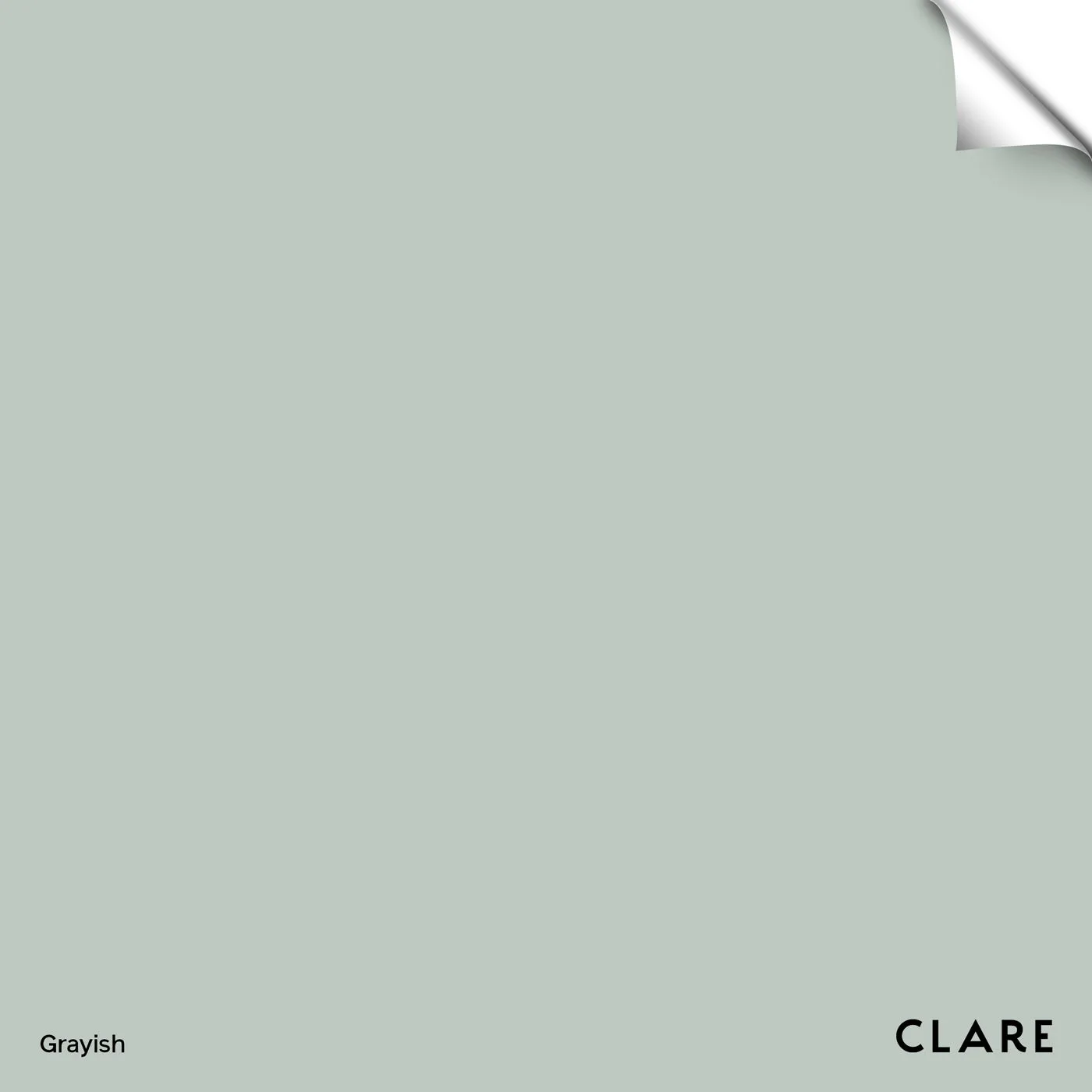
Grayish - Swatch: Grayish is a soft, light gray with subtle green undertones from Clare’s Founder’s Pick collection. The green undertone is the reason warm wood and textured neutrals pair more easily than stark black-and-white schemes.
Grayish - Swatch