Quick answer
Start with a two-tone plan that treats the KAM Outline keycaps as the accent layer: choose a neutral base for the alphas and let the outline design carry the contrast on modifiers. Then check your layout and KAM profile uniformity before mounting anything.
Why KAM Outline suits a restrained two-tone plan
The KAM Outline set is built around a 1930s-inspired outline motif, so its visual interest comes from line work rather than loud color blocking. That makes it a natural fit for a two-tone build where one tone stays quiet and the other does the framing. If you try to add a third strong color, the outline detail competes for attention and the result looks busy rather than clean.
KAM profile is uniform and low-profile, which means rows do not have the height sculpt of sculpted profiles. In practice, a uniform profile makes color placement more visible across the whole board, so your two-tone split should be deliberate rather than random. Decide the split before you buy anything else.
One trade-off to accept before you commit
Thickened PBT is chosen for durability and a solid typing feel, and it resists wear and shine over time better than thinner, softer plastics. The trade-off is that PBT does not offer the same range of vivid, translucent color options as some other materials, so a two-tone plan built on PBT tends to lean toward muted or classic tones. If your heart is set on a high-saturation neon split, this may not be the right starting point.
Also note that the KAM Outline listing describes the set as a KAM profile design with a thickened PBT build, but it does not publish a full compatibility list in the supplied catalog facts. Check your keyboard's layout and stabilizer needs against the set's available options before ordering, rather than assuming every layout is covered.
Steps to plan your two-tone build
- Map your layout first: List every key position your keyboard actually uses, including any non-standard bottom row, split spacebar, or extra macro keys. Compare that list against the options available for the KAM Outline set before choosing colors. Common mistake: assuming a standard layout and discovering a missing key size after the color plan is set. If a key size is not covered, change the keyboard or the set before you design the color split.
- Choose one quiet base tone: Pick a neutral base for the alphas, such as a soft off-white, warm gray, or muted beige, and keep it consistent across the main typing area. This gives the outline motif room to read clearly. Common mistake: using two mid-tone colors on the alphas, which flattens the contrast you wanted. The base tone should be the least attention-grabbing color on the board.
- Assign the accent tone to modifiers only: Place the second tone on the modifier cluster, function row, and escape key, and leave the alphas in the base tone. This creates a clean two-tone layout with a clear boundary. Common mistake: scattering accent keys randomly across the alphas, which breaks the outline pattern and looks accidental. Draw the two-tone boundary along a logical cluster, not across individual letter keys.
- Check contrast in your actual lighting: View your chosen pair under the light you actually type in, not just on a screen. A pair that looks distinct in a product photo can merge under warm desk lighting. Common mistake: judging color coordination from a monitor alone. If the two tones blur together at arm's length, pick a lighter base or a darker accent.
- Confirm the uniform KAM profile fits your habits: Because KAM is uniform and low-profile, every row sits at the same height. Type on a uniform profile if you can before committing, especially if you are used to sculpted rows. Common mistake: expecting a sculpted feel from a uniform set and finding the flat rows unfamiliar. Uniform profile rewards consistent finger placement; give yourself a few days to adjust.
- Dry-fit the color plan before mounting: Lay the keycaps out in your planned two-tone arrangement on a flat surface and check the balance of base versus accent. Adjust the accent count before pressing anything onto switches. Common mistake: mounting the whole set and only then noticing the accent cluster is too large or too small. A five-minute dry fit saves a full re-mount.
Product facts
-
KAM Outline Thickened PBT Keycaps: KAM Outline Thickened PBT Keycaps use a uniform, low-profile KAM design with a 1930s-inspired outline motif. A uniform profile keeps every row the same height, so your two-tone color split reads consistently across the board instead of shifting with row sculpt.
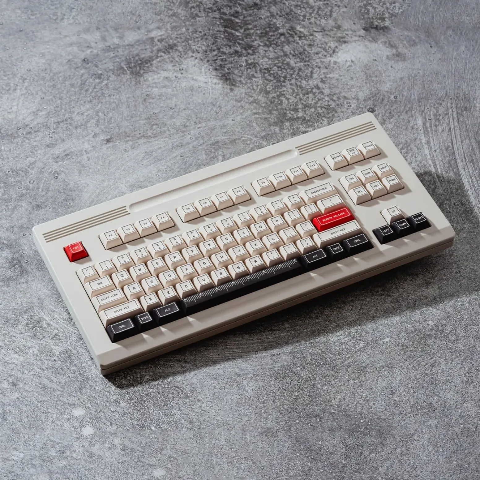
KAM Outline Thickened PBT Keycaps
-
KAM Outline Thickened PBT Keycaps: The set is made from thickened PBT, described as resistant to wear and shine over time. That durability matters most on the keys you hit constantly, so it supports a plan where the accent tone sits on high-use modifiers without quickly looking worn.