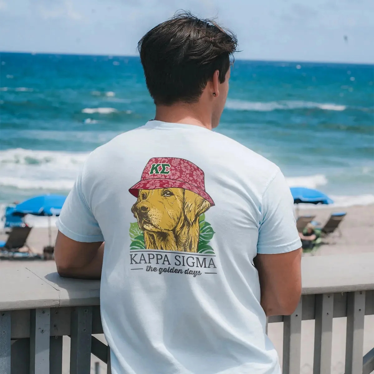
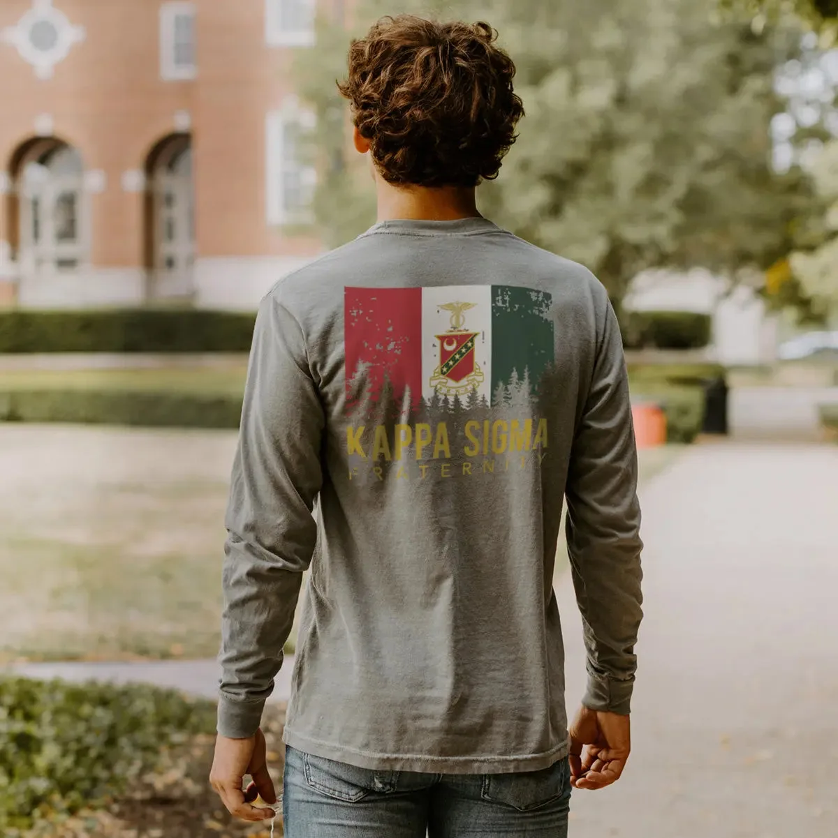
Start with the tonal print, not the logo size
The Monochrome Brotherhood Tee is built around restraint. The Kappa Sig name and your founding year are printed in a subtle tonal treatment that blends into the fabric, so the shirt reads as a solid color from across the room and reveals its details up close. That changes how you plan an outfit: the tee works as a quiet base layer rather than a loud statement piece.
Because the print is low-contrast, the color you choose and the size you pick do more visual work than the graphic itself. A clean fit and a deliberate hue matter more here than they would on a high-contrast lettered tee.
What the catalog confirms about this tee
-
Kappa Sig Monochrome Brotherhood Short Sleeve Tee: Subtle tonal print of Kappa Sig and the founding year on a super-soft fabric. The low-contrast print is the defining feature, so styling should support a quiet, monochrome look rather than compete with it.

Kappa Sig Monochrome Brotherhood Short Sleeve Tee
-
Kappa Sig Monochrome Brotherhood Short Sleeve Tee: Kappa Sigma approved classic cut that layers under letterman jackets or stands strong solo on game day. This tells you the intended use: a layer under outerwear and a standalone shirt for campus events.
-
Kappa Sig Monochrome Brotherhood Short Sleeve Tee: Available in sizes S, M, L, XL and XXL. Size availability is confirmed, but the catalog does not list chest or length measurements, so fit must be judged from the classic-cut description.
How to choose a size without measurements
The catalog describes a classic cut but does not provide chest, length or sleeve measurements. That means you cannot calculate an exact fit from the listing alone. Use the classic-cut description as your starting point: it suggests a standard, not oversized, silhouette that is meant to sit cleanly under a jacket.
If you already own a Kappa Sigma short sleeve tee in a size that fits well, start there. If you are between sizes and want the tee to work as a layer under a letterman jacket, the smaller size is the more practical choice for a classic cut. If you want it to stand alone on game day with a little more room, size up. Either way, treat this as a judgment call rather than a guarantee, because the catalog does not confirm garment measurements.
Styling a monochrome Greek tee for campus and game day
The tee's tonal print makes it easy to build outfits around one color family. These combinations keep the focus on the subtle detailing instead of burying it.
- Under a letterman jacket: The catalog specifically supports layering under a letterman jacket. Let the tee be the quiet base and keep the jacket as the outer statement.
- Game day, solo: Wear it on its own with jeans or shorts in a matching or neutral tone so the tonal print stays visible up close without clashing.
- Rush and chapter events: Pair it with chinos or clean denim for a put-together look that still reads casual. The monochrome treatment keeps it from feeling like a costume.
- Reunions and alumni weekends: A tonal tee is an easy way to show affiliation without a loud graphic. Keep the rest of the outfit simple so the shirt's subtlety does the work.
How to style a black graphic tee when the graphic is tonal
A black graphic tee usually leads with contrast. This one does the opposite: the print sits close to the fabric color, so the shirt behaves more like a solid black tee with a hidden detail. That means you can wear it with almost anything you would wear with a plain black tee, and the Kappa Sig reference appears only when someone is close enough to notice.
Keep the rest of the outfit matte and simple. Avoid stacking multiple loud graphics or high-contrast logos on top of it, because they will pull attention away from the tonal print. If you want the founding year to be readable, choose a fit that does not bunch or fold across the chest.
Care guidance the catalog supports, and what it does not
The supplied product information does not include washing instructions, fabric composition, drying guidance or print-care steps. That is a real limitation, not an oversight you should fill in with guesswork. Do not assume a specific water temperature, bleach rule or tumble-dry setting from this article.
What you can do is protect the tonal print by treating the tee as a printed garment: turn it inside out before washing, avoid washing it with rough items that could abrade the print, and follow the care label on the garment when it arrives. If the label is missing or unclear, contact the store before washing. The catalog does not confirm whether the print is screen-printed, heat-transferred or otherwise applied, so avoid ironing directly over the graphic.
Checkpoints before you order
- Confirm your size: S through XXL are listed, but measurements are not. Compare against a tee you already own and decide whether you want a layering fit or a standalone fit.
- Choose the hue deliberately: The catalog says to choose your hue, but does not list the available color names. Check the variant options on the product page before ordering.
- Plan for the tonal print: Expect a subtle, close-to-fabric look rather than a high-contrast logo. If you want a loud graphic tee, this is not that shirt.
- Check the care label on arrival: The supplied information does not include washing instructions. Use the garment label as the authority and ask the store if anything is unclear.