Start with the black foil base, not the artwork
Printed Black Foil with Full Color imprint - MNS is a custom foil wrapper product, and the base material is black foil. That single fact changes how you should approach artwork: you are not designing on a white label. Your full color imprint sits on a dark surface, so contrast and ink coverage matter before you think about fonts or fine detail.
The listing confirms the product name, the black foil base, and a full color imprint. It does not supply a print template, color profile, or minimum line weight, so treat those as questions for the custom team rather than assumptions. The practical move is to design for a dark background and confirm any technical print limits directly with Rip N Roll before you finalize files.
What the MNS listing confirms
-
Printed Black Foil with Full Color imprint - MNS: Printed Black Foil with Full Color imprint - MNS is the product name, and the wrapper base is black foil. Your artwork will be printed on a dark foil surface, so contrast decisions come before style decisions.
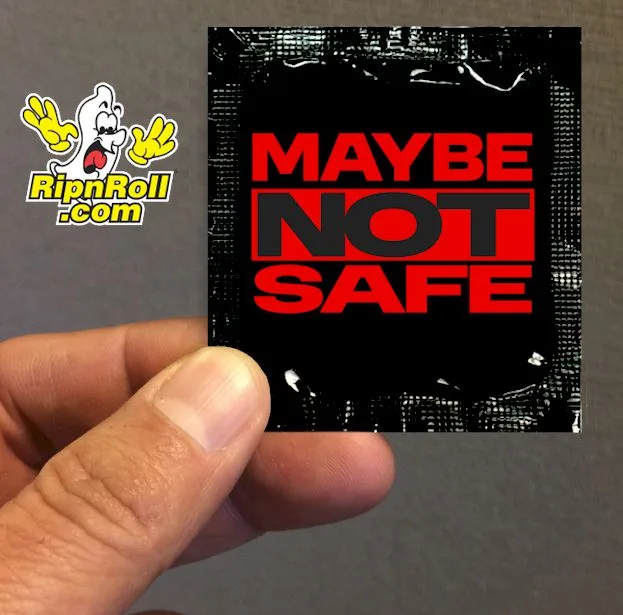
Printed Black Foil with Full Color imprint - MNS
-
Printed Black Foil with Full Color imprint - MNS: The catalog price includes a $0.05 up-charge for Black colored foil wrappers. The black foil is a priced option, not the default white base, so budget for it per unit when comparing quotes.
-
Printed Black Foil with Full Color imprint - MNS: The listing offers quantity options from 500 pack - $450 through 10000 pieces $5000. Artwork that reads well at small sizes matters more as quantities grow, because every unit carries the same imprint.
A practical artwork sequence for a dark foil face
The listing does not provide a file-preparation checklist, so these steps focus on the design decisions the supplied evidence supports. Confirm technical requirements with the custom team before sending final art.
- 1. Design on a black background from the first draft: Open your canvas with a black fill rather than placing art on white and recoloring later. This exposes weak contrast early, while changes are still cheap.
- 2. Choose light and saturated colors for the main message: On black foil, pale tints, white, and bright saturated hues generally separate better than dark browns, deep blues, or near-black outlines. The listing does not guarantee specific ink behavior, so request a proof if color accuracy is critical.
- 3. Keep the most important text large and simple: A brand name or event title should survive at wrapper scale. Avoid thin scripts and hairline rules for essential information; the listing does not state a minimum line weight, so ask before relying on fine detail.
- 4. Test the artwork at actual foil size: View your design on screen at the approximate size of a foil wrapper, not zoomed in. If the message is unreadable at that scale, simplify it before ordering any quantity.
- 5. Match the quantity tier to your distribution plan: The catalog lists 500 pack - $450, 1000 pieces $640, 2500 pieces $1350, 5000 pieces $2600, and 10000 pieces $5000. Ordering a larger tier only makes sense if you have a confirmed use for the extras.
Contrast choices that usually help on black foil
These are design principles, not manufacturer instructions. The listing does not specify ink opacity, print method, or color-matching limits, so treat them as starting points for a conversation with the custom team.
- Use white or very light type for essential copy: Light type on black foil creates the strongest separation for names, dates, and short messages.
- Reserve dark colors for large shapes, not fine text: A deep red or navy block can work as a background shape, but the same color used for small lettering may disappear into the black foil.
- Avoid relying on black outlines to define shapes: An outline in a color close to the foil base reduces separation. Use a light outline or a contrasting fill instead.
- Keep the background uncluttered: Busy photographic art or many overlapping elements compete with your message on a small dark surface. A simple, high-contrast composition is easier to read.
Black foil versus the white foil alternative
The catalog also lists printed white foil products, but this article focuses on the black foil MNS option. The main tradeoff is visual impact versus readability.
- Black foil: A dark, distinctive base with a $0.05 per-unit upcharge in the catalog. It demands deliberate contrast and simpler artwork to stay readable.
- White foil: A lighter base that generally gives more forgiving contrast for detailed or multicolor artwork. The supplied evidence for this article does not include white foil pricing or specifications, so compare directly in the catalog.
What the listing does not settle before you order
The supplied record does not include a dieline, bleed, resolution requirement, color profile, or proof timeline. It also does not state minimum order quantity beyond the listed pack sizes, turnaround time, or whether a physical proof is available. Those are not reasons to avoid the product; they are reasons to ask.
The listing does include a direct contact route for custom questions: call 1-888-747-6765 or email [email protected]. Use that channel to confirm file specs and proofing before you commit to a large quantity tier. For a 500-piece order the risk of a contrast mistake is limited; for a 10000-piece order the same mistake is multiplied across every wrapper.