When you walk down the beverage aisle, what makes you reach for one bottle over another? Before a single sip, your brain has already decided based on the packaging. In the competitive world of premium sodas, design is not just decoration—it’s a silent salesperson. Understanding the psychology behind soda packaging can help brands connect with consumers and drive purchasing decisions.
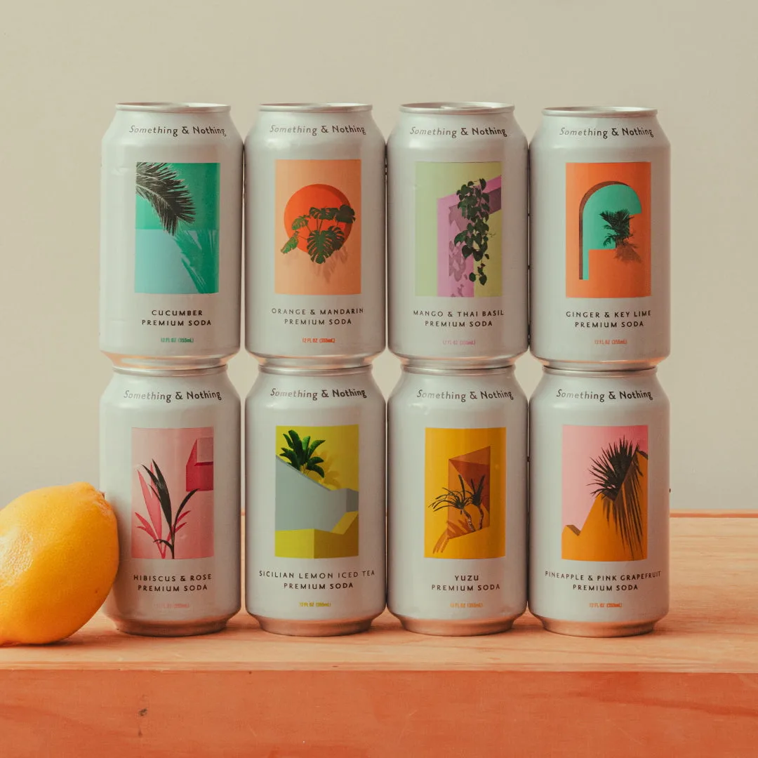
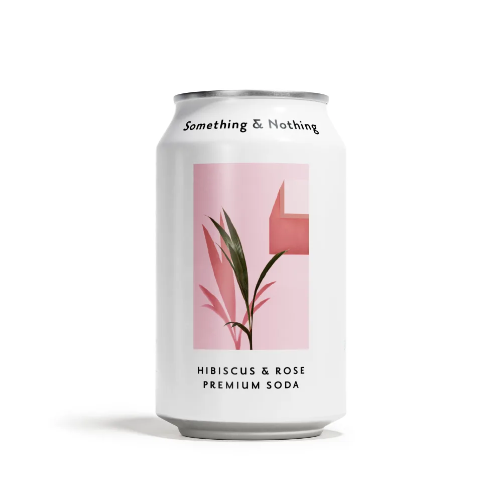
Something & Nothing Premium Sodas has mastered this art. Their minimalist, nature-inspired aesthetic immediately signals quality and authenticity. But what exactly happens in the consumer’s mind when they see a sleek can or a vibrant label? Let’s dive into the science and strategy behind beverage branding.
First Impressions: The 7-Second Rule
Research shows that consumers form an opinion about a product within seven seconds. For sodas, the packaging is often the first—and only—touchpoint before purchase. Colors, shapes, and fonts all work together to create an instant emotional response. A bright, eye-catching design can trigger curiosity, while muted tones suggest sophistication and natural ingredients.
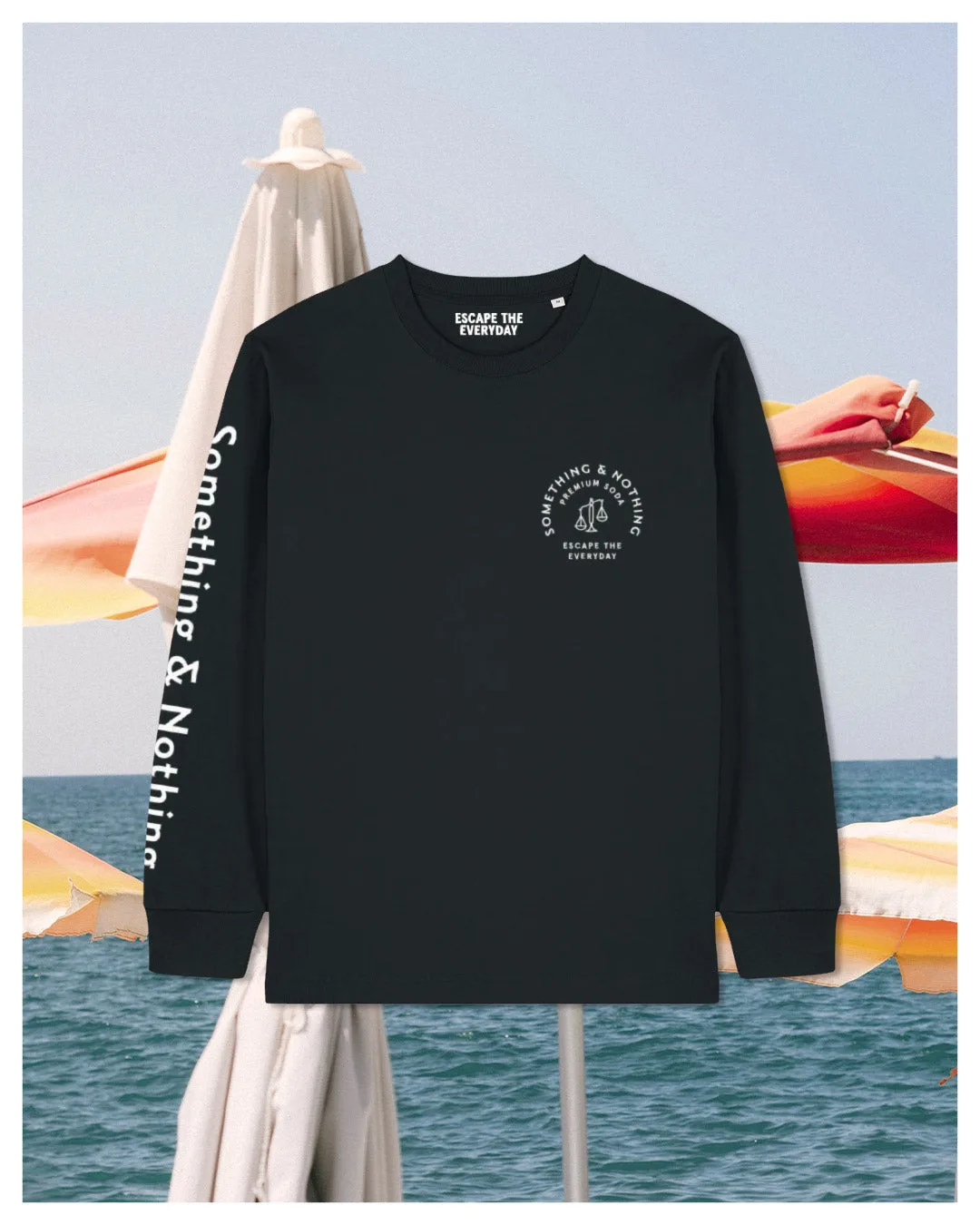
Brands like Something & Nothing use clean lines and soft pastels to evoke calmness and premium quality. Their Pink Tee, for example, uses a soft blush hue that feels approachable yet upscale, appealing to shoppers looking for a treat that feels intentional rather than indulgent.
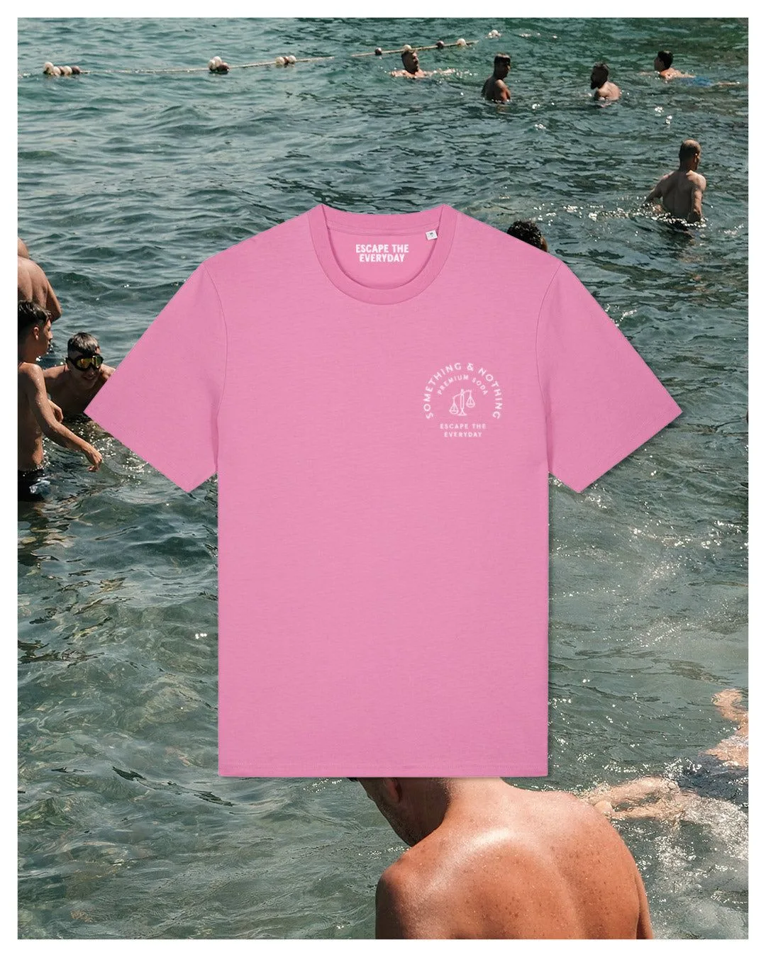
Pink Tee
- Use color to match your brand personality: bright for energy, pastels for elegance, dark for luxury.
Color Psychology in Soda Packaging
Color is the most powerful tool in packaging psychology. Different hues trigger specific emotions and associations. Green suggests health and nature, red evokes excitement, and blue conveys trust. For premium sodas, earthy tones and botanical greens are popular because they align with natural ingredients and wellness trends.
Something & Nothing’s Pineapple & Pink Grapefruit flavor uses a vibrant coral that hints at tropical freshness, while the label’s white space reinforces purity. This combination makes the product stand out on a crowded shelf without feeling loud or artificial.
- Blue and green: trust, health, nature
- Red and orange: excitement, energy
- Pastels: sophistication, calm
- Black and gold: luxury, premium
Typography and Label Storytelling
Fonts communicate personality. Serif fonts feel traditional and trustworthy, while sans-serif fonts are modern and clean. Handwritten or script fonts add a personal, artisanal touch. For premium sodas, the label is where the brand tells its story—ingredients, origin, and values.
Something & Nothing uses a minimalist sans-serif typeface that feels contemporary and unpretentious. The label clearly highlights natural ingredients and low sugar, which appeals to health-conscious buyers. This transparency builds trust and makes the product feel honest.
- Match font style to brand voice: modern, classic, or playful.
- Keep key information (flavor, ingredients) easy to read at a glance.
Shape and Material: The Tactile Experience
The physical feel of a bottle or can influences perceived value. Glass bottles feel heavier and more premium than plastic, while sleek aluminum cans suggest modern convenience. Unique shapes—like fluted bottles or embossed glass—create a memorable tactile experience.
Something & Nothing’s cans are slim and easy to hold, with a matte finish that feels soft and refined. This tactile quality encourages consumers to pick up the product and examine it, increasing the likelihood of purchase. Even the sound of opening a can—a crisp pop—adds to the sensory appeal.
- Consider a matte or textured finish for a premium feel.
- Unique bottle shapes can become a brand signature.
How Packaging Signals Quality and Health
Premium packaging often uses cues like minimalism, natural imagery, and transparent labeling to signal higher quality. Consumers associate clean design with fewer additives and better ingredients. For health-focused sodas, packaging must convey that the drink is a smart choice without feeling medicinal.
Something & Nothing’s labels feature simple fruit illustrations and ingredient lists that are easy to understand. This aligns with the growing demand for clean labels and transparency. The packaging itself becomes a promise: what you see is what you get.
- Avoid clutter—white space signals purity.
- Use real fruit images or simple icons to communicate flavor naturally.
The next time you pick up a premium soda, notice how the packaging makes you feel. From color to typography to texture, every element is carefully designed to influence your choice. Something & Nothing Premium Sodas exemplifies how thoughtful design can elevate a beverage from ordinary to irresistible. Explore their range and see how design meets taste in every can.