When it comes to giving a room a fresh, inviting feel, few things work as well as a soft, neutral paint color. Magnolia's Classic Interior Paint line has earned a loyal following for its smooth application and beautiful finish. Among the standout shades is Quaint Cottage, a warm, creamy off-white that feels both timeless and cozy. In this review, we'll take a close look at the color, performance, and overall value of this popular paint.
Whether you're updating a living room, refreshing a bedroom, or tackling a whole-home makeover, choosing the right paint can make all the difference. We tested Quaint Cottage in several lighting conditions and on different surfaces to give you an honest, detailed assessment. If you're considering this shade for your next project, read on to see if it lives up to the hype.
First Impressions: Color and Undertones
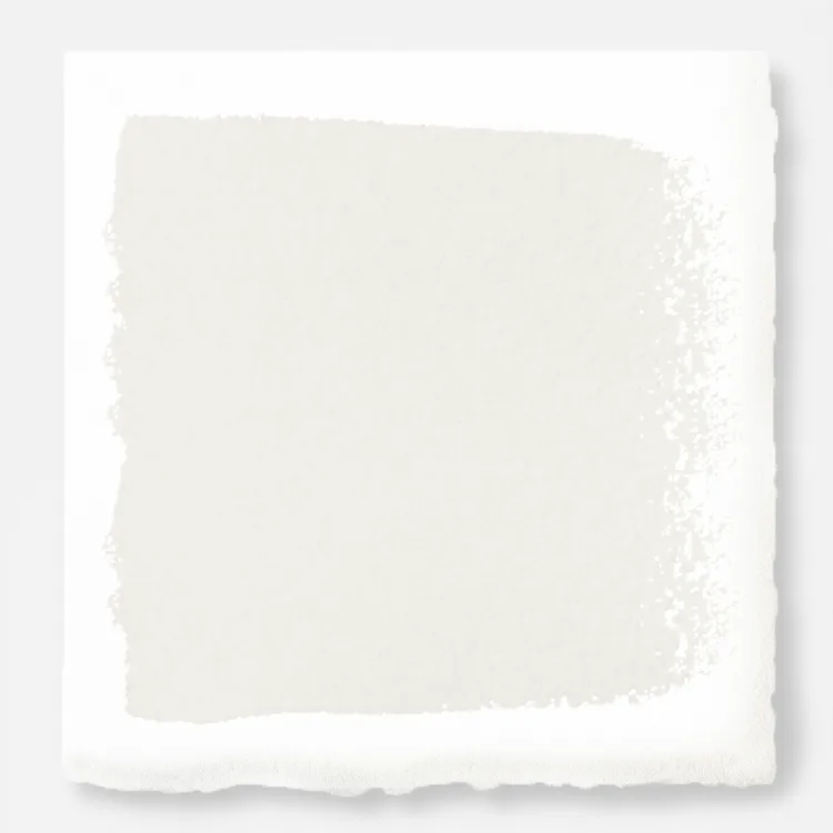
Quaint Cottage is described as a warm off-white with subtle beige undertones. Upon opening the can, the color appears creamy but not yellow—a delicate balance that avoids feeling too stark or too warm. On the wall, it reads as a soft, welcoming neutral that pairs beautifully with natural wood tones, crisp whites, and earthy accents. We tested it in a north-facing room with limited natural light, and the paint still felt bright without looking flat.
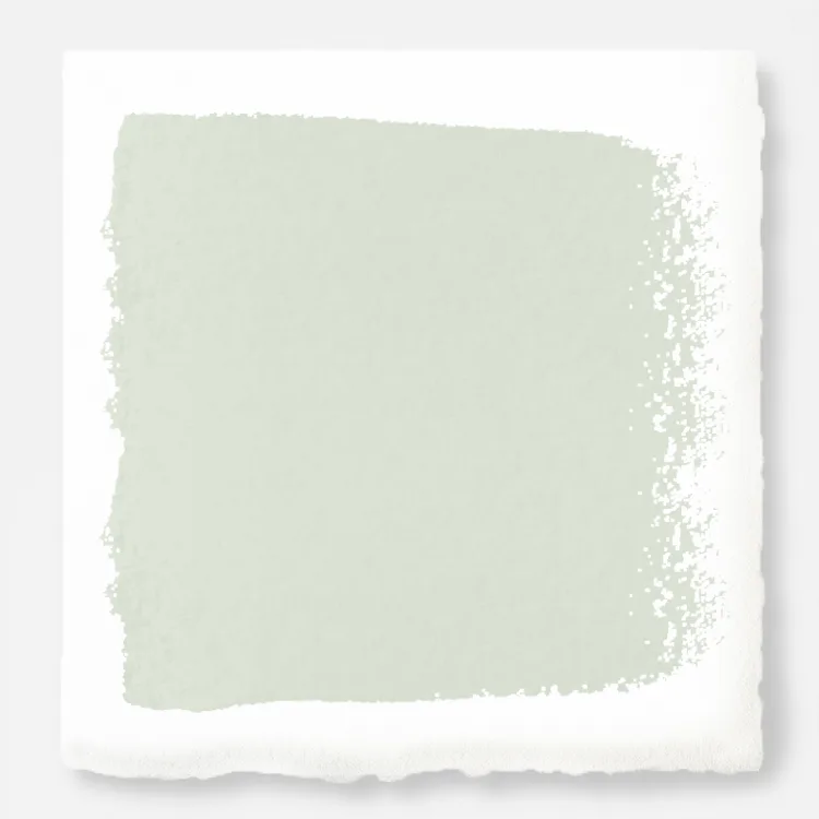
Compared to other popular whites in the Classic Interior Paint line, Quaint Cottage is noticeably warmer than Lemon Leaves - Classic Interior Paint (which has a hint of green) and softer than Regal Leaf - Classic Interior Paint (a deeper sage). If you're looking for a neutral that adds warmth without overpowering, Quaint Cottage is an excellent choice.
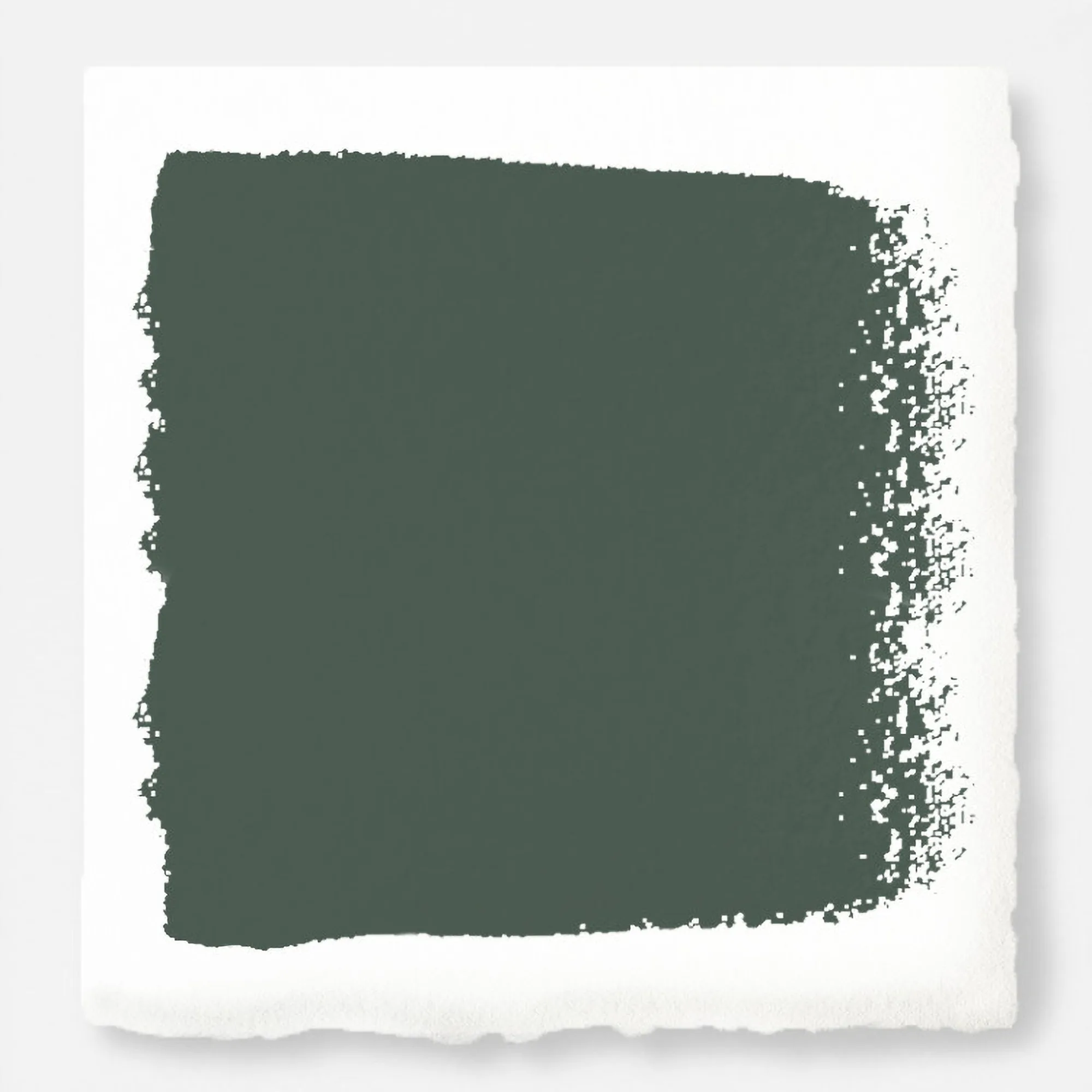
Regal Leaf - Classic Interior Paint
- Warm off-white with subtle beige undertones
- Brightens north-facing rooms without looking cold
- Pairs well with wood, white trim, and earthy decor
Application and Coverage
We applied Quaint Cottage using a high-quality roller and brush on primed drywall. The paint has a smooth, buttery consistency that glides on evenly without excessive dripping. One coat provided good coverage on a light gray primer, but we recommend two coats for a uniform finish—especially if you're painting over a darker color. Drying time was about two hours between coats, and the paint leveled nicely, leaving minimal brush or roller marks.
The finish is a matte sheen that hides minor imperfections well, making it ideal for walls in living rooms, bedrooms, and hallways. For high-traffic areas or spaces prone to moisture, you may want to consider a satin or semi-gloss finish, but for most interior walls, the matte look is both elegant and practical. Cleanup was straightforward with soap and water, and the paint had a low odor, which is a plus for indoor projects.
- Two coats recommended for best coverage
- Matte finish hides wall imperfections
- Low odor and easy water cleanup
Durability and Long-Term Performance
After letting the paint cure for a week, we tested its resistance to scuffs and light cleaning. The matte finish held up well against gentle wiping with a damp cloth—minor marks came off without damaging the paint film. However, like most matte paints, it is not as scrub-resistant as higher-sheen finishes. We recommend using it in low- to moderate-traffic areas for best results.
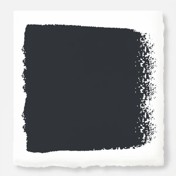
In terms of fading, the paint maintained its color after several weeks of indirect sunlight exposure. No yellowing or chalkiness was observed. If you're pairing Quaint Cottage with other shades from the Classic Interior Paint line, you can expect consistent color quality across the board. For a complementary accent wall, consider the deeper, moodier tones available in the Premium Interior Paint line, such as Weathered Windmill - Premium Interior Paint, which adds a soft gray-blue contrast.
- Good resistance to light scuffs and cleaning
- No fading or yellowing after several weeks
- Best for low- to moderate-traffic rooms
Quaint Cottage vs. Other Popular Whites: A Quick Comparison
To help you decide if Quaint Cottage is the right white for your space, we compared it to two other popular shades in the Classic Interior Paint line. The table below highlights key differences in undertone, brightness, and best use.
- Quaint Cottage: Warm beige undertone, medium brightness, ideal for cozy living rooms and bedrooms.
- Lemon Leaves: Subtle green undertone, light and fresh, great for kitchens and bathrooms.
- Regal Leaf: Sage green, medium depth, perfect for accent walls or nature-inspired spaces.
Final Verdict: Is Quaint Cottage Worth It?
After extensive testing, we can confidently recommend Quaint Cottage Classic Interior Paint for anyone seeking a warm, livable neutral. Its creamy tone adds coziness without feeling heavy, and the paint quality—smooth application, good coverage, and lasting finish—makes it a reliable choice for DIYers and professionals alike. While it may not be the most durable option for high-traffic areas, it excels in spaces where comfort and style are the priority.
If you're still on the fence, consider ordering a sample to test in your own lighting. The color can look slightly different depending on the time of day and room orientation, so a small test patch is always a smart move. For those who love the farmhouse-meets-cottage aesthetic, Quaint Cottage is a shade you'll enjoy living with for years to come.
Ready to bring the cozy charm of Quaint Cottage into your home? Explore the full Classic Interior Paint collection and find your perfect shade today. For a complete room refresh, pair it with complementary decor from our store—like the Gingham Swivel Plug-In Sconce for a touch of cottage lighting that ties the look together.