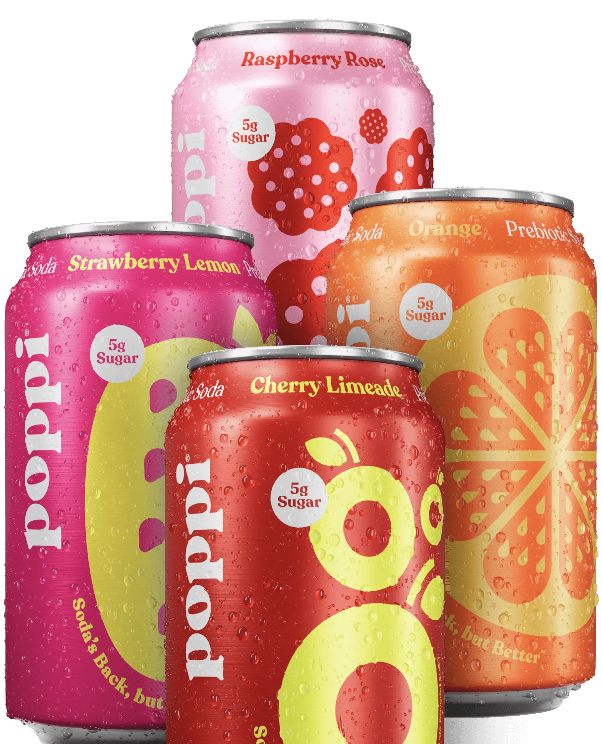
In the crowded world of beverages, a soda's label is often the first point of contact between the product and the consumer. With hundreds of options lining store shelves, the visual appeal of a label can be the deciding factor between a purchase and a pass. Soda label design is not just about aesthetics; it's a strategic tool that communicates brand identity, flavor expectations, and quality promises in a split second.
For e-commerce platforms like Poppi, understanding what attracts buyers through packaging art is crucial. Whether you're a small-batch craft soda maker or a large distributor, the right label can elevate your product from a commodity to a coveted item. This article explores the key elements of effective soda label design, from color psychology to typography, and how they influence buyer behavior.
The Psychology of Color in Soda Label Design
Color is one of the most powerful tools in packaging art. It evokes emotions, sets expectations, and can even influence taste perception. For soda labels, bright and vibrant colors often signal fruity or sweet flavors, while darker tones suggest richness or complexity. For example, a deep amber hue might hint at a caramel-based soda, while a pastel pink could promise a delicate floral note.
Research shows that consumers make subconscious judgments about a product within 90 seconds of seeing it, and up to 90% of that assessment is based on color alone. For a brand like Poppi, using consistent color schemes across their product line—such as the bold reds and oranges in their Fun Favorites range—helps build brand recognition and trust. When designing a label, consider the emotional response you want to trigger: excitement, nostalgia, or refreshment.
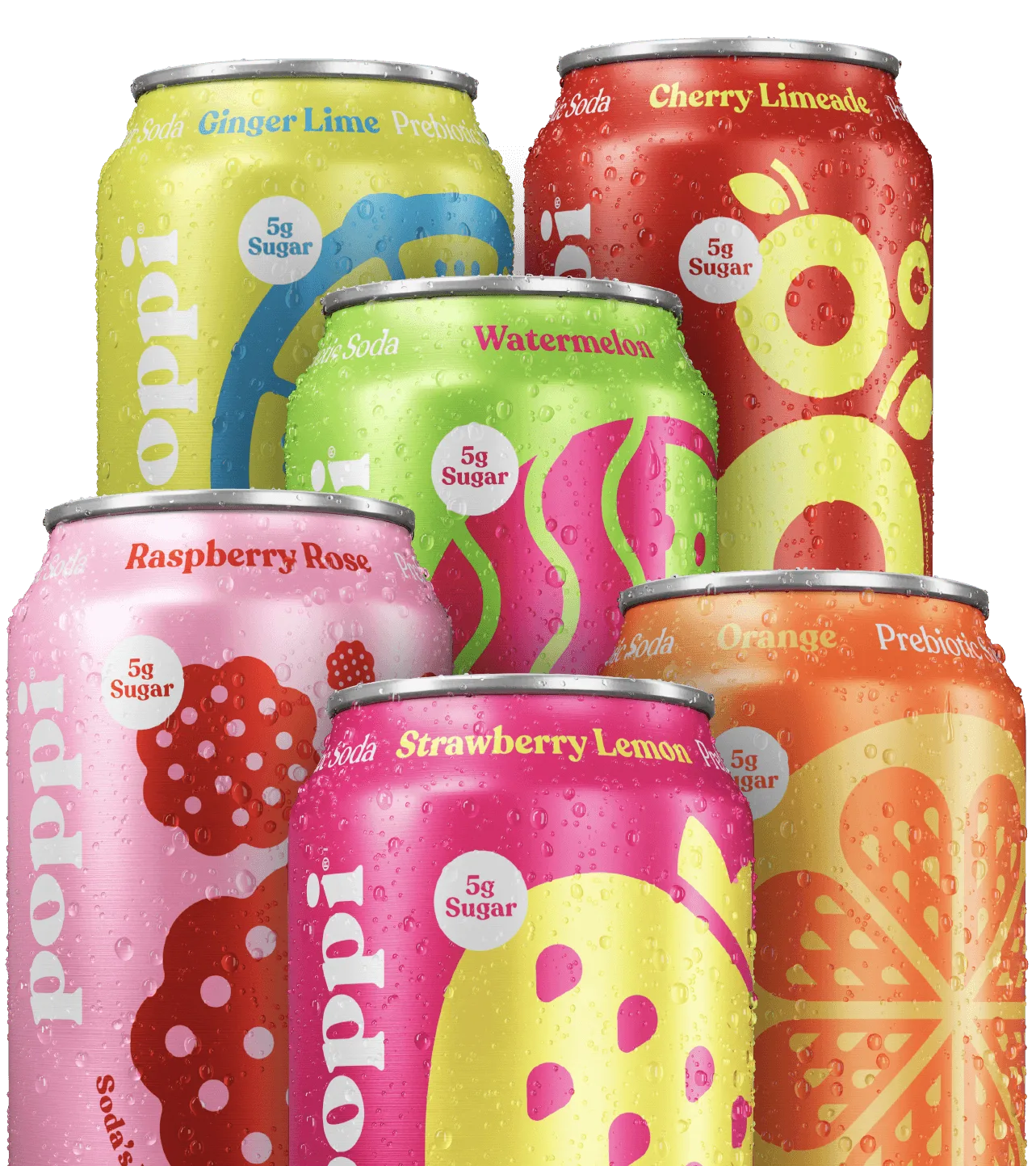
Fun Favorites
- Use warm colors (red, orange, yellow) for energy and appetite stimulation.
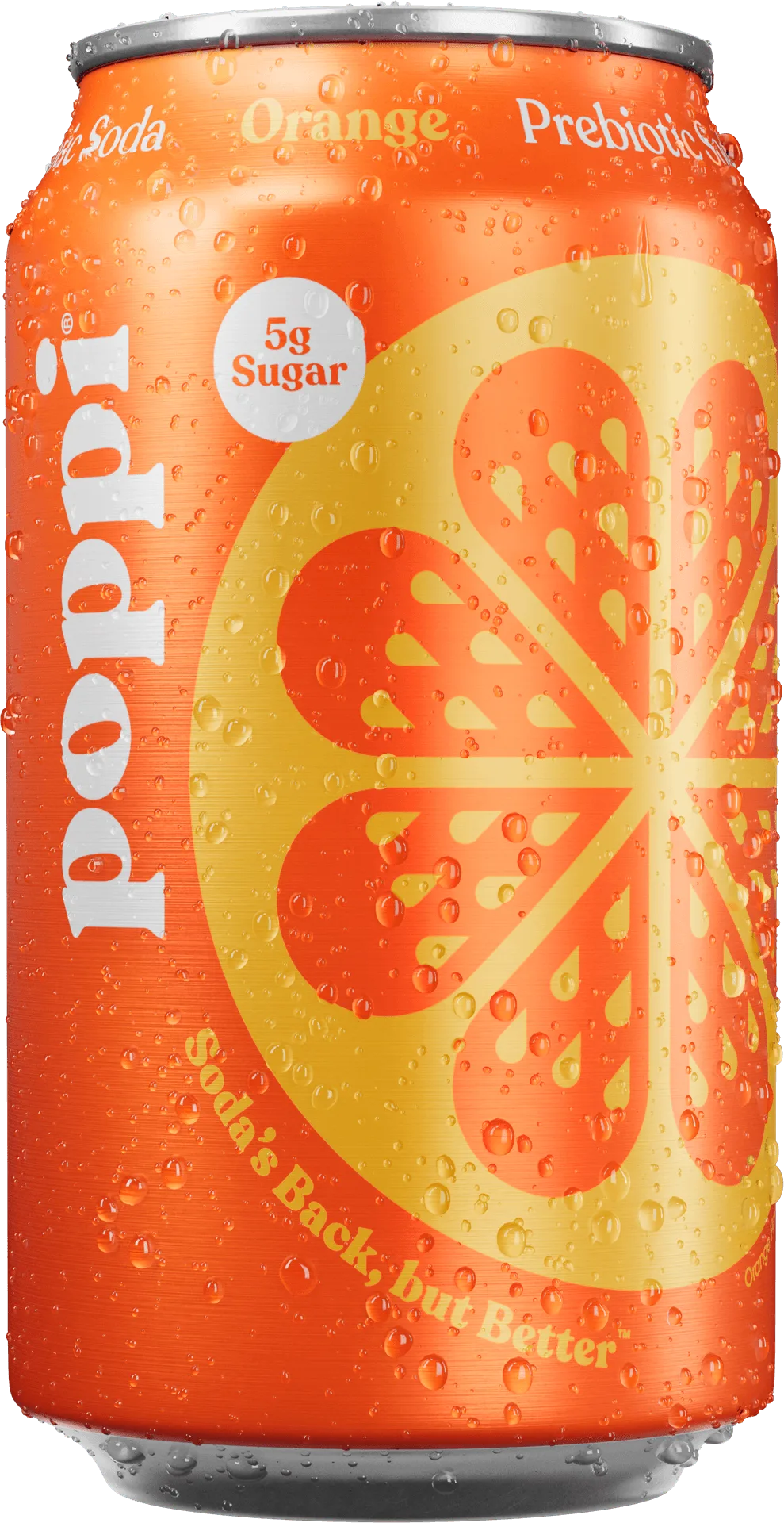
orange
- Cool colors (blue, green, purple) convey calmness and natural ingredients.
- Limited palettes (2-3 colors) often look more premium and focused.
Typography: The Voice of Your Soda Brand
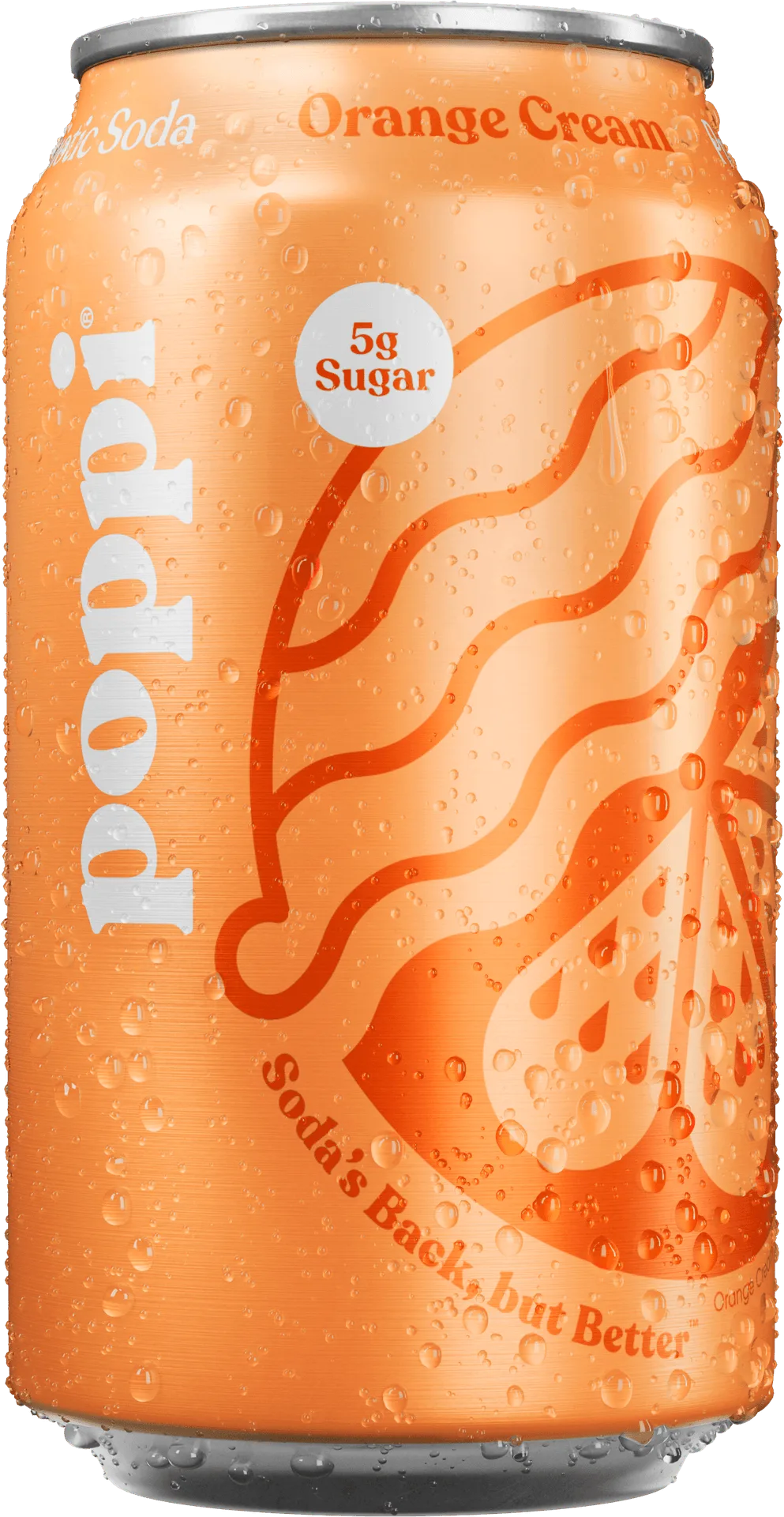
The font choice on a soda label is like the voice of the brand. A playful, hand-drawn script can suggest artisanal quality and fun, while a clean sans-serif font implies modernity and simplicity. Typography must be legible from a distance, especially on a shelf crowded with competitors. The name of the flavor, such as Orange Cream, should be instantly readable to guide quick purchasing decisions.
Beyond legibility, typography helps convey the soda's personality. For instance, a retro-inspired serif font might evoke nostalgia for classic sodas, while a bold, geometric typeface can signal a contemporary or health-focused product. Brands like Poppi use distinct typography to differentiate their product lines—the Short List collection often employs minimalist, elegant fonts to appeal to discerning buyers looking for curated flavors.
- Ensure the flavor name is the most prominent text on the label.
- Avoid overly decorative fonts that compromise readability.
- Match font style to brand identity: playful, premium, or nostalgic.
Imagery and Graphics: Telling a Story Without Words
Images on a soda label can instantly communicate flavor, origin, or lifestyle. A label featuring fresh fruit illustrations, like those on Raspberry Rose, immediately signals a natural, fruity taste. Conversely, abstract patterns or geometric shapes might suggest a modern, experimental soda. The key is to align imagery with consumer expectations—if the label shows a citrus fruit, the soda better taste like citrus.
Graphics also help differentiate product lines within a brand. For example, Poppi's Wild Berry label might use vibrant berry illustrations to attract younger audiences, while their Root Beer label could feature vintage-inspired graphics to appeal to traditionalists. Effective packaging art creates a visual story that invites the buyer to imagine the drinking experience.
- Use high-quality illustrations or photography that match the flavor.
- Avoid cluttered designs; white space can make key elements pop.
- Consider cultural symbolism—certain colors or images may have different meanings globally.
Materials and Finishes: The Tactile Experience
The physical feel of a soda label also contributes to buyer attraction. Matte finishes often convey a premium, eco-friendly vibe, while glossy labels suggest brightness and energy. Textured paper or embossed elements can add a tactile dimension that makes the product feel special. For e-commerce, where customers can't touch the product, close-up photography of the label texture can help convey quality.
Sustainability is increasingly important to consumers. Labels made from recycled materials or with plant-based inks can be a selling point. Poppi's commitment to quality extends to their packaging choices—using materials that feel good in hand while being environmentally conscious. The label's durability is also crucial; it must withstand refrigeration and handling without peeling or fading.
- Matte finishes suggest luxury and eco-friendliness.
- Glossy finishes enhance color vibrancy and shelf presence.
- Consider adding a UV spot coating to highlight key elements like the logo.
Soda label design is a blend of art and science, where every color, font, and image works together to attract buyers and communicate brand values. By understanding the psychology behind visual appeal, brands can create labels that not only stand out on the shelf but also build lasting connections with consumers. Whether you're drawn to the playful energy of Fun Favorites or the refined elegance of the Short List, Poppi offers a range of beautifully designed sodas that prove great packaging is just the beginning of a delicious experience.