Quick answer
Treat your neutral watch as the anchor tone, not an afterthought: pick one beige reference point like Neutral Territory, then match your strap, metals, and clothing to that single tone so the whole look reads deliberate instead of washed out.
Why one reference tone beats a drawer of similar beiges
Neutral watch styling falls apart when every piece is a slightly different beige. A sandy beige with subtle red undertones behaves differently next to cool gray, stark white, or yellow-based tan, and the eye notices the mismatch before it notices the watch. Choosing one reference tone and holding the rest of the outfit to it keeps the palette coherent.
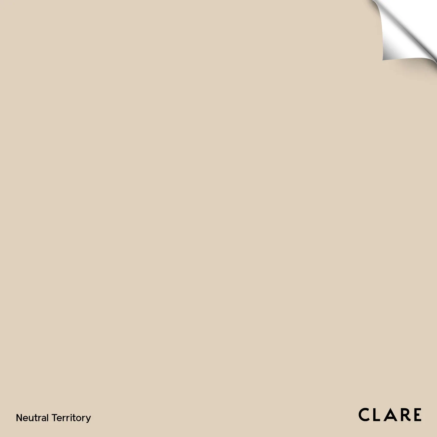
That is the logic behind Neutral Territory: it is lighter than Turbinado, deeper than No Filter, and carries subtle red undertones. Those undertones are the useful part. They warm up a neutral outfit without pushing it into orange, which is why the tone works as a styling anchor rather than just a color.
Where a neutral watch helps and where it disappears
A neutral watch is at its strongest in low-contrast outfits: oatmeal knitwear, stone chinos, ecru shirting, taupe suiting. In those combinations it blends into the look and lets texture do the talking. The trade-off is that against a very similar beige it can vanish entirely, so you need one deliberate point of contrast, usually a darker strap, a metal case, or a deeper trouser.
It is weakest as the only neutral in a high-contrast outfit. If you are wearing black tailoring with a white shirt, a beige watch reads as an accessory rather than part of the palette, which is fine but a different effect. Decide which of the two you want before you start building the outfit.
The workwear exception
Office dress codes often push people toward navy, charcoal, and black, and a warm sandy beige can feel out of place there. It does not have to be. The trick is to keep the watch as the only warm element and let the rest of the outfit stay cool and tailored, so the beige becomes a deliberate accent instead of a competing neutral.
If your workplace is strictly formal, a neutral watch with subtle red undertones is more versatile than it looks, but check it against your actual jacket and shirt in daylight rather than under office lighting, which flattens warm tones.
Steps to build a neutral watch look
- Choose your reference tone first: Pick one beige to anchor the outfit, such as Neutral Territory, and hold it next to your watch strap in daylight. If the strap reads cooler or grayer than the reference, it will look mismatched on the wrist. Check the match in daylight, not under warm indoor bulbs.
- Match the strap to the undertone, not the shade: A warm sandy beige with red undertones sits best with tan, honey, and warm brown leather. Cool gray or black straps will fight it. If you want contrast, choose a darker brown rather than a cooler tone. Undertone mismatch is more visible than a slight shade difference.
- Build the outfit in one temperature: Keep clothing in the same warm or cool family as the watch. Cream, oatmeal, camel, and stone support a warm beige watch; icy gray and optic white will make it look yellow by comparison. Lay the outfit out together before committing to it.
- Add one point of contrast: Because a neutral watch blends in, give it something to sit against: a darker trouser, a metal case, or a textured knit. Without that contrast the watch disappears into a monochrome outfit. If the whole look is one flat beige, add texture before adding color.
- Adapt the same palette for workwear: For office settings, keep the suit cool and tailored and let the watch be the only warm element. Test it against your actual jacket and shirt rather than guessing from a photo. Formal outfits need the watch to be the single warm accent.
- Finish with a monochrome check: For an all-neutral outfit, vary texture and depth instead of adding a second beige. Pair a sandy beige watch with a deeper stone or taupe garment so the look has layers rather than one flat tone. Monochrome works when depth varies, not when shades repeat.
Product facts
-
Neutral Territory - Swatch: Sandy beige with subtle red undertones, lighter than Turbinado and deeper than No Filter. The warm undertone pairs naturally with cream, camel, and stone clothing, so it works as the anchor color in a low-contrast neutral outfit.
Neutral Territory - Swatch