Two Italian Cityscapes, Two Different Atmospheres
Choosing between a Venice waterfront scene and a Florence bicycle image is not about picking a better photograph. It is about deciding which atmosphere belongs in your room. Both prints are limited editions of 10 from Dan Kosmayer, but they achieve very different moods through composition, palette, and subject matter.
The Venice print leans into stillness and architectural weight. The Florence print is quieter in scale and invites a more intimate, everyday narrative. Understanding these differences helps you match the print to the wall you actually have.
What Each Print Actually Shows
-
Italy Veneto Venice Giudecca Waterfront Architecture Morning Scene Urban Black And White Wall Art | Limited Edition of 10: The Venice photograph captures a stretch of the Giudecca Canal with waterfront façades, a vaporetto, and an overcast sky. It is a black-and-white image that emphasizes architectural geometry, tiled roofs, arched windows, and layered tree silhouettes. The monochrome palette and wide horizontal composition make this print feel grounded and contemplative. It works best where you want a calm, European atmosphere without busy color.
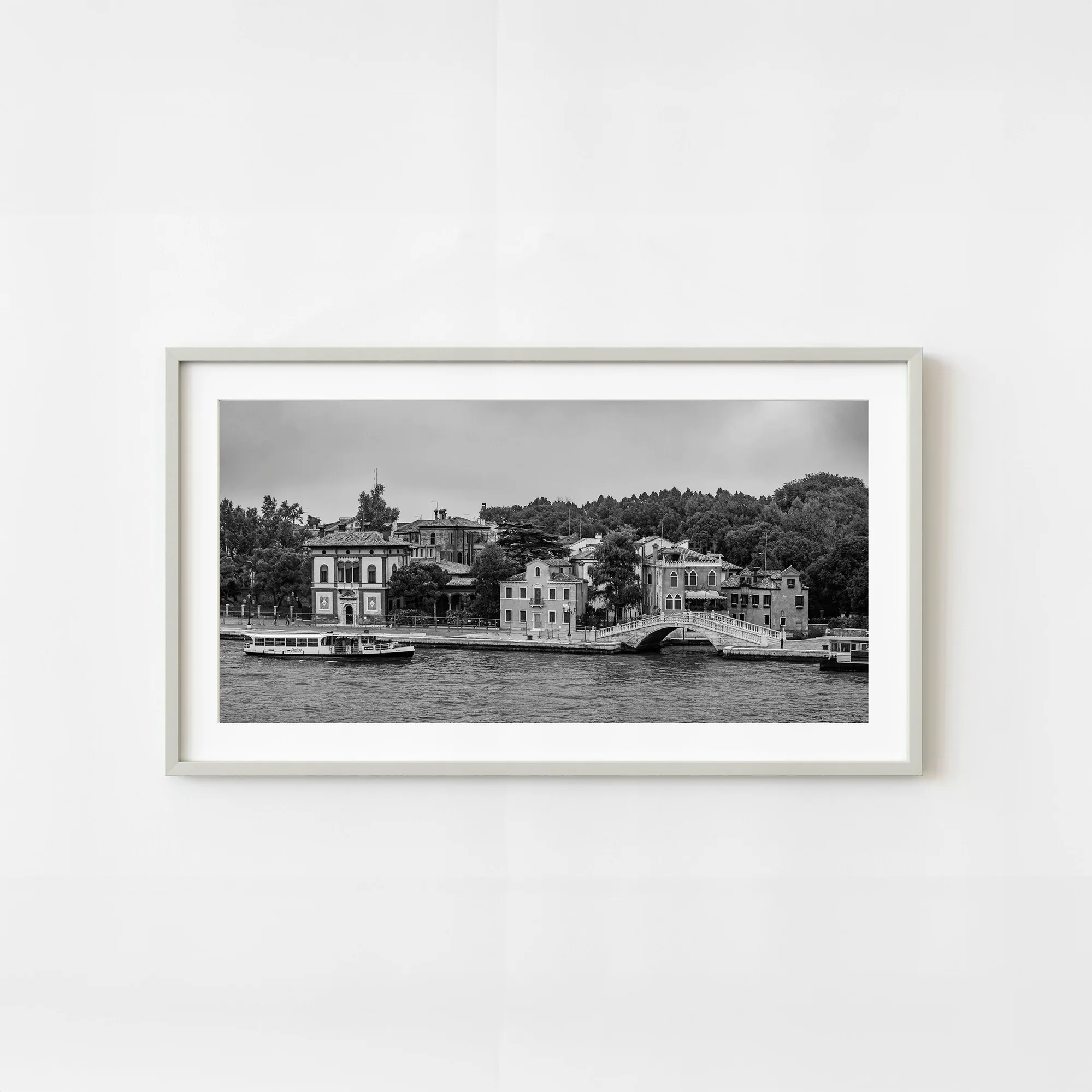
Italy Veneto Venice Giudecca Waterfront Architecture Morning Scene Urban Black And White Wall Art | Limited Edition of 10
-
Florence Wall and Bicycle – Timeless Beauty | Limited Edition of 10: The Florence print shows a classic bicycle resting against an aged wall. It is printed on acid-free 100% cotton paper with deep blacks and vibrant colors. The composition highlights the texture of the wall and the bicycle's sleek lines. This is a smaller, square composition that draws the eye inward. The color detail and storytelling feel make it suitable for a cozy reading corner or a hallway where you want a subtle conversation starter.
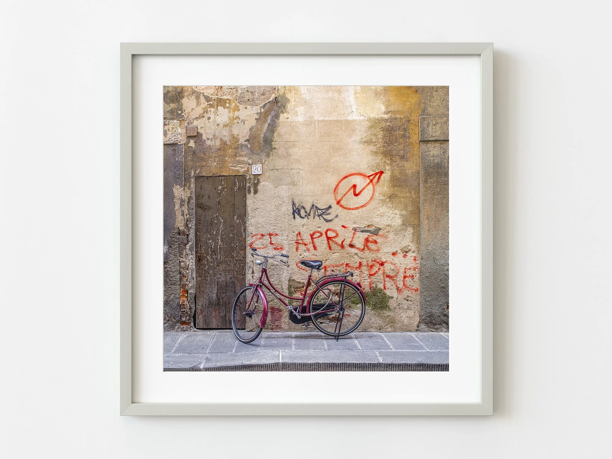
Florence Wall and Bicycle – Timeless Beauty | Limited Edition of 10
Venice vs Florence: Key Differences at a Glance
Both prints are limited editions of 10, hand-signed, and come with a certificate of authenticity. But their visual jobs are different.
- Composition and shape: Venice: horizontal panorama (e.g., 8×16 to 20×40 inches). Florence: square (10×10 to 30×30 inches). The Venice print stretches across a wall; the Florence print fits a tighter space.
- Mood and color: Venice: black-and-white, muted, architectural. Florence: color, warm, textured. The Venice print anchors a room with stillness; the Florence print adds a touch of charm and elegance.
- Placement: Venice works above a sofa, console, or desk where the horizontal line echoes furniture. Florence suits a small wall, a shelf, or a grouping with other small art.
- Framing: Neither print includes a frame. The Venice print benefits from a simple black or white frame that respects the monochrome palette. The Florence print can take a natural wood or dark frame that complements the aged wall texture.
Which One Belongs in Your Room?
Start with the wall you are filling. If you have a long, empty wall above a piece of furniture, the Venice waterfront print gives you a clean horizontal line and a sense of depth. The black-and-white palette makes it easy to integrate with existing decor without clashing.
If you are decorating a smaller nook, a hallway, or a space that already has color, the Florence bicycle print offers a quieter focal point. The square format lets you pair it with other prints or hang it alone without overwhelming the area.
Both prints are limited editions of 10, so availability is a real constraint. The Venice print is priced at USD 141.29, while the Florence print is USD 56.09. The choice comes down to the atmosphere you want—old-world stillness or everyday Italian charm.