The saturation slider is not a color fix
The most persistent myth in nature photography is that dull colors are an editing problem. In practice, the files that need the least color work are the ones captured with the right light, white balance, and exposure in the first place. Pushing saturation after the fact amplifies whatever color information is already in the file, including noise and color casts.
That does not mean editing is wrong. It means the order matters: get the capture close, then refine. A useful test is to open a raw file and ask whether the color problem is global (everything looks flat) or local (one hue is off). Global flatness usually points back to light and white balance; a single off hue is an editing decision.
Five color claims worth testing against your own files
These are common claims, not rules. Judge each one against your own raw files rather than against edited JPEGs.
- Myth: Saturation and vibrance do the same thing: They overlap, but they are not interchangeable. Saturation pushes all colors; vibrance is typically designed to favor less-saturated colors. The practical consequence is that heavy saturation can clip already-strong colors first, while vibrance can leave a dominant hue untouched. Test both on the same file and watch which colors move.
- Myth: Auto white balance is good enough for vivid color: Auto white balance is a convenience, not a color decision. It can neutralize a warm sunrise or a cool shadow in ways that remove the mood you saw. Setting white balance deliberately, or correcting it in raw, gives you a consistent starting point across a sequence.
- Myth: A dull camera file means the camera is bad: A flat-looking raw file is often a sign of conservative in-camera processing, not a sensor limitation. Raw files are intended to be interpreted. The more useful question is whether the color information is present and clean enough to shape.
- Myth: A polarizer is only for skies: A polarizer changes how reflections and haze are recorded, which can affect color saturation in foliage and water. The effect depends on the angle of the light and the subject, so it is not a universal color boost. Rotate and check the result rather than leaving it fixed.
- Myth: More color always means more impact: Oversaturation flattens separation between hues and can make greens and reds look artificial. Impact usually comes from contrast and color relationships, not from maximum chroma. Editing color without oversaturation means protecting the brightest and most saturated areas first.
Why colors look dull in camera, and what to check first
Before changing any setting, compare what you saw with what the camera recorded. Three checks cover most cases: was the light actually colorful, was the exposure clipping the brightest channel, and was white balance fighting the scene? A washed-out sky at midday is not a camera fault; it is a light problem.
If the file looks flat but the histogram is healthy, the issue is usually interpretation rather than data. That is the point where a structured in-camera workflow helps more than another slider.
A course built around the capture side of color
-
Vibrant Colors in Nature Photography: Vibrant Colors in Nature Photography focuses on in-camera workflow along with light and colors, helping nature photographers approach color from the moment of capture. That framing matches the main finding here: most color problems are decided before editing, so a capture-first approach is the relevant skill to build.
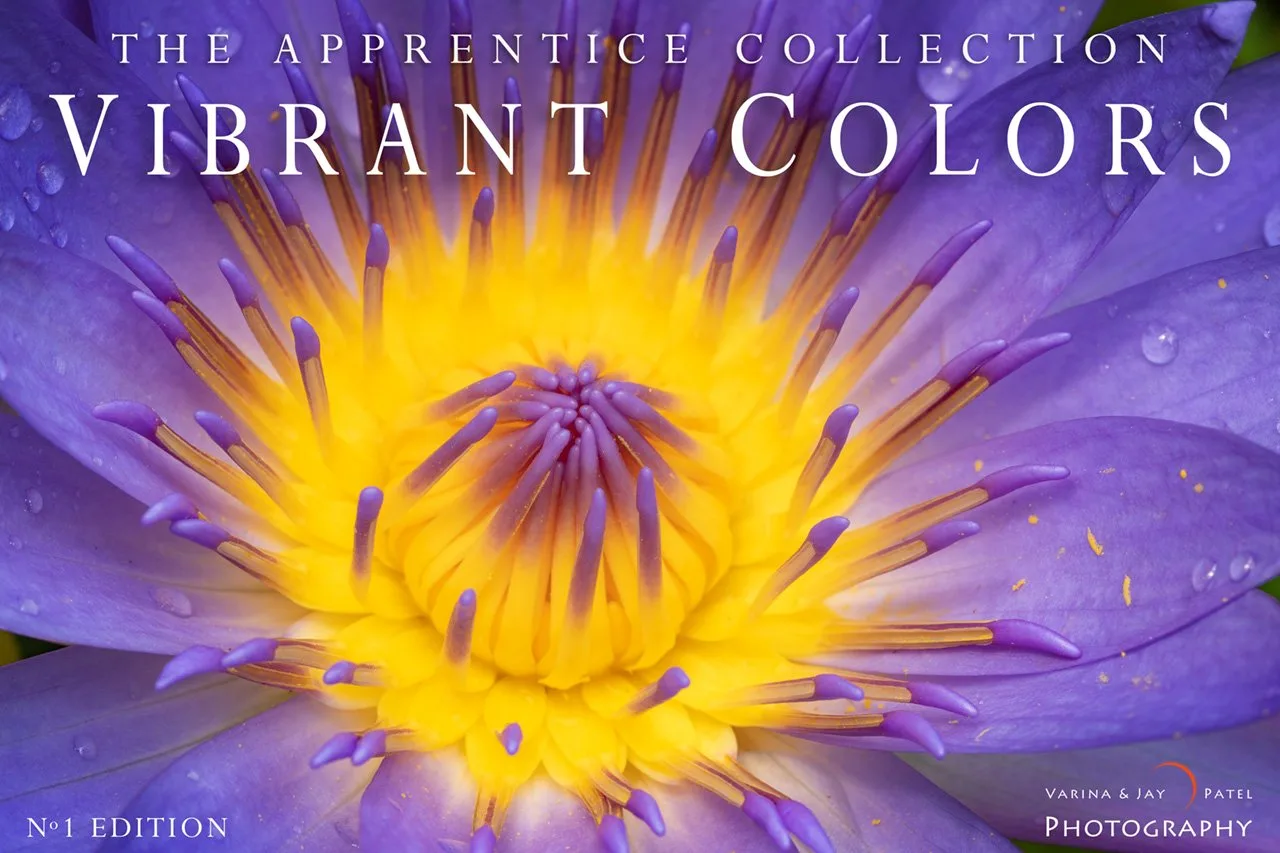
Vibrant Colors in Nature Photography
-
Vibrant Colors in Nature Photography: The course covers camera settings, gear, and creative decisions for capturing rich, vibrant colors in nature. It addresses the settings-and-gear side of the myths above rather than promising a preset or a single slider fix.
Editing color without oversaturation: a working order
Start with white balance and exposure, because both change how every color reads. Then decide whether the problem is global or local. For global flatness, a modest vibrance adjustment is usually easier to control than a saturation push. For a single hue, target that hue rather than the whole image.
Check the brightest saturated areas as you work. Oversaturation often shows up first as clipped color detail, not as an obviously wrong hue. If you cannot recover separation in a flower petal or a sunlit leaf, you have gone too far for that file.
What the evidence does not settle
The supplied course information does not specify camera brands, file formats, or exact white balance procedures, so treat those as decisions to make for your own gear rather than fixed instructions. Likewise, no polarizer brand or setting is recommended here; the useful test is your own comparison of rotated versus unrotated frames in the same light.
The honest trade-off is time. Learning to judge color at capture takes deliberate practice, while slider-based fixes are faster but less consistent across a shoot. The myth worth retiring is that one is a substitute for the other.