Quick answer
Your swatch is not wrong. A paint swatch looks different on the wall because light, surface texture, and the size of the sample change how color reads. Before you reorder paint, tape the swatch to the actual wall, view it at three times of day, and compare it against the trim and floor. If it still reads wrong after that, switch colors rather than repaint the same shade.
shade
Why the same color reads two ways
A swatch is a small, flat, portable sample. A wall is large, vertical, and lit differently from the surface you held the swatch against. Light bounces off the wall at a different angle, and nearby objects cast color onto it. That is why a shade can look warm in your hand and cool once it covers a full wall.
Paint also changes with sheen. A flat finish scatters light and softens color; a glossier finish reflects more and can make the same shade look deeper or brighter. If you are comparing a swatch to a painted wall, check that the finish matches before you blame the color.
Check lighting before you change anything
Lighting effect on paint swatches is the most common cause of a mismatch. North-facing rooms receive cooler, bluer light all day. South-facing rooms get warm, yellow light that intensifies in the afternoon. Incandescent bulbs pull colors warm; many LEDs pull them cool or green.
View the swatch at three points: morning, midday, and evening with the lamps you actually use. If the color only looks wrong under one condition, you have a lighting problem, not a paint problem. Add a warmer bulb or move the lamp before you repaint.
Test the swatch the way the wall will be seen
Do not judge a color from a swatch held in your hand at the store. Tape it to the wall at eye level, then look at it from the doorway and from across the room. Color reads differently at scale, and a shade that feels calm on a 3-inch square can feel heavy across a whole wall.
Paint a large sample if you can. A swatch gives you the hue; a painted patch gives you the hue plus the surface and sheen. If you are not ready to paint, at least move the swatch to the wall and leave it there for a full day.
Separate undertone problems from lighting problems
Paint undertones explained simply: every color carries a secondary hue that shows up under certain light. A green with a gray undertone can look muddy in a dim room; a blue with a violet undertone can look purple under warm bulbs. If the swatch looks like a different color family on the wall, that is an undertone issue, not just brightness.
Compare the swatch to your fixed elements: flooring, countertops, and trim. If the swatch clashes with those, no amount of lighting adjustment will fix it. If it harmonizes with them but shifts under one lamp, adjust the light.
Diagnose the mismatch in four steps
- Symptom: the swatch looks warmer or cooler on the wall: This is almost always lighting. Check the room's orientation and the bulbs in use. North light cools colors; south and incandescent light warm them. If the shift disappears under daylight, keep the color and change the bulb.
- Symptom: the swatch looks like a different color family: This points to undertones reacting with your fixed surfaces. Compare the swatch to flooring and trim, not to the white of the swatch card. If it clashes with fixed surfaces, choose a different color rather than repainting the same one.
- Symptom: the swatch looks fine small but heavy or flat on the wall: This is a scale and sheen issue. A full wall amplifies a color, and a glossier finish deepens it. Test a larger painted patch in the intended finish. If the large patch still feels wrong, adjust the finish or move to a lighter shade.
- When to stop testing and choose another color: If you have checked lighting, compared undertones to fixed surfaces, and tested a large patch in the right finish, and the color still reads wrong, the color is wrong for that room. Stop repainting the same shade. Pick a new color and repeat the wall test once.
Clare products that help you test before you commit
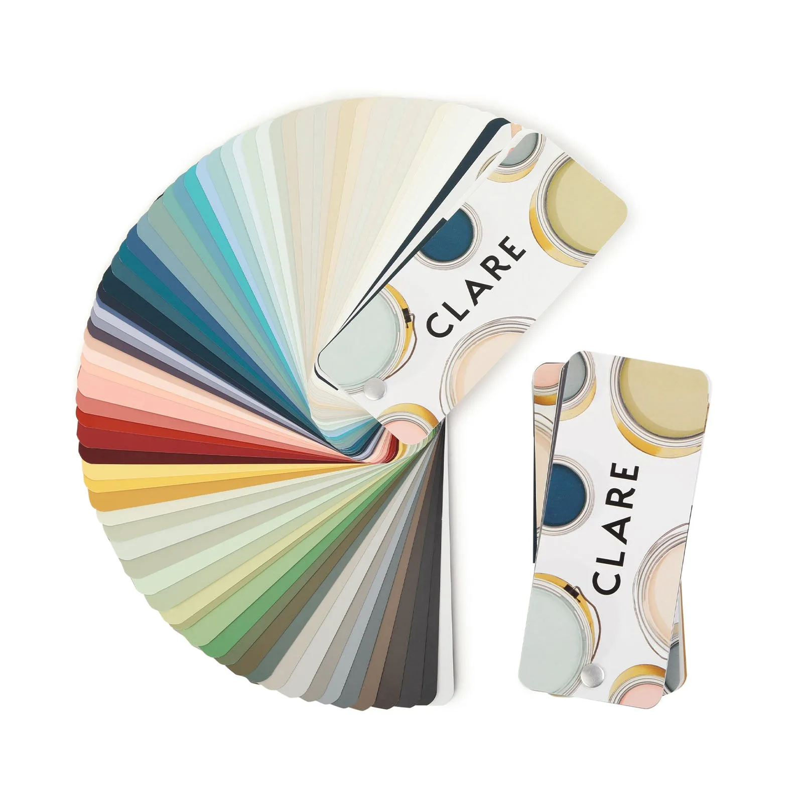
- Clare Color Fan Deck: The Clare Color Fan Deck samples the entire palette of fewer, better, designer-curated colors in one place, and contains colors through the Summer 2023 launch. Use it to compare undertones side by side before you tape a single swatch to the wall, so you can rule out a color family that will not work in your light.
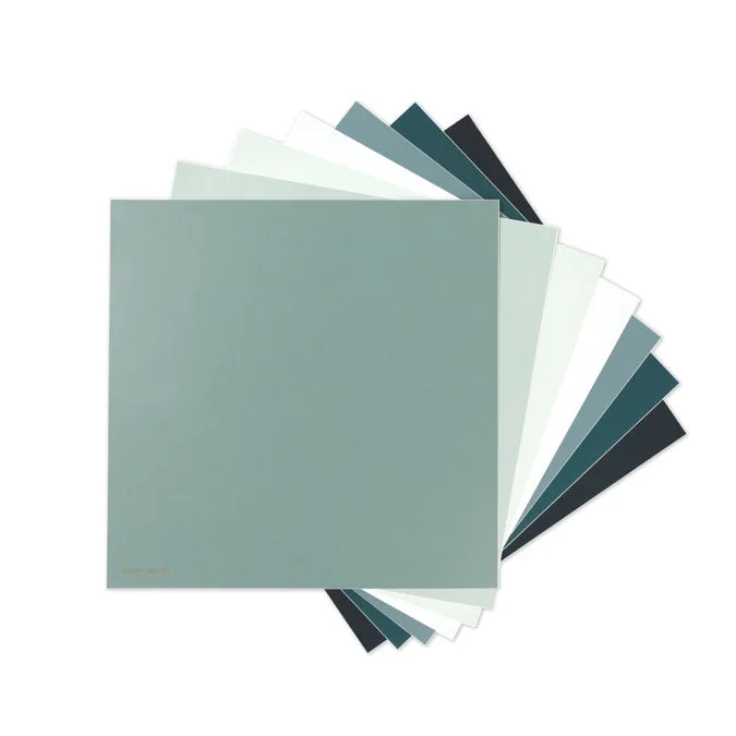
- Best of the Blues Swatch Kit: The Best of the Blues Swatch Kit includes seven blues: Headspace, Goodnight Moon, Frozen, Make Waves, Views, Good Jeans, and Deep Dive. Blues are the shades most likely to shift between cool and warm light, so a bundle lets you test several undertones on your actual wall instead of guessing from one square.