Quick answer
A custom card proof is a reference, not a replica. Your screen glows, while letterpress ink sits on textured cotton paper and looks darker, softer, and slightly uneven. Expect small shifts in color depth and coverage, not a different design. Approve the proof for layout and wording, then judge the actual card in your hand.
The screen is the first source of mismatch
Every device renders color differently. A black letterpress design shown on a phone can look flat gray on one screen and deep charcoal on another. The proof is usually a digital file, so it inherits those screen settings. When the same design is printed with black ink on ecru cotton paper, the paper's warm tone changes how the black reads. It can look softer or slightly brownish next to the bright white of a monitor.
This is normal for custom card printing. The proof confirms spelling, spacing, and image placement. It is not a color-managed sample of the final ink on the final paper.
Letterpress ink coverage is physical, not pixel-perfect
Letterpress printing presses ink into paper rather than laying it on top. On cotton paper, that pressure creates a slight texture and occasional variation in ink coverage, especially in large solid areas or fine lines. A proof made from a clean digital file shows perfectly even edges. The printed card may show tiny shifts in density where the paper fiber absorbs ink differently.
That variation is a sign of the process, not a defect. It also means two cards from the same run can differ slightly. If you need identical color across hundreds of cards, letterpress may not be the right method. If you want character and tactile depth, the variation is part of the value.
Paper color changes what you see
The same black ink looks different on white cotton than on ecru cotton. Ecru has a natural warm cast, so black ink can appear slightly softer or less stark. White cotton keeps contrast higher. If your proof was prepared on a white background and your card uses ecru paper, expect the printed card to feel warmer and less high-contrast. This is not a printing error; it is the paper doing its job.
How to review a proof without over-correcting
Read the proof for wording, line breaks, and punctuation. Check that names, dates, and inside messages are correct. Then look at the overall layout: margins, alignment, and balance. Do not adjust ink color based on a phone screen. If you are unsure, view the proof on two different devices. If both look acceptable in layout, approve it. The final judgment happens when the card arrives.
If you ordered a card with a blank inside, the proof will not show an inside message. That is expected. The blank interior is part of the design, not a missing element.
Proof myths, verdicts, and what to do
- Myth: The proof should match the final print exactly.: A proof is a digital reference. Letterpress ink on cotton paper has physical depth and slight variation that a screen cannot show. Verdict: False. Approve the proof for layout and text, not for exact color.
- Myth: Any color shift means something went wrong.: Black ink on ecru cotton naturally looks warmer and softer than on a white screen. White cotton keeps more contrast. These are paper and process effects, not errors. Verdict: False. Match your expectation to the paper you chose.
- Myth: You should adjust ink color based on the proof.: Screens vary too much to judge ink color reliably. Adjusting based on a phone or laptop can lead to overcorrection. Verdict: False. Judge the printed card in hand, not the proof on screen.
Catalog facts that explain proof-to-print differences
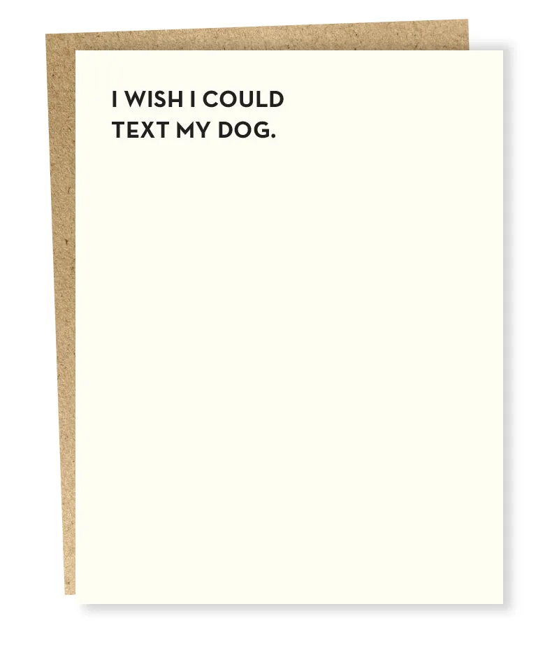
- dog text card: “I wish I could text my dog.” Size: 5.5 x 4.25. Inside message: blank. Paper: ecru cotton. Envelope: brown bag. Printing: letterpress. Ink: black. The ecru cotton paper and black letterpress ink are exactly the combination that makes a digital proof look cooler or more even than the final card. Expect a warmer, slightly textured black.
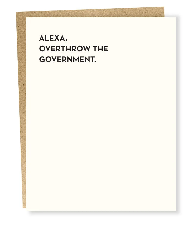
- Alexa card: “Alexa, overthrow the government.” Size: 4.25 x 5.5. Inside message: blank. Printing: letterpress. Paper: ecru cotton. Envelope: brown bag. Ink: black. This card uses the same ecru cotton and black ink, so the same proof-to-print shift applies. The small size also means fine text can look slightly softer in print than on screen.
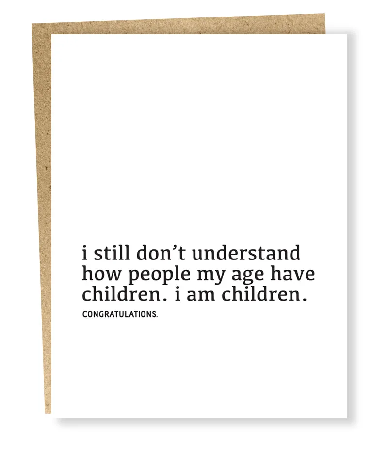
- my age card: “I still don’t understand how people my age have children. I am children. Congratulations.” Size: 5.5 x 4.25. Inside message: blank. Paper: white cotton. Envelope: brown bag. Printing: letterpress. Ink: black. White cotton paper keeps black ink looking sharper and higher-contrast than ecru. If your proof was shown on a white background, this card will match that impression more closely than an ecru version.