Quick Answer
Paint swatch colors differ from wall results because of lighting, surface texture, and the way paint dries. To get the closest match, always test a large sample on your actual wall and view it in different lights.
Lighting Changes Everything
The same paint color can look completely different under warm incandescent light, cool daylight, or soft evening light. A swatch viewed at the store under fluorescent bulbs will not match what you see in your home. Natural light also shifts through the day, so a color that looks perfect at noon may feel darker or cooler at dusk.
To reduce surprises, hold your swatch against the wall in the room where you'll paint, and check it at different times of day. But even this has limits: a small swatch can't replicate the way a full wall reflects light across a larger surface.
Surface Texture and Sheen Matter
Paint swatches are usually printed on smooth paper, while your wall may be textured, porous, or previously painted. Rough surfaces absorb more light, making colors appear darker and less vibrant. Similarly, the sheen of the paint—matte, eggshell, satin, or gloss—affects how light bounces off the wall. A glossy finish reflects more light, which can make a color look lighter and more intense than a matte swatch suggests.
If you're painting over a dark wall, the old color can show through and alter the new shade, even with primer. Always consider the surface you're painting on, not just the swatch.
Paint Dries Differently Than Swatch Ink
Swatches are printed with ink, not paint. The pigments and binders in actual paint can dry to a slightly different shade. Additionally, paint often appears darker and more intense once it's applied to a large area because your eye perceives color differently when it fills your field of view.
This is why even the best swatch can only give you a rough idea. The only way to know for sure is to paint a test patch on your wall and let it dry completely.
Diagnose and Fix Your Paint Color Mismatch
- Symptom: The paint on your wall looks darker, lighter, or a different undertone than the swatch you chose.
- Likely Cause: Lighting differences, wall texture, sheen, or the difference between printed swatch ink and actual paint. Check the room's light at different times of day before you repaint.
- Corrective Action: Paint a large test patch (at least 12x12 inches) on your actual wall, let it dry completely, and observe it in morning, afternoon, and evening light. If the color still isn't right, try a different shade. Always view the test patch at multiple times of day before making a final decision.
- Stop or Choose Another Option: If after testing the color still doesn't match your vision, stop and choose a different shade. Don't paint the whole room hoping it will look better once dry—it rarely does. Trust your eyes: if the test patch doesn't feel right, move on to another color.
Test Colors with Real Paint Swatches
-
Wing It - Swatch: Wing It is a pale, sophisticated barely there pink, inspired by our favorite all-ladies social club that made pink our new favorite neutral. A barely-there pink like this is especially sensitive to lighting and undertones, so testing a real paint swatch on your wall is essential before committing.
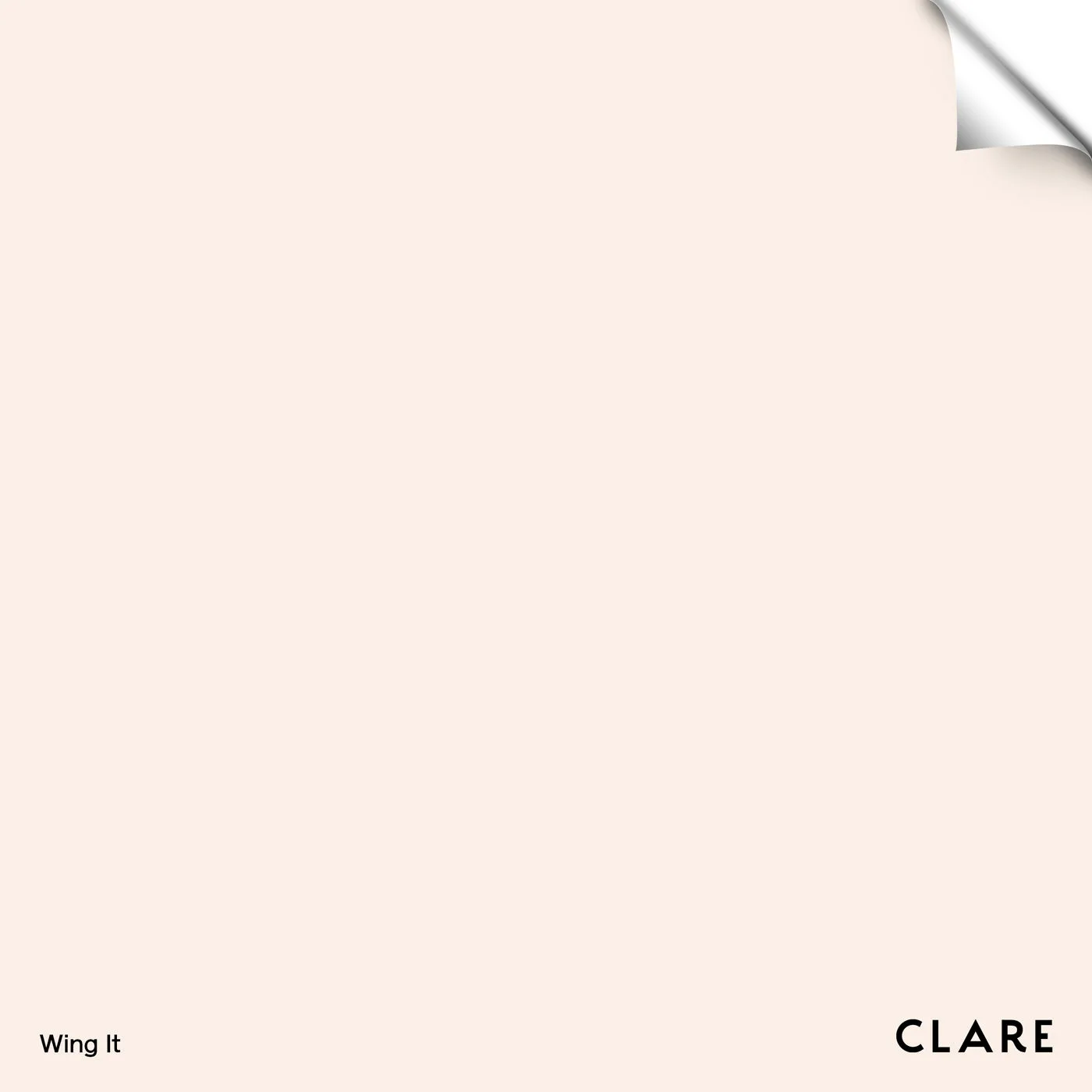
Wing It - Swatch
-
Nairobi Blue - Swatch: Nairobi Blue is a fresh, light blue that reminds us of cool waters, cloudless skies, and a magical red carpet moment that put this heavenly blue hue in the spotlight. Light blues can appear more gray or more green depending on the light in your room, so a swatch helps you see how the undertone behaves in your space.
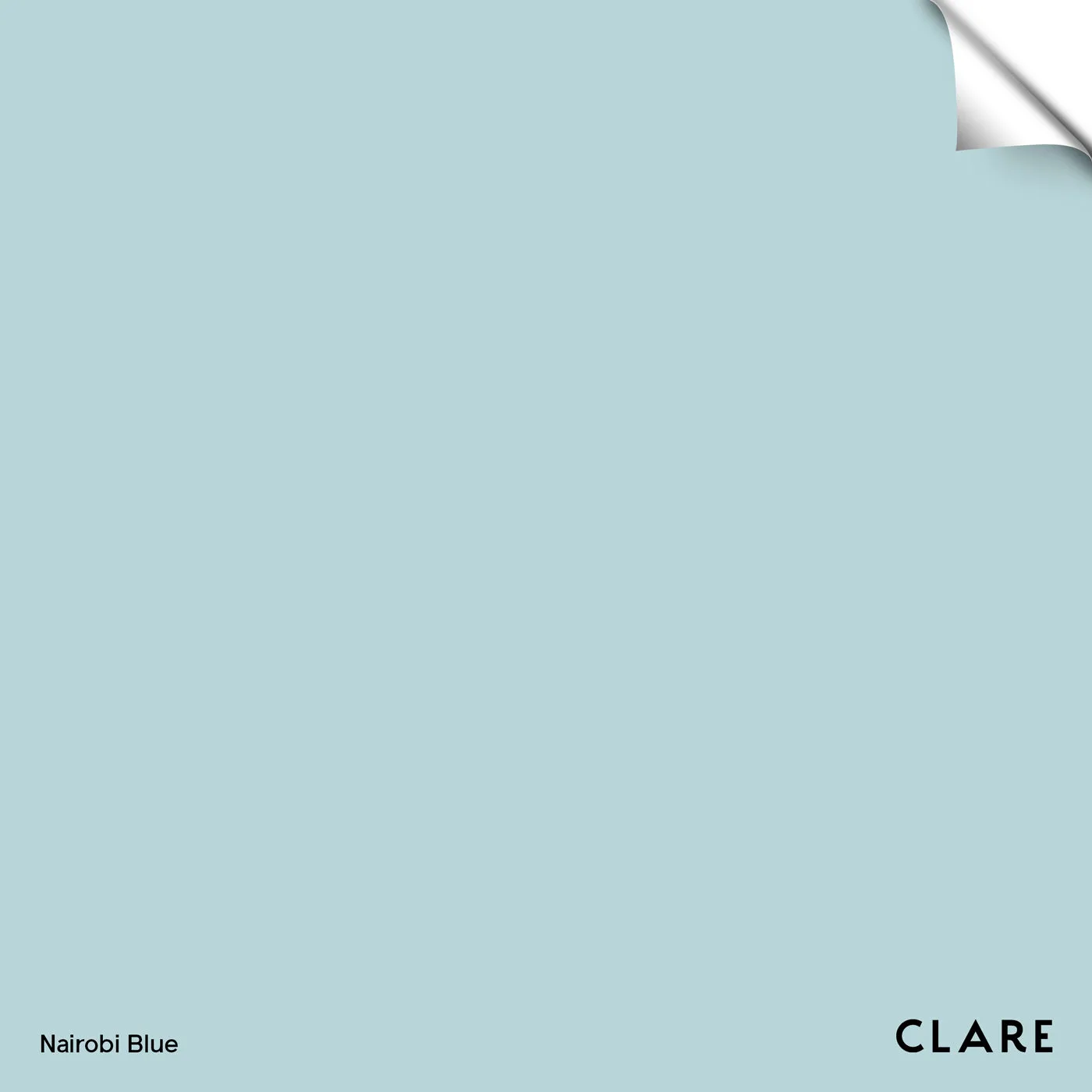
Nairobi Blue - Swatch