Quick answer
Choose a black and white cityscape print when you want to emphasize architectural form and timeless calm. Choose a color cityscape print when you want to capture the energy and warmth of a place. Your room's existing palette and lighting should guide the final decision.
Mood and atmosphere
A black and white cityscape print strips away color to focus on composition, light, and texture. It creates a quiet, timeless feel that works well in minimalist or monochrome rooms. A color cityscape print brings the warmth and vibrancy of a location, making it ideal for spaces that already feel neutral or need a pop of energy.
Practical trade-offs
Black and white prints are more forgiving with existing wall colors and furniture patterns—they rarely clash. Color prints demand more attention to the room's palette: a warm-toned print can fight with cool gray walls, while a cool-toned print might feel flat in a warm room. On the other hand, color prints often draw the eye more quickly and can become a focal point even from across the room.
Trade-offs at a glance
- Black and white cityscape print: Best for rooms with busy patterns or bold furniture colors—the monochrome look won't compete. Also ideal for spaces where you want a calm, gallery-like feel, such as a bedroom or hallway. If your room has warm beige walls or wooden floors, a black and white print can still feel inviting because of the contrast in tones.
- Color cityscape print: Best for rooms that are mostly neutral or light gray, where a pop of color adds energy. Also great for spaces like a living room or home office where you want the print to be a conversation starter. Test the print's dominant color against your wall paint before buying. A small sample or digital preview can save a mismatch.
- Room lighting: Bright, direct light makes color prints pop but can wash out subtle black and white details. Soft, indirect light enhances the depth of black and white prints while muting color saturation. Place a color print where it catches natural light during the day. Place a black and white print where you can control glare, such as a wall opposite a window.
Two cityscape prints compared
-
Gdansk Poland city centre empty street | Limited Edition of 10: This limited-edition print shows a quiet Gdańsk street before the city wakes up, with pastel facades under soft morning light. The pastel tones are subtle, so this print can work in either black and white or color—but in color, the soft hues add a gentle liveliness without overwhelming a neutral room.
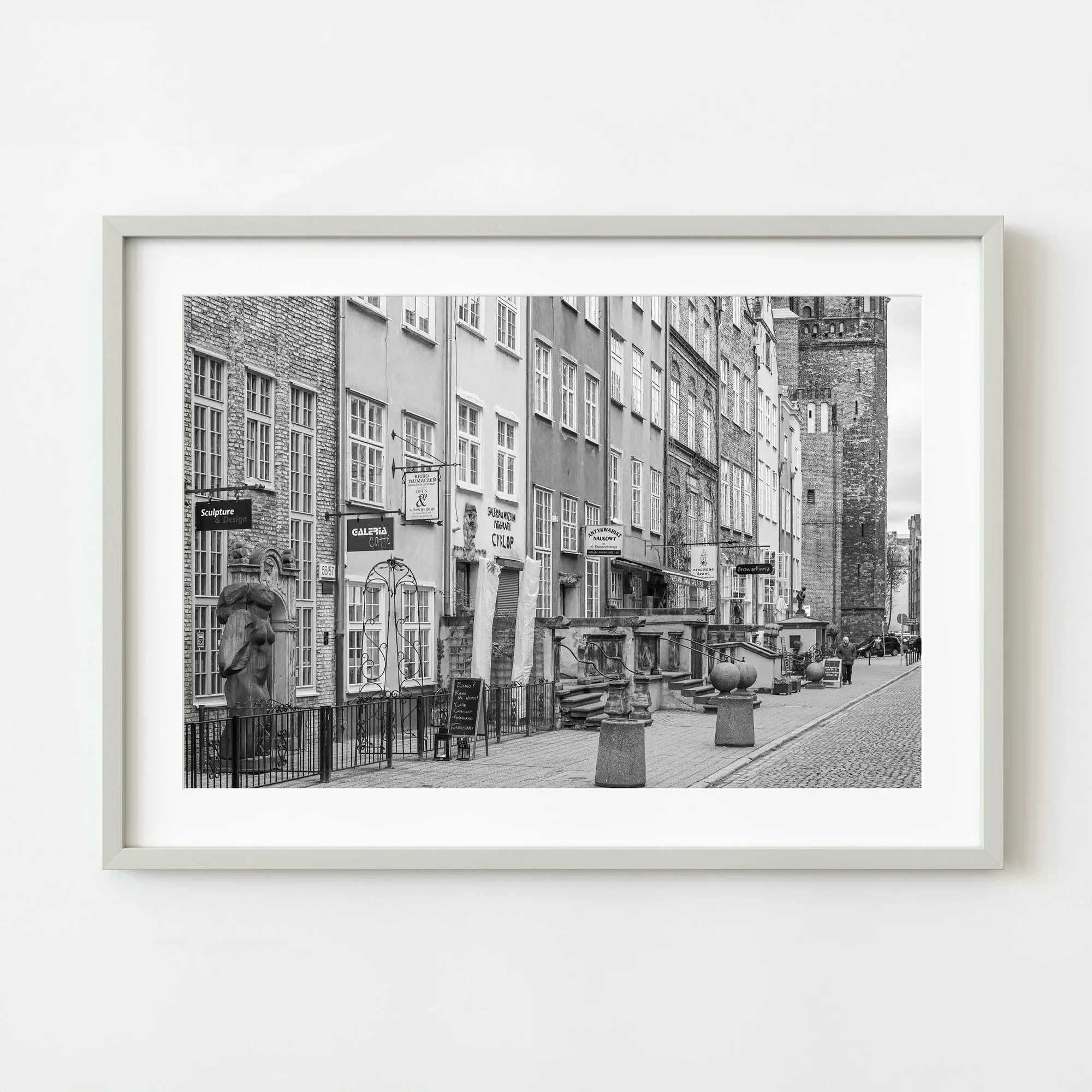
Gdansk Poland city centre empty street | Limited Edition of 10
-
Cityscape over harbor in Havana Cuba | Limited Edition of 10: This panoramic Havana harbor view features warm, rich colors and a vibrant skyline that captures the city's lively spirit. The strong color palette makes this print a natural choice for a color-focused display, but it also means you should check that the warm tones complement your wall color and furniture.
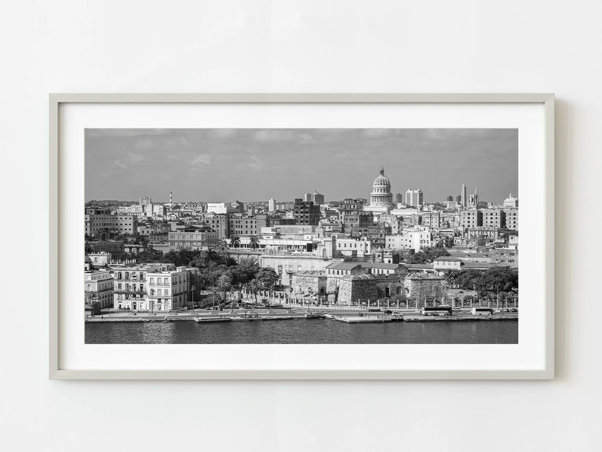
Cityscape over harbor in Havana Cuba | Limited Edition of 10
Which print style fits your space?
Best for
- Minimalist or monochrome rooms that benefit from a calm, architectural statement
- Neutral or gray rooms that need a warm, energetic focal point
Not for
- Rooms with very warm or very cool wall colors without testing the print's palette first
- Spaces where the print will compete with busy patterns or multiple art pieces