Quick answer
Choose Dots if you want a warm, playful square-ish composition that reads well above a low dresser or play table; choose Vertical if your wall is narrow or tall and you want upward energy. Both are framed abstract art prints with size and frame color options, so the real decision is orientation and palette, not quality.
Shape changes where the print can live
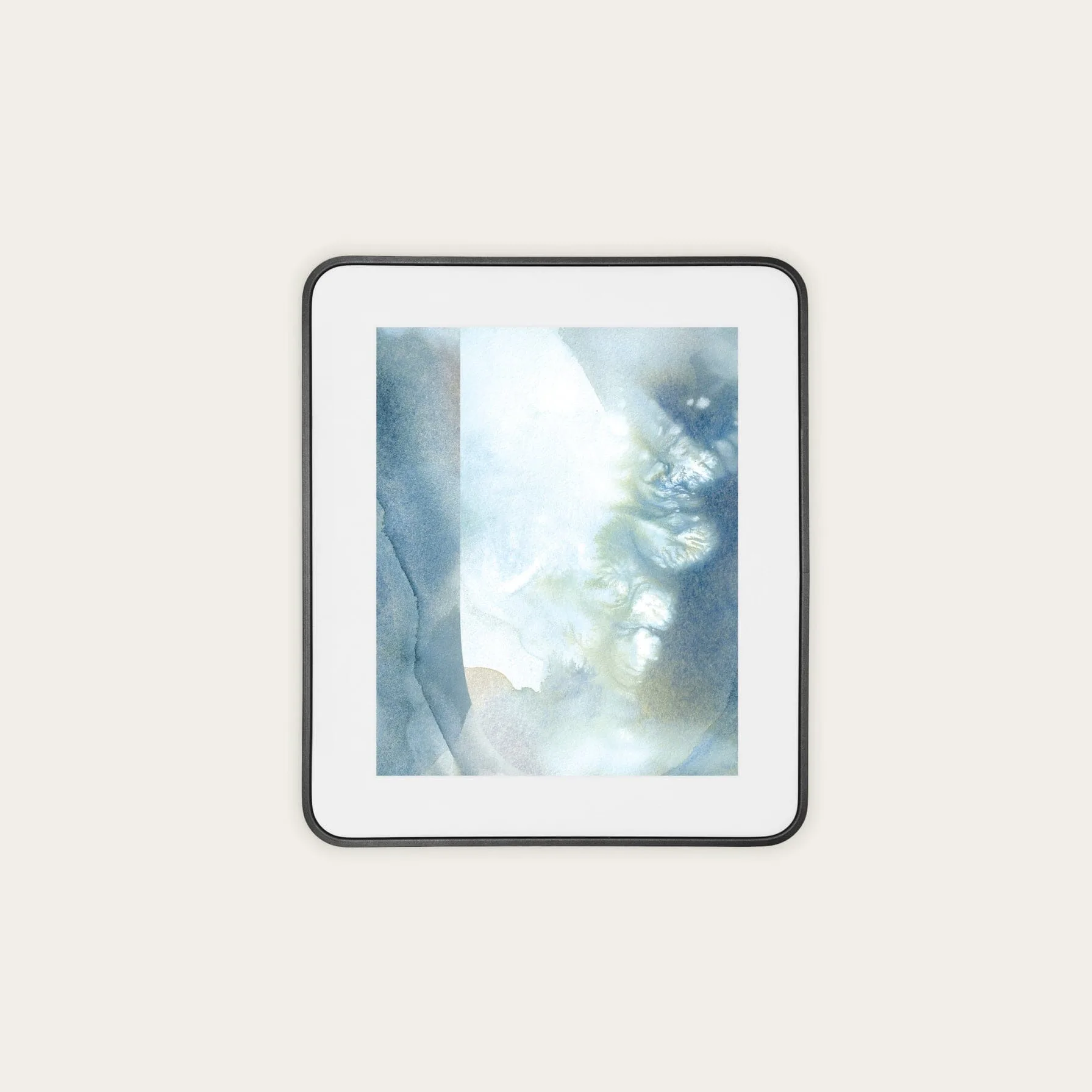
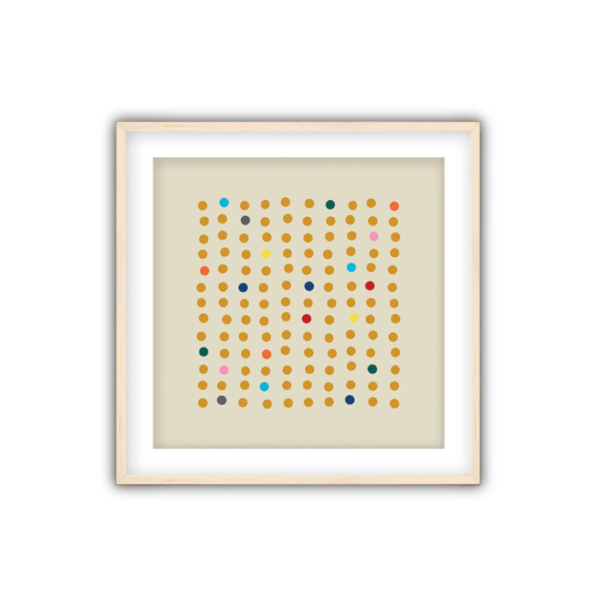
Vertical is built around three tall rectangular forms standing side by side, so it emphasizes height and rhythm. That makes it a natural fit for a slim wall segment, the space beside a window, or a tall stretch above a toy kitchen. Dots layers a field of warm ochre dots with bursts of color, creating a more even, all-over rhythm that suits a wider wall or a spot centered over a low piece of furniture.
This is the practical version of the square vs vertical wall art question: match the print's dominant direction to the wall space you actually have, not to a trend.
Palette and mood: warm order vs bold motion
Dots leans warm and lively. The ochre dot field gives it a steady background rhythm, while the color bursts keep it from feeling flat. It is easy to live with in a room that already has a lot of toys and color because the structure holds its own without competing.
Vertical is more graphic and energetic, with blue, orange, and red forms that suggest doors, ladders, or pathways. That makes it a strong focal point, but it also means it will draw the eye first. If your kids room already has a busy rug or a wall of shelves, Dots will usually feel calmer; if the wall is bare and needs a statement, Vertical earns its place.
The trade-off you cannot avoid
A vertical print solves a narrow-wall problem but can look undersized on a wide blank wall unless you pair it or size up. A dots print fills a wider wall more comfortably but can feel repetitive if you already have patterned wallpaper or a busy gallery arrangement. Neither print is inherently better; each asks you to commit to a wall shape and a level of visual energy.
Also note what the catalog does not specify: exact dimensions for each size option and the full frame color range. Check those on the product page before ordering, especially if you are matching an existing frame or measuring a tight space.
Trade-offs to weigh before you choose
- Vertical orientation: Vertical suits a narrow wall, a spot between windows, or a tall stretch above a play kitchen. On a wide wall, it may need a companion piece or a larger size to avoid looking lost. Measure the wall width first; if it is wider than about twice the print width, plan a pair or size up.
- Dots composition: Dots fills a wider wall more evenly and reads as warm and playful. In a room with patterned wallpaper or many framed pieces, the dot rhythm can compete rather than calm. If the wall already has pattern, give Dots breathing room or choose a simpler frame color.
- Frame color and size options: Both prints offer size and frame color choices, but the catalog does not list the exact dimensions or every frame finish. Confirm those on the product page before ordering. Order a frame color that matches existing trim or furniture, not just the print's palette.
Product facts at a glance
-
Vertical, Abstract Wall Art with Frame: Vertical is a bold abstract composition with three colorful rectangular forms (blue, orange, red) that suggest doors, ladders, or pathways. The tall, stacked geometry makes it a natural fit for narrow or height-dominant wall spaces.
Vertical, Abstract Wall Art with Frame
Vertical, Abstract Wall Art with Frame
-
Dots, Abstract Wall Art with Frame: Dots layers a field of warm ochre dots with bursts of vibrant color by Julie Goodman-Khasani. The warm, rhythmic field gives a wider wall a playful focal point without a single dominant shape.
Dots, Abstract Wall Art with Frame
Which print fits your room?
Best for
- Dots: a wide wall above a low dresser or play table in a room with a calm, neutral backdrop
- Vertical: a narrow or tall wall that needs upward movement and a clear focal point
Not for
- Dots: a wall already covered in busy pattern or a tight vertical strip where the dots would feel cramped
- Vertical: a very wide blank wall where a single vertical print would look undersized without a pair