Quick answer
Match your concealer to your skin's undertone and depth, not just the surface color. For most concerns, choose a shade that is one to two tones lighter than your foundation for brightening, or match exactly for spot concealing.
Undertone matters more than you think
Your skin's undertone—cool, warm, or neutral—determines whether a concealer will look natural or ashy. Cool undertones (pink, red, blue) pair best with ivory or rosy shades. Warm undertones (yellow, golden, peachy) need golden or peach-based concealers. Neutral undertones can pull off most shades but should avoid extremes.
The shade name often gives a clue: 'Paper Thin' from Kjaer Weis is described as a cool, ivory color, ideal for fair to medium skin with slightly pink undertones. If you have warm undertones, look for words like 'warm,' 'golden,' or 'peach.'
Coverage level changes the shade choice
A lightweight concealer like Invisible Touch Concealer can be built from light to high coverage. For sheer coverage, a shade that is slightly off will blend out more forgivingly. For full coverage, the match must be nearly exact to avoid a patchy look.
If you need to conceal hyperpigmentation, match the concealer exactly to your foundation shade so it blends seamlessly. For under-eye brightening, go one to two shades lighter than your foundation, but stay within the same undertone family.
Test in natural light and on the right area
Swatch concealer on your jawline or the area you intend to use it—not your hand. The skin on your face and neck may differ from your arm or wrist. Apply a thin layer and step into natural daylight to see the true effect.
For under-eye use, test the shade on the inner wrist or directly under the eye. The skin there is thinner and may show a different tone than your cheek. A concealer that matches your cheek might look too dark or too light under the eye.
Your concealer shade decision rules
- Identify your undertone: Look at the veins on your wrist: blue or purple veins indicate cool undertones; green veins indicate warm undertones; a mix means neutral. Choose a concealer shade that matches your undertone, not just your surface color.
- Choose your coverage goal: For spot concealing (blemishes, hyperpigmentation), select a shade that exactly matches your foundation. For under-eye brightening, pick a shade one to two tones lighter than your foundation, staying within the same undertone family. If you often switch between sheer and full coverage, a buildable formula like Invisible Touch Concealer works for both.
- Test before you commit: Apply a small dot to the area you'll use and blend with your fingertip. Check the result in natural light. If the concealer disappears into your skin without a gray or orange cast, you have your match. Wear the test shade for a few hours to see how it oxidizes or settles into fine lines.
Product facts
-
Invisible Touch Concealer / F140 – Paper Thin: A lightweight, skincare-infused concealer that brightens, conceals and lifts. Offers flexible coverage from light to high. Paper Thin is a cool, ivory color best for fair to medium skin with slightly pink undertones. This shade is an excellent choice if you have fair to medium skin with cool undertones, and its buildable coverage lets you use it for both spot concealing and brightening.
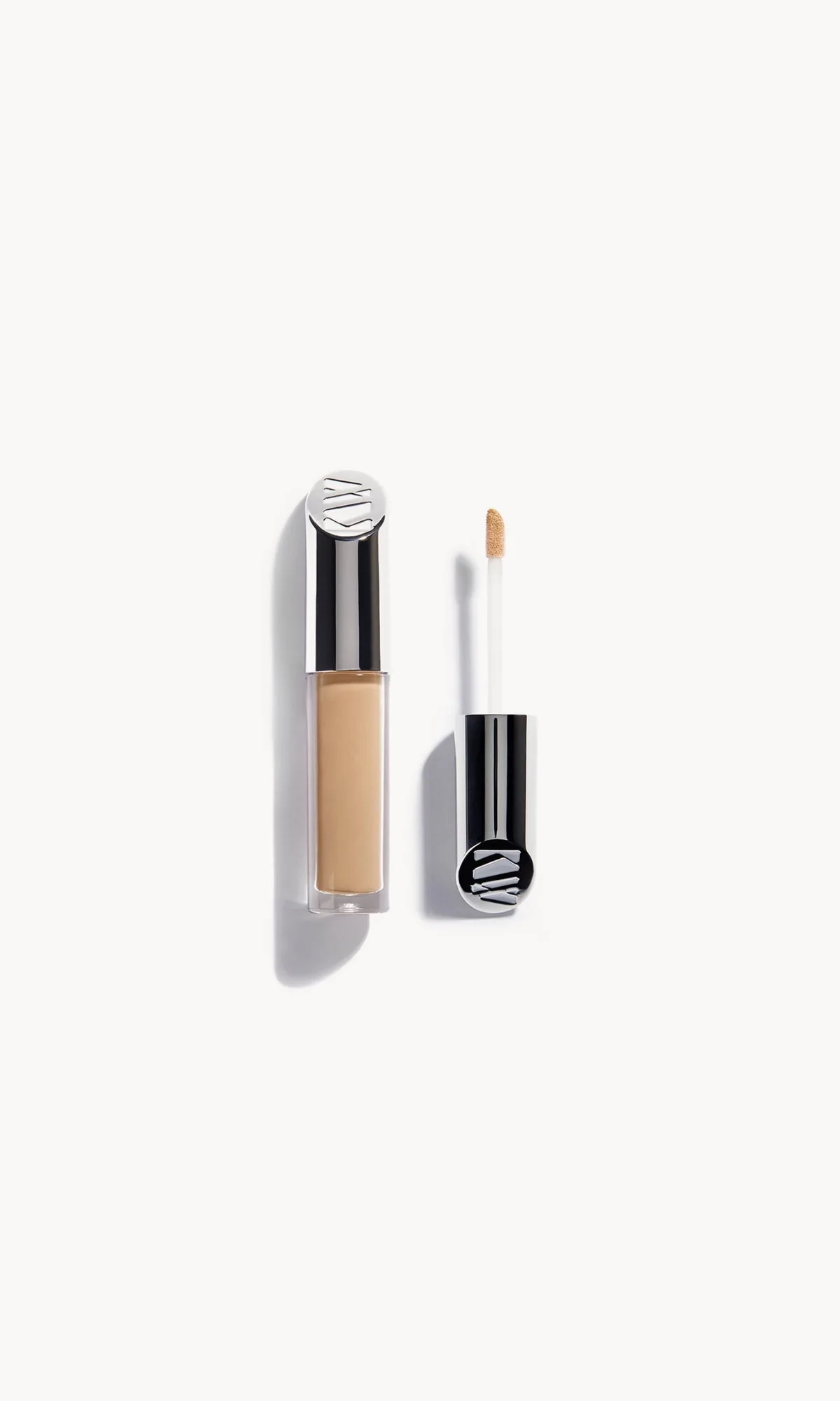
Invisible Touch Concealer / F140 – Paper Thin
Who this approach works for
Best for
- Anyone who wants a natural-looking concealer finish, whether for spot concealing or brightening
- People with fair to medium skin and cool undertones looking for a lightweight, buildable formula
Not for
- Those who prefer a full-coverage concealer that cannot be sheered out (look for a high-coverage formula instead)
- Individuals with very deep or very fair skin who need a shade outside the typical cool/warm range (custom blending may be required)