Quick answer
Start with a focus fabric you love, pull three to five coordinating colors from it, then add one or two background or blender fabrics. Choose prints in small, medium, and large scales so the quilt looks balanced. Test your choices together in daylight before you cut.
Coordinating fabrics for a quilt can feel overwhelming when you see hundreds of bolts. The good news is that you do not need a design degree. A simple ordered process helps you choose fabrics that work together and avoid a muddled look.
This guide walks you through seven steps, from picking a starting point to finalizing your palette. Each step includes a checkpoint or common mistake so you can catch problems before you cut. By the end, you will have a fabric pull you feel confident about.
Step 1: Start with one fabric you love
Pick a single fabric that makes you happy. It could be a large-scale print, a hand-dyed batik, or a solid with a rich color. This becomes your focus fabric, and every other choice will relate back to it. Do not overthink this step; if you keep returning to the same bolt, that is your starting point.
Once you have your focus fabric, look closely at its colors. You will pull three to five colors from it later. If the fabric has many colors, choose the ones you want to highlight. This keeps your palette from getting too busy.
- Common mistake: choosing a fabric you feel obligated to use instead of one you truly like. You will be happier with the finished quilt if you start with a fabric that sparks joy.
Step 2: Pull a color palette from your focus fabric
Lay your focus fabric on a table and pick out three to five colors you see in it. These will be your palette. You can use a color wheel or simply trust your eye. A common approach is to choose one dominant color, one secondary color, and one accent color.
If you want a harmonious look, stay within one color family (monochromatic) or use neighboring colors on the color wheel (analogous). For more contrast, add a complementary color opposite your main color. Either way, keep the number of colors small so the quilt feels cohesive.
- Checkpoint: squint at your focus fabric. The colors that still stand out are the ones to build on.
Step 3: Choose a background fabric
A background fabric gives the eye a place to rest. It is often a solid or a low-volume print in a light or dark neutral. Your background should contrast with your focus fabric in value, not necessarily in color. For example, if your focus fabric is medium-dark, a light background will make it pop.
Consider how much background your pattern needs. Some quilts use background as a large part of the design, while others use it sparingly. Buy enough yardage based on your pattern, and always round up. Running out of a background fabric mid-project is a common frustration.
- Common mistake: choosing a background that is too similar in value to your focus fabric. The design can disappear. Test by taking a black-and-white photo of the two fabrics together.
Step 4: Add supporting fabrics in different scales
Now add three to five supporting fabrics. These can be prints, blenders, or solids that echo your palette. The key is to vary the scale of the prints. If your focus fabric is a large floral, add a medium geometric and a small dot or stripe. This mix keeps the quilt from looking flat.
Scale also affects how the eye moves across the quilt. Large prints draw attention, while small prints recede. Distribute them so no single area feels too heavy. If you are unsure, lay all fabrics together and step back a few feet.
- Checkpoint: take a photo of your fabric pull in black and white. You should see a range of light, medium, and dark values.
Step 5: Balance color and value
Color and value are different. Color is the hue (red, blue, green), while value is how light or dark it is. A quilt with good value contrast looks crisp even if the colors are similar. Aim for at least one light, one medium, and one dark fabric in your palette.
If your quilt feels dull, you likely need more value contrast. If it feels chaotic, you may have too many colors or too many competing prints. In that case, remove one print and replace it with a solid or a blender that matches one of your palette colors.
- Common mistake: relying only on color and ignoring value. A red and a green can have the same value and blend together from a distance.
Step 6: Test your fabric pull in daylight
Store lighting can distort colors. Before you cut, take your fabrics to a window or outside and look at them in natural daylight. This is the best way to see if any fabric clashes or looks out of place. You may find that a fabric you loved indoors looks muddy outdoors.
If a fabric feels wrong, trust your gut. It is easier to swap it now than to rip seams later. Once you are happy, take a photo of the final pull. This reference helps you stay on track if you add fabrics later.
- Checkpoint: view your fabrics from a distance of at least six feet. The overall palette should read as cohesive, not jumbled.
Step 7: Finalize your palette and buy enough fabric
Once your palette is set, calculate how much of each fabric you need based on your quilt pattern. Always buy a little extra for mistakes, borders, and binding. If you are using a pre-cut bundle, check that it includes the colors and scales you need.
Before washing, consider whether you want to pre-wash. Some quilters pre-wash to check for bleeding, while others prefer the crisp hand of unwashed fabric. If you pre-wash, follow the manufacturer's instructions. For the fabrics mentioned in this guide, the care instructions are machine wash cold and tumble dry low.
- Common mistake: buying just enough fabric. Fabric lines sell out, and dye lots can vary. Buying extra ensures you have matching fabric if you need more.
Your step-by-step fabric coordination checklist
- Choose a focus fabric: Select one fabric you love. Pull three to five colors from it to create your palette. Checkpoint: if you keep coming back to it, it is the right choice.
- Pick a background fabric: Choose a neutral or low-volume fabric that contrasts in value with your focus fabric. Common mistake: background too similar in value, making the design disappear.
- Add supporting fabrics: Select three to five prints or blenders in small, medium, and large scales. Checkpoint: black-and-white photo should show a range of values.
- Balance color and value: Ensure you have light, medium, and dark values. Adjust if the palette feels dull or chaotic. Common mistake: ignoring value and relying only on color.
- Test in daylight: View your fabric pull in natural light and from a distance to confirm cohesion. Checkpoint: if it reads well from six feet away, you are ready.
- Finalize and buy enough: Calculate yardage, add extra for borders and binding, and check care instructions. Common mistake: buying just enough; dye lots vary and fabrics sell out.
Fabric facts to guide your choices
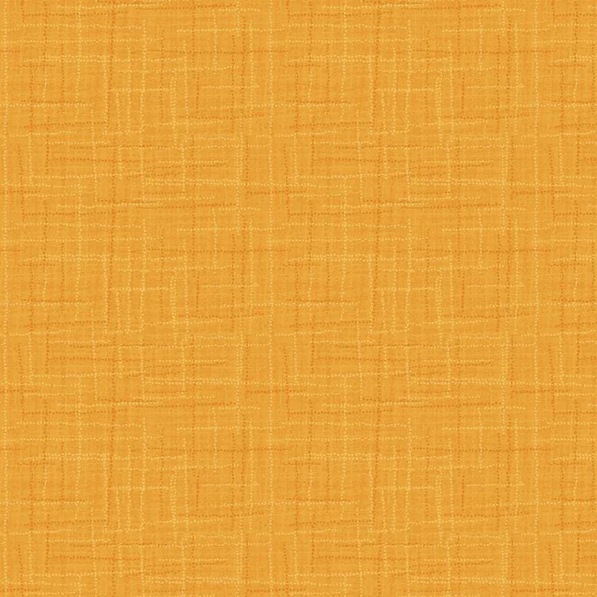
- Grasscloth Goldenrod by Heather Peterson for Riley Blake Designs: 100% cotton, 43"/44" wide, from the Grasscloth Cottons collection. Features dimensional color to create a woven look. This fabric works well as a background or blender because its woven look adds texture without competing with prints. The goldenrod color can serve as a warm accent in a fall palette.
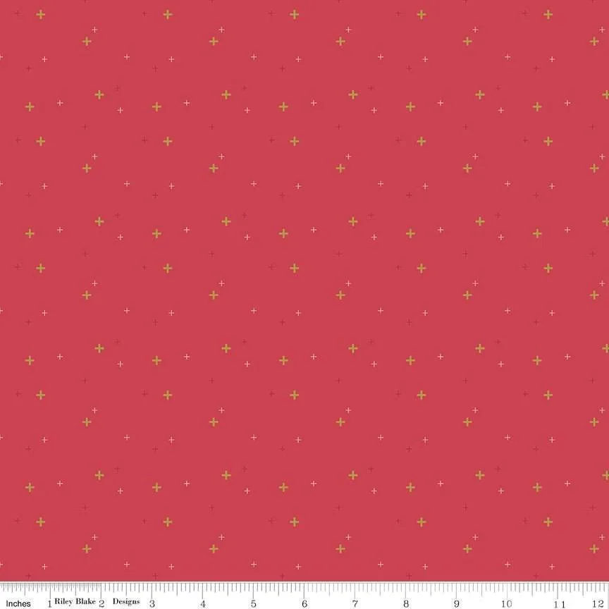
- Cayenne Sparkle from Sparkler Basics by Melissa Mortenson for Riley Blake: 100% cotton, 43"/44" wide, from the Sparkler collection. Features scattered plus signs of various sizes with gold sparkle. The small-scale plus signs make this a good supporting print. The gold sparkle adds a subtle shine that can act as an accent in a modern quilt.
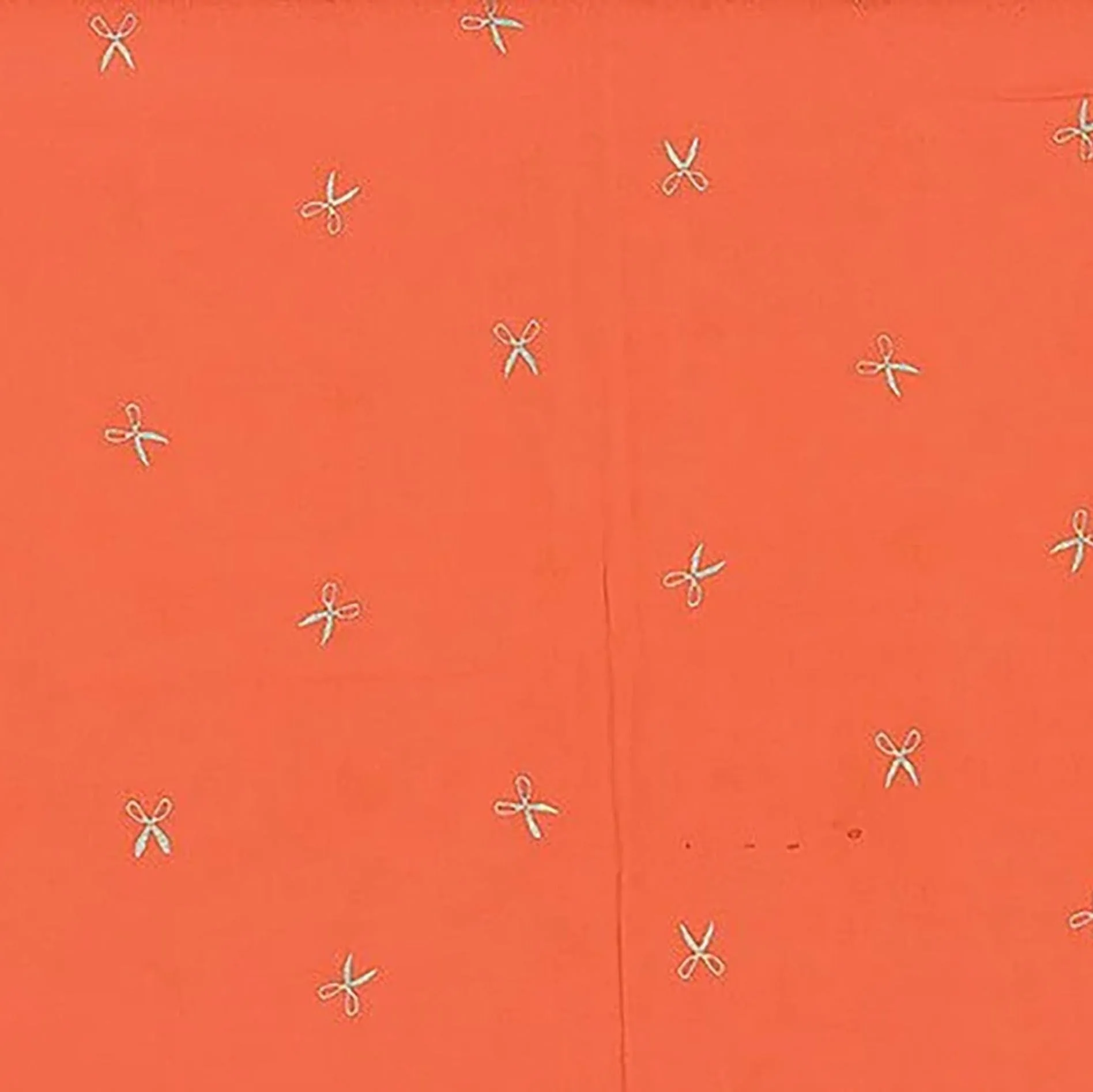
- Me+You Hand Dyed Batiks Scissors Mardi Gras/Silver: 100% cotton, 44"/45" wide, from Me + You Hand Dyed Batiks by Hoffman. Pattern: Scissors Mardi Gras/Silver. Hand-dyed batiks have rich color variation that can serve as a focus fabric. The scissors motif adds a novelty element for a themed quilt.
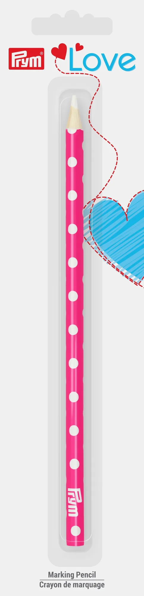
- Prym Love Fabric Marking Pencil: Fabric marking pencil with white lead. Water-soluble; remove markings by soaking with water. Made of wood/chalk. Includes one pencil. A marking pencil helps you transfer quilting lines or templates accurately. Because it is water-soluble, you can remove marks after piecing or quilting.
Coordinating fabrics for a quilt is a skill you build with each project. Start with one fabric you love, pull a small palette, and test your choices in daylight. With these steps, you will create a cohesive quilt that reflects your style.