Start with the pattern, not the artwork file
A checkerboard singlet lives or dies on two decisions: where the pattern sits and which colors carry it. The catalog record for the Men's Custom Checkerboard Custom Men's Premium Racerback Singlet gives you a concrete starting point: Navy Blue, Silver Grey, and White, with a note that the BOA logo must be visible.
That is enough to build a layout brief before anyone opens a design file. Decide the checkerboard's scale and placement, assign each color a role, and confirm the logo will read against the pattern. Everything else follows from those three choices.
What the catalog confirms for this singlet
-
Men's Custom Checkerboard Custom Men's Premium Racerback Singlet. (x 15): Men's Custom Custom Men's Premium Racerback Singlet Checkerboard in Navy Blue, Silver Grey, and White. These are the colors your checkerboard layout has to work with, so pattern contrast decisions start here.
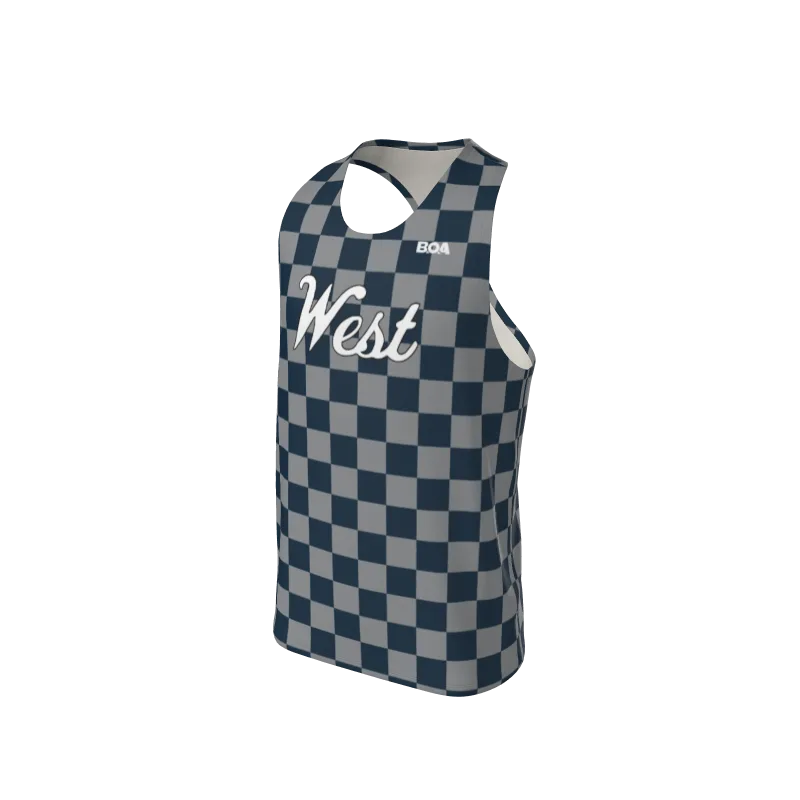
Men's Custom Checkerboard Custom Men's Premium Racerback Singlet. (x 15)
-
Men's Custom Checkerboard Custom Men's Premium Racerback Singlet. (x 15): Note - BOA logo must be visible. Logo visibility is a stated requirement, not a preference, so pattern placement must leave room for it.
-
Men's Custom Checkerboard Custom Men's Premium Racerback Singlet. (x 15): Sizes S, M, and L are listed with quantities of 8, 5, and 2 respectively. This shows the size range and quantity structure the record actually documents for a team order.
Build the checkerboard layout in four passes
Work in this order so each decision narrows the next one instead of reopening it.
- 1. Assign color roles: Treat Navy Blue, Silver Grey, and White as a three-role palette: a dominant field, a contrasting square, and an accent. A two-color checkerboard is the simplest read; a third color works best as a border, side panel, or logo surround rather than a third square in the grid.
- 2. Choose pattern scale: Small checks read as texture from a distance; large checks read as a graphic. Pick one and keep it consistent across the front, back, and any side panels so the singlet does not look pieced together.
- 3. Place the pattern around the racerback: The racerback cut means the back has narrow straps and an open shoulder area. Decide whether the checkerboard runs full-bleed across the back or stops below the strap line, and note that choice in your artwork brief.
- 4. Reserve the logo zone: Mark a clear area for the BOA logo before finalizing the grid. If the checkerboard runs through that zone, confirm the logo still reads against both colors it overlaps.
Checkerboard placement choices worth deciding early
- Full-body checkerboard: The boldest option and the hardest to keep clean at panel seams. Best when the logo sits on a solid block or a single-color chest panel.
- Chest or back panel only: Keeps the pattern as a focal graphic and leaves solid Navy Blue or Silver Grey around it. This makes logo visibility easier to guarantee.
- Side-panel or trim checks: A restrained use of the pattern that still reads as checkerboard. Useful when the team wants a matched look across singlets and shorts.
- Gradient or fading checks: Only pursue this if your artwork can show exactly how the transition works. The supplied record does not describe a fade option, so confirm it before promising it to a team.
Where the BOA logo requirement changes your design
The record states plainly that the BOA logo must be visible. In practice, that means the logo cannot be buried inside a busy checkerboard or placed in a color that blends into the grid. Give it a solid backing area, or position it where the pattern is calm.
Check the logo against each color it touches. White on Silver Grey is a weak pairing; Navy Blue behind a White logo is a strong one. If your checkerboard alternates Navy Blue and White, the logo needs a deliberate home rather than landing on a random square.
Artwork details to confirm before you submit
The catalog record lists sizes and colors but does not spell out print method, file format, or production tolerances. Confirm these with your order contact rather than assuming.
- Color matching: Ask how Navy Blue, Silver Grey, and White will be matched to your artwork. The record gives color names and hex references, but not a proofing process.
- Pattern alignment at seams: Ask whether the checkerboard will be aligned across side seams or cut panel by panel. This affects how tidy the finished singlet looks.
- Logo file: The record references a front-logo image. Confirm the logo artwork and placement with your order contact so the visibility requirement is met on the first run.
- Size and quantity breakdown: The record documents S, M, and L in quantities of 8, 5, and 2. Use that structure as your starting roster count and adjust before submission.
What the record does not settle
The supplied information does not describe fabric composition, fit measurements, care instructions, or print durability. It also does not confirm whether additional sizes or colorways are available beyond those listed. Treat those as questions for your order contact, not as gaps you can fill by assumption.
A checkerboard design is a strong choice for a team that wants a recognizable look. Get the pattern scale, color roles, and logo zone settled in writing before the order goes in, and the rest of the process stays simple.