Quick answer
Start with one neutral base robe color that flatters everyone, then layer your wedding palette in through accessories, florals, and signage rather than trying to match every shade exactly. If you want color in the robes themselves, choose soft pastels or your palette's lightest tint so the group still reads as coordinated in getting-ready photos.
Getting-ready photos are some of the most relaxed, candid images of the whole day, and the robes in them set the visual tone before anyone is in formalwear. That means the color decision matters more than most brides expect, but it does not have to be complicated.
This guide walks through a practical order of decisions: base color, palette relationship, fabric and lighting, then the small details that pull the group together. Each step includes the mistake that most often derails it.
Step 1: Pick the Base Robe Color Before Anything Else
Choose one base color first, because everything else, from hair and skin tones to the hotel room walls, will be photographed against it. Soft pastels, blush, ivory, and muted rose tend to photograph cleanly on a wide range of skin tones and do not compete with bouquets or dresses. Deep black and saturated jewel tones can look dramatic, but they create a harder contrast next to white bedding and bright windows.
If your wedding party spans a range of complexions, test your shortlist in person or ask for a swatch. A shade that looks delicate online can turn grey or washed out in a dim getting-ready room.
- Checkpoint: if you cannot picture the robe color next to your bouquet, it is not the base color yet.
Step 2: Decide How Literally to Match Your Palette
You have three workable approaches. Exact match means the robes echo a dress or accent color directly, which reads very polished but limits your options. Tonal match means the robes sit in the same family as your palette at a lighter or softer value, which is the most forgiving. Neutral-plus-accent means everyone wears one calm base color and you add the palette through ribbons, hangers, or florals.
For most weddings, tonal or neutral-plus-accent photographs better than an exact match, because getting-ready rooms rarely have the same lighting as your ceremony space.
- Common mistake: trying to match a dye lot to a dress fabric. Different materials absorb color differently, so an exact match is rarely achievable.
Step 3: Choose the Fabric Before You Lock the Color
Fabric changes how a color reads. Silk has a natural sheen that catches window light and makes pastels look luminous, while matte cotton and embroidered cotton absorb light and read slightly deeper. Lace adds texture and pattern, which softens the impact of the color itself.
This is why the same blush pink can look completely different across a silk robe, a Pima cotton robe, and a lace robe. Decide the fabric mood first, then confirm the color in that material.
- Checkpoint: view your color choice in the actual fabric, not in a flat digital swatch.
Step 4: Test the Color Against the Room and the Light
Getting-ready photos usually happen in the morning, near windows, against white or cream bedding. Warm morning light pushes colors warmer; cool north-facing light pushes them cooler. Hold your robe option against a white wall in daylight and look for whether the color stays clean or shifts muddy.
If your venue's getting-ready suite has dark walls or heavy curtains, a lighter robe keeps the group from disappearing into the background.
- Common mistake: choosing a color from an evening photo on a phone screen. Screens and evening light both distort color.
Step 5: Coordinate, Do Not Clone, Across the Wedding Party
A single color for everyone is the simplest and most reliable choice. If you want variety, keep the same fabric and vary only the shade within one family, so the group still reads as a set. Mixing fabrics and wildly different colors at the same time usually looks accidental rather than intentional.
If your party is large, order together and confirm lead times early. Ready-to-ship options remove the risk of a shade arriving after the wedding.
- Checkpoint: line up all robe colors together in one photo before you commit to the order.
Step 6: Tie the Palette Together With Small Details
Once the robes are set, your wedding color palette robes connection can come from the smallest things: satin sashes, hanger ribbons, hair accessories, or the florals in the room. These are cheap to change and easy to coordinate with your overall scheme.
This approach also gives you flexibility if a bridesmaid wants a different silhouette or size. The color story stays intact even when the cuts vary.
- Common mistake: over-accessorizing. Two coordinated accents read better than five competing ones.
Your color-matching checklist, in order
- 1. Lock the base color: Choose one neutral or soft pastel shade that flatters every member of your wedding party. Checkpoint: if it does not look good against your bouquet, start over.
- 2. Choose tonal over exact: Match your palette in the same color family at a lighter value rather than chasing an exact dye match. Checkpoint: exact matches across different fabrics are rarely achievable.
- 3. Confirm the fabric first: Silk, cotton, and lace each change how a color reads, so pick the material before finalizing the shade. Checkpoint: view the color in the actual fabric, not a digital swatch.
- 4. Test in real light: Hold the robe against white bedding near a window in the morning, the way it will actually be photographed. Checkpoint: avoid choosing from an evening phone photo.
- 5. Keep the party coordinated: Use one color for everyone, or vary only the shade within a single fabric family. Checkpoint: photograph all options together before ordering.
- 6. Add palette accents last: Bring your wedding colors in through sashes, ribbons, hair pieces, and florals rather than the robe itself. Checkpoint: two coordinated accents beat five competing ones.
Robe options that make color matching easier
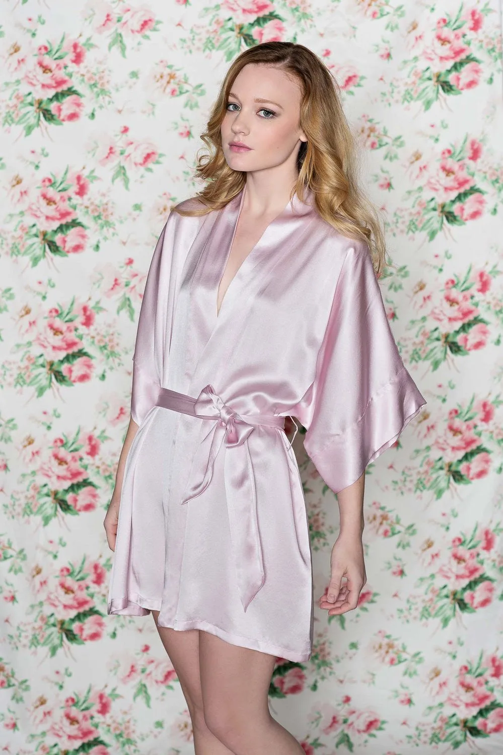
- Samantha Silk getting ready bridal bridesmaids robe kimono in rose pink - style 300: Handmade with couture quality silk and available in many soft pastel shades and custom colors, pictured in rose pink, in stock and ready to ship in 1 day. The range of pastel and custom color options lets you match a soft palette without changing fabrics, and the short ready-to-ship window reduces the risk of a late order.
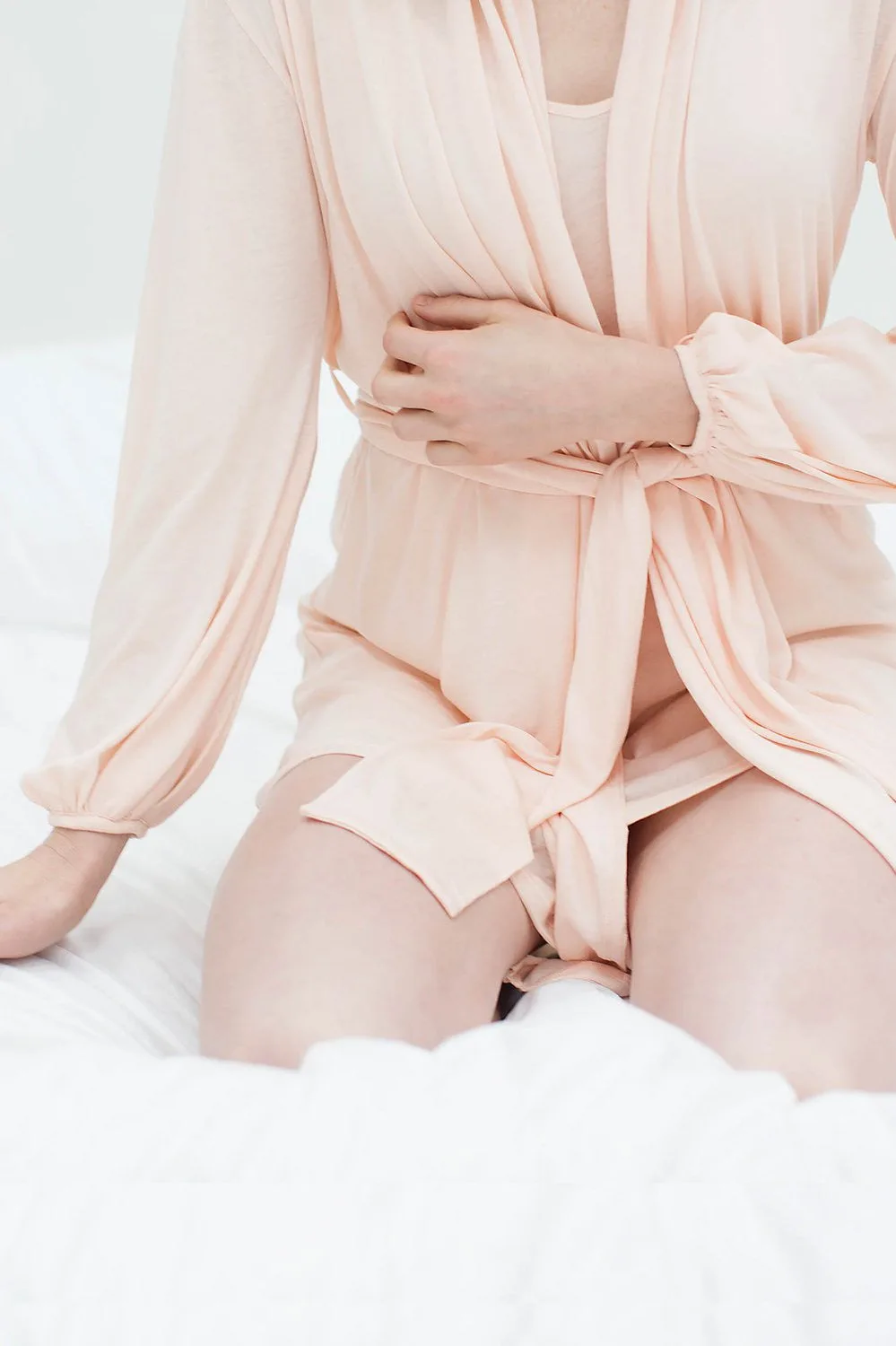
- Lounge Pima Cotton Robe in blush pink: Made of soft Pima cotton with a featherweight drape, shawl collar, long poet sleeves, hand pleated cuffs, and a self-tie waist, true to size, available in size and color options. A matte cotton robe reads slightly deeper than silk in the same shade, so this is a good pick if you want a softer, less reflective look in morning light.
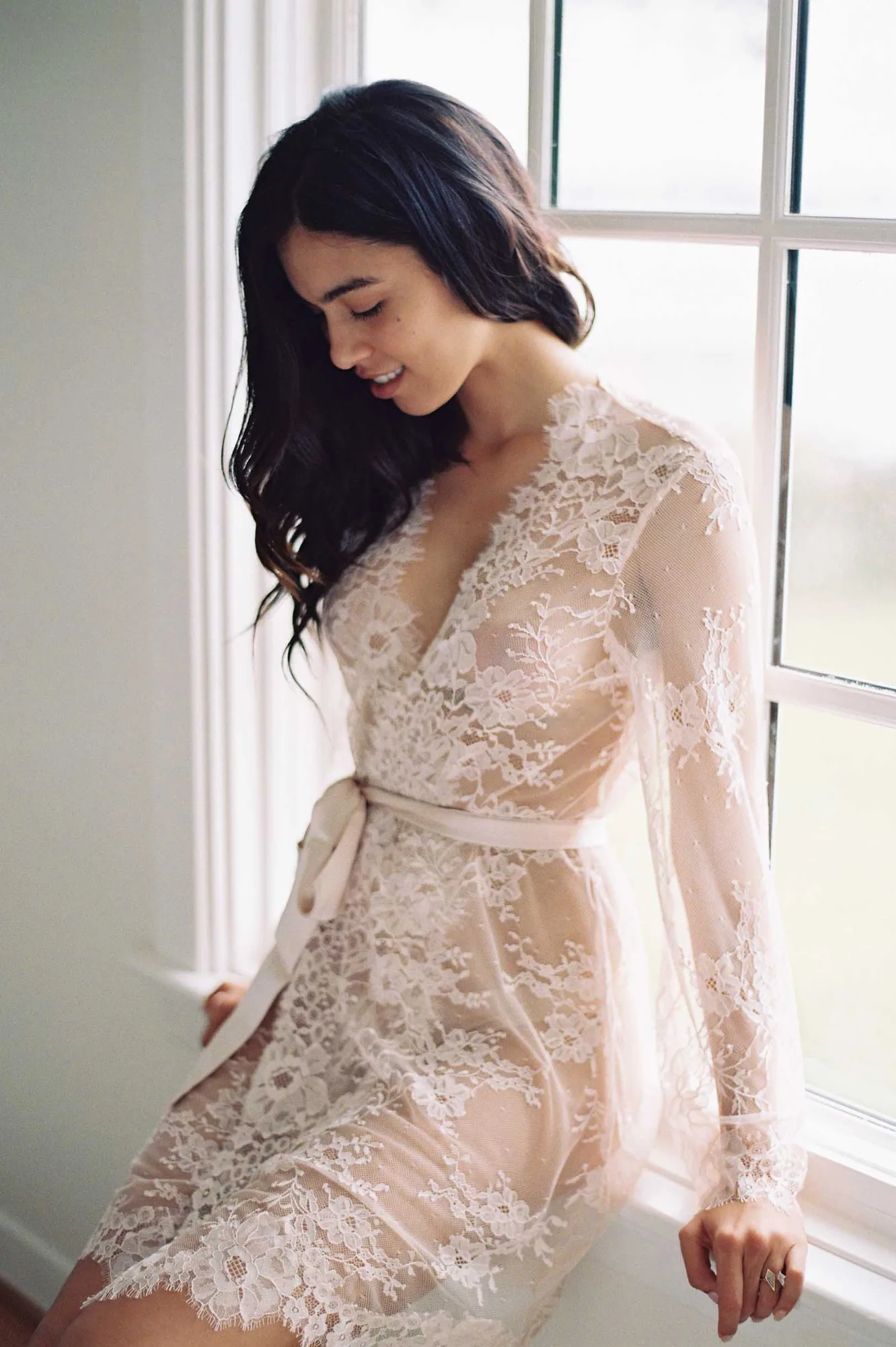
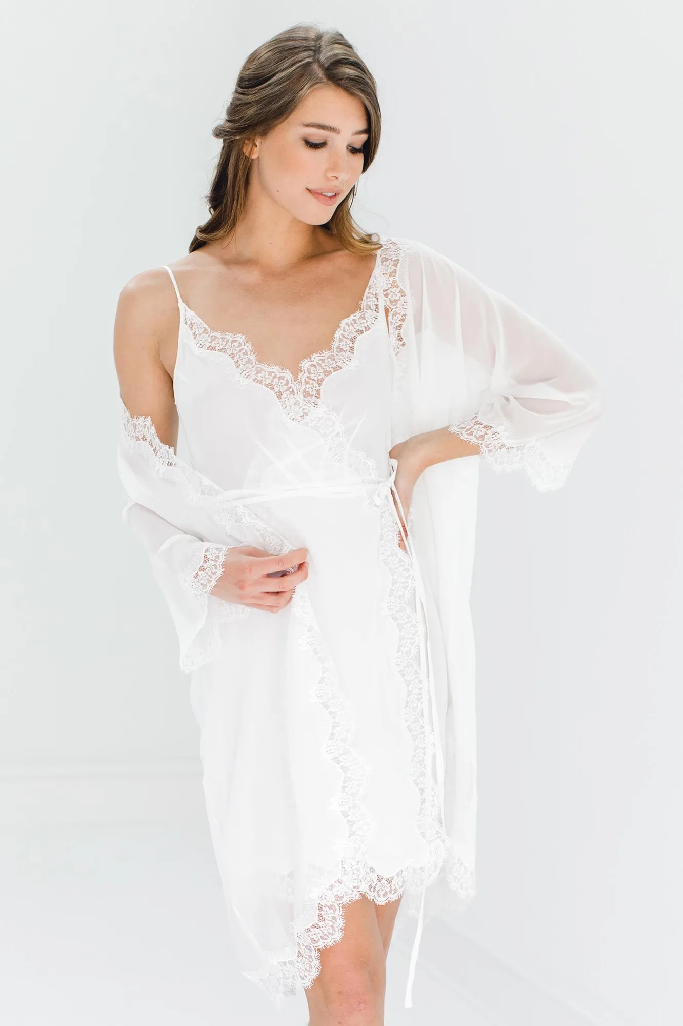
- Camellia lace robe in Rose Pink: Made of soft Chantilly lace with floral details, a scalloped neckline, scallop hem, long flared sleeves, and a satin belt. Lace texture softens the impact of the color itself, which makes it a forgiving choice when you are matching a rose or blush tone to your palette.
Work through these steps in order and you will end up with robes that look intentional in every getting-ready photo, without chasing a color match that fabric and lighting will never quite allow.