Quick answer
Choose your needlepoint colors by starting from the canvas and the room or person it is for, not from the thread wall. Limit yourself to three main colors plus one accent, test the threads against the canvas in daylight, and buy enough of each dye lot before you stitch a single stitch.
Color regret in needlepoint rarely comes from picking a bad color. It comes from picking colors in isolation, under bad light, or without enough thread to finish the project. The fix is a short, ordered process you can repeat for every canvas.
This guide walks through needlepoint color selection step by step, with the checkpoints that keep a palette coherent and the mistakes that send stitchers back to the shop mid-project.
Start with the canvas, not the thread wall
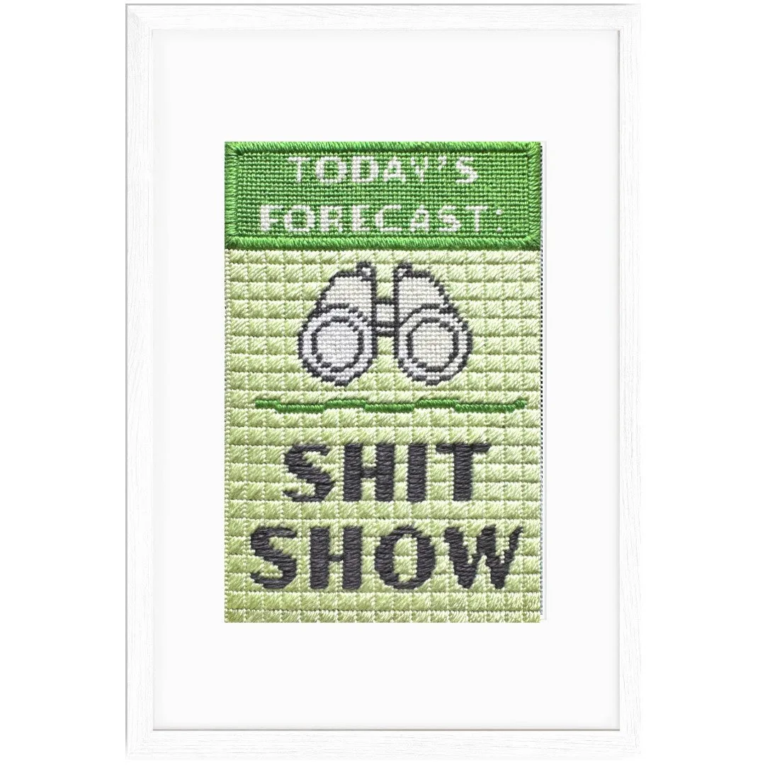
Before you open a single skein, look at what the canvas already gives you. A color-printed canvas like the Sh*t Show Needlepoint Kit has its design printed on 18-mesh mono canvas, which means the palette is partly decided for you. Your job is to choose threads that support the printed colors rather than fight them.
Sh*t Show Needlepoint Kit
If you are working from a charted or painted canvas, note the dominant color, the background, and any area you want to stand out. Those three notes become your palette brief. Walking into a thread wall without a brief is how you end up with six shades of green that all look the same stitched.
- Checkpoint: if you cannot name the one color you want people to notice first, you are not ready to buy thread.
Build a three-plus-one palette
A reliable needlepoint color palette uses three main colors and one accent. The three mains do the heavy lifting: a dominant, a secondary, and a neutral or grounding shade. The accent is the small, bright, or metallic thread that draws the eye and should cover the least area.
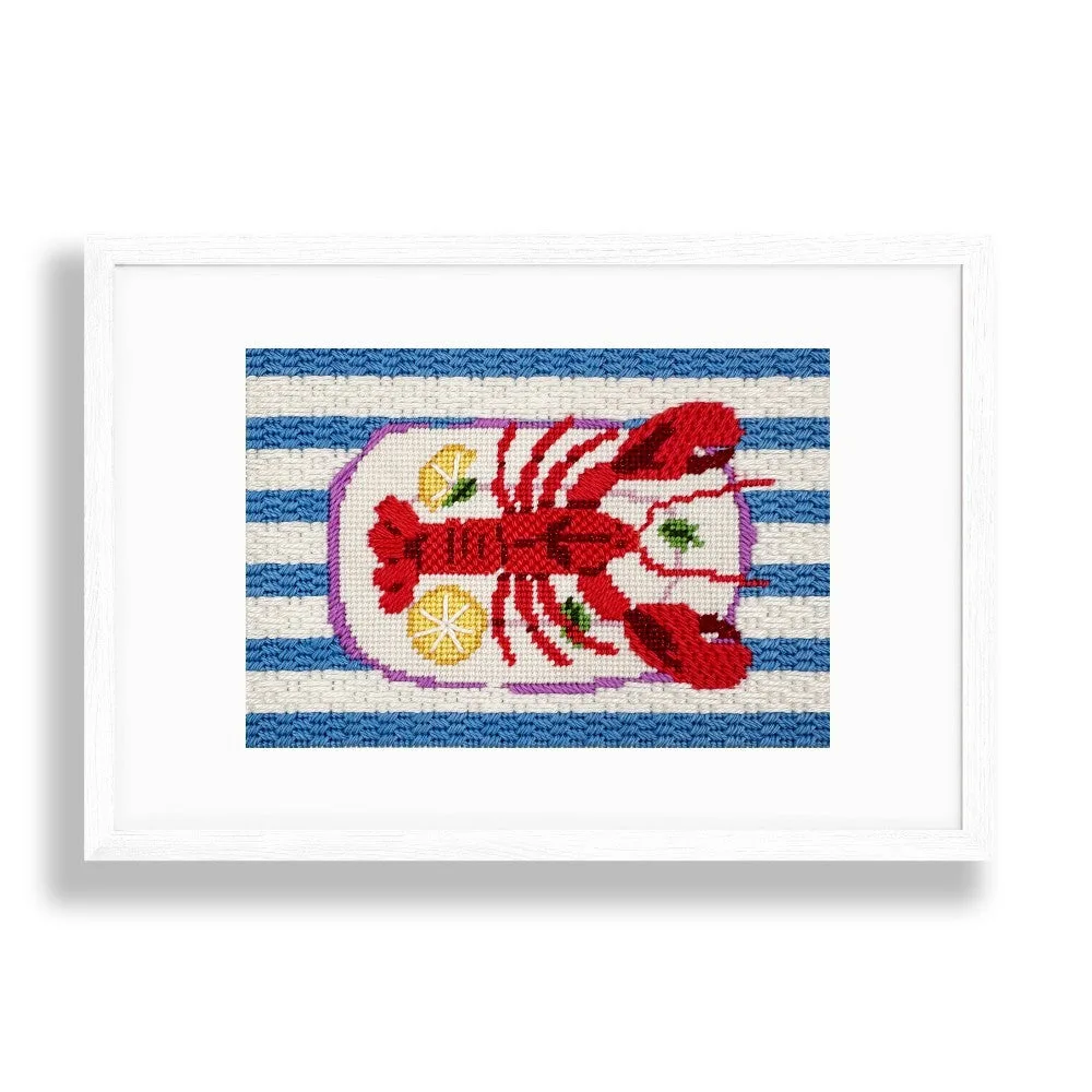
This structure works because it gives you contrast without chaos. The Lobster Stripes Needlepoint Kit follows this logic with Pepperpot Silk threads in vibrant shades plus a touch of shimmering red metallic for extra sparkle. The metallic is the accent, not the base, and that is why it reads as sparkle instead of noise.
Lobster Stripes Needlepoint Kit
- Common mistake: making the accent color the largest area. Keep the accent under roughly a tenth of the stitched surface.
Match thread to canvas in daylight
Thread color matching in needlepoint is a lighting problem before it is a taste problem. Store lighting is usually warm and dim, which makes blues look greyer and reds look browner than they will at home. Take candidate threads to a window or step outside before you commit.
Lay the thread directly on the canvas, not next to it. A thread that looks perfect in your hand can disappear once it sits on a printed background of a similar value. If the thread and the canvas blend into one shape at arm's length, you need more contrast.
- Checkpoint: squint at the canvas. If the thread area vanishes, swap it for a lighter or darker version.
Test the stitch before you commit
Stitched thread behaves differently from loose thread. A single strand of silk catches light and shows texture that you cannot judge from a skein. Stitch a small sample patch on spare canvas, or on a corner of the design you will cover later, and look at it under the light where the finished piece will live.
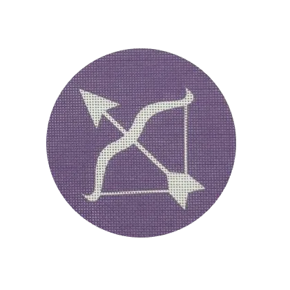
This test also tells you whether your thread covers the canvas. The Sagittarius Needlepoint Canvas + Optional Thread Pack pairs a 4-inch Zodiac canvas with an optional Pepperpot Silk thread pack in rich violet, and testing that violet against the canvas first confirms the contrast before you stitch the whole piece.
- Common mistake: judging coverage from one strand. Add a strand if the canvas grid shows through.
Buy enough thread, and buy it together
Dye lots shift slightly between batches, so two skeins of the same color number can stitch as two different colors. Buy all the thread for a project in one visit, and buy more than you think you need for any color that covers a large area. Leftover thread is cheaper than a mid-project color mismatch.
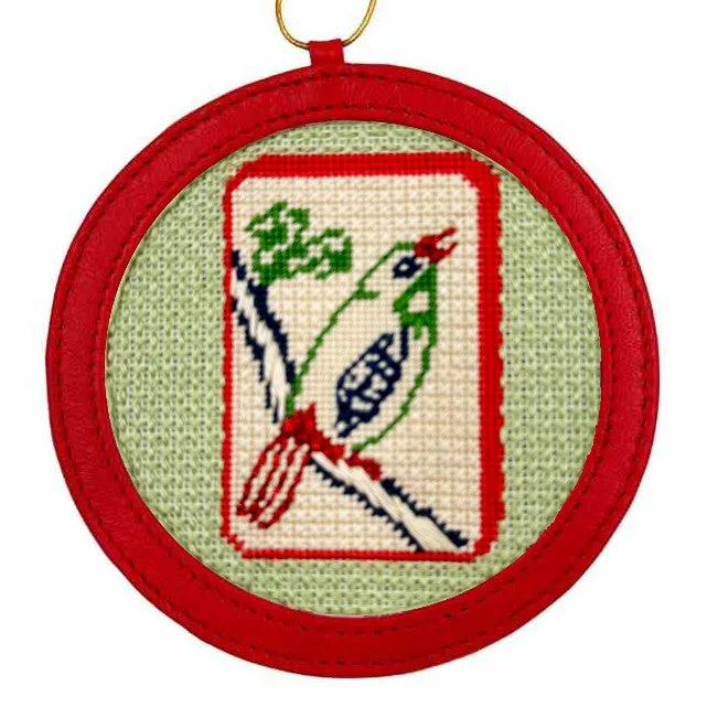
Kits remove most of this risk because the thread is already selected and measured. The Mahjong Tile Needlepoint Kit includes Pepperpot Silks, DMC cotton, and Caron Snow threads for sparkle, so the palette arrives coordinated. If you are building your own palette from canvas and thread, treat the dye lot as part of the color decision.
- Checkpoint: write the dye lot number on your thread bag so you can reorder the same batch if you run short.
Plan the finish before the last stitch
Where the piece will live changes which colors work. A pillow on a dark sofa needs more value contrast than a framed piece on a pale wall. If the finished needlepoint will be a gift, ask about the recipient's room colors before you buy thread, not after.
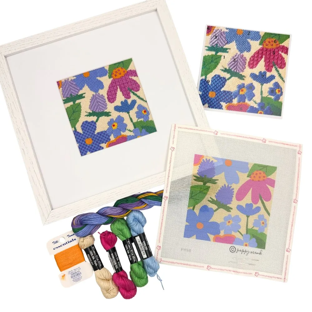
The Pollinator Garden + Frame Needlepoint Bundle is a useful example because the premium oak frame is part of the decision. The frame sets a warm neutral boundary around the flowers, so the stitched colors need to hold their own against oak rather than compete with a bright wall.
- Common mistake: choosing colors for the photo instead of the room. Photograph the palette in the space if you can.
Your color selection checklist, in order
- Step 1: Write a one-line palette brief: Name the dominant color, the mood, and the one area you want noticed. Do this before you look at thread. Checkpoint: if the brief is vague, the palette will be too.
- Step 2: Choose three mains and one accent: Pick a dominant, a secondary, a neutral, and a small accent. Keep the accent under about a tenth of the stitched area. Common mistake: too many equal colors, which flattens the design.
- Step 3: Test threads on the canvas in daylight: Lay each candidate thread directly on the canvas near a window. Squint to check value contrast. Checkpoint: if a thread disappears at arm's length, replace it.
- Step 4: Stitch a sample patch: Work a small area with your chosen threads and check coverage and shine under the light where the piece will live. Common mistake: judging coverage from a loose skein instead of a stitched stitch.
- Step 5: Buy all thread at once and note dye lots: Purchase enough of each color in a single visit and record the dye lot numbers on your thread bag. Checkpoint: running short mid-project is the most common cause of color regret.
- Step 6: Check the palette against the finish: Compare your threads with the frame, pillow, or wall where the piece will end up, and adjust the neutral if needed. Next step: stitch with confidence, knowing the palette was tested before the first full row.
What these kits show about color planning
- Sh*t Show Needlepoint Kit: A 4" x 6" design on 18-mesh mono canvas with a hand-picked selection of single-ply Pepperpot Silks. A printed 18-mesh canvas leaves less room for thread substitution, so the supplied silk palette is the safest starting point.
- Lobster Stripes Needlepoint Kit: Pepperpot Silk threads in vibrant shades plus a touch of shimmering red metallic on 18-count canvas. Shows the three-plus-one structure in practice: the metallic is a small accent, not a base color.
- Sagittarius Needlepoint Canvas + Optional Thread Pack: A 4" Zodiac canvas with an optional Pepperpot Silk thread pack in rich violet. Lets you test one strong color against the canvas before committing to the full thread pack.
- Pollinator Garden + Frame Needlepoint Bundle: A 4.75" x 4.75" design on 18-count canvas with Pepperpot Silk and Essentials wool/silk blend threads and a premium oak frame. The frame is a fixed color in the composition, so plan the stitched palette around oak rather than choosing flowers in isolation.
Good needlepoint color selection is mostly sequencing: brief first, palette second, daylight test third, and enough thread bought at once to finish. Follow that order and the finished piece will look like a decision rather than an accident.