Quick answer
Choose matte when the print will hang across from a window, under a ceiling light, or anywhere you'll view it from an angle—its surface scatters light instead of bouncing it back, so the image stays readable. Choose glossy when you want deep blacks and crisp highlights and the print will sit in a spot with controlled, indirect light. If you're unsure, matte is the safer default for wall art in rooms you actually live in.
How each finish handles light
Glossy paper has a smooth, reflective surface. Light hitting it bounces straight back toward the viewer, which is why you sometimes see a bright rectangle of window or lamp instead of the photograph. That same reflectivity is what gives glossy prints their punch: blacks look denser and highlights look brighter because the surface itself is adding contrast.
Matte paper has a slightly textured, non-reflective surface. It absorbs and scatters light rather than reflecting it, so you rarely get a hot spot on the image. The trade-off is that matte prints can look slightly softer and less dimensional, especially in very dark scenes, because the surface isn't amplifying contrast the way glossy does.
Neither is more accurate. They simply distribute light differently, and that difference matters most in the room where the print will actually hang.
Where the print will hang decides more than the paper
A glossy print in a hallway with no direct light source can look fantastic—deep, rich, and almost wet. The same print moved to a wall facing a south window becomes a mirror for half the day. Before you choose a finish, stand where the print will hang and note what's reflected in that spot: windows, lamps, a TV, a glass door.
Matte prints are forgiving in bright, multi-source rooms and in spaces where you'll walk past the art at an angle rather than standing directly in front of it. They also tend to photograph well for social media and online listings, because there's no glare to work around.
If the wall gets direct sun for part of the day, matte is almost always the more comfortable choice, and it also reduces the visual distraction of reflections while you're trying to look at the image.
Subject matter and tonal range
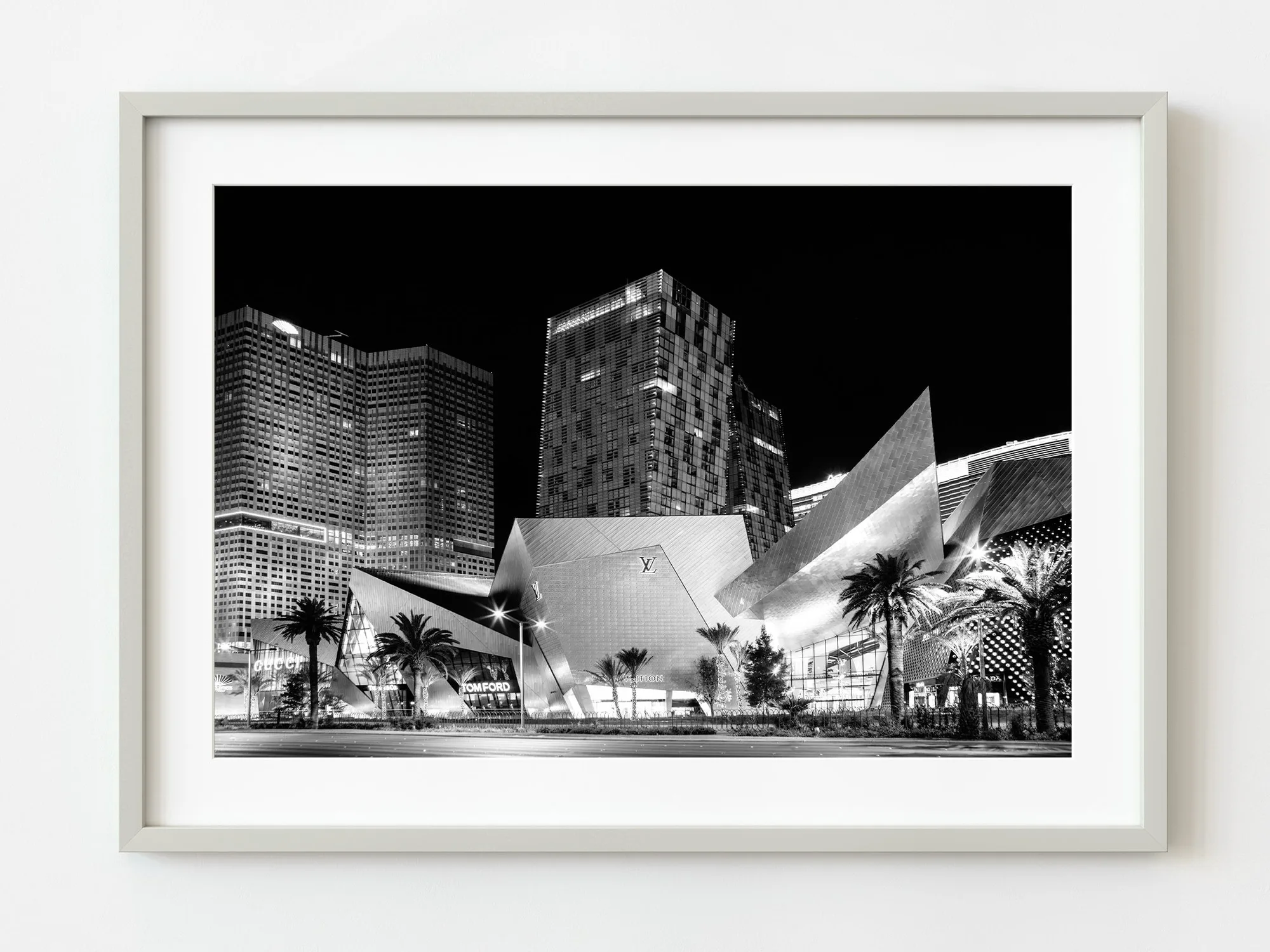
High-contrast black-and-white work often benefits from glossy, because the surface reinforces the separation between deep shadows and bright highlights. Scenes with fine, low-contrast detail—soft foliage, mist, weathered textures—often read more clearly on matte, where the surface doesn't compete with subtle gradations.
Warm, muted color palettes tend to feel calmer on matte. Saturated color and night scenes with lots of small light sources tend to feel more alive on glossy. This isn't a rule, but it's a useful starting point when you're matching a finish to a specific photograph.
One practical limitation: the product listings here specify dimensions as the available option, not paper finish. If finish isn't listed as a selectable option, treat the finish as fixed for that edition and choose the photograph that already suits the room, rather than assuming you can switch surfaces later.
Framing, glazing, and long-term care
Behind glass, the finish matters less than you'd expect—the glass itself adds a reflective layer, and glare from the glazing can outweigh the paper's surface. If you plan to frame under standard glass, matte plus anti-reflective glazing is the most comfortable combination in a bright room.
Unframed or canvas-style display is where finish differences are most visible, because nothing sits between your eye and the paper. In that setup, matte handles ambient light more gracefully, while glossy demands more deliberate placement.
For cleaning, both finishes should be dusted with a dry, soft brush or microfiber cloth. Avoid spraying cleaner directly on the surface, and never rub a glossy print with a dry paper towel—it can leave fine scratches that catch the light.
Matte vs glossy trade-offs at a glance
- Glare and reflections: Glossy reflects light sources directly, so windows and lamps can wash out the image. Matte scatters light and stays readable from most angles. If the wall faces a window or a lamp, matte wins.
- Contrast and depth: Glossy deepens blacks and brightens highlights, giving night scenes and high-contrast black-and-white more punch. Matte softens that contrast slightly. Choose glossy for dramatic tonal range, matte for subtle gradations.
- Handling and display: Glossy shows fingerprints and fine scratches more readily; matte hides minor handling marks but can look flatter unframed. Matte is more forgiving if the print will be handled or moved often.
- Framing under glass: Glass adds its own reflections, which can cancel out the paper's finish advantage. Anti-reflective glazing changes the equation in bright rooms. If you're framing under standard glass, matte plus anti-reflective glazing is the safest pairing.
How finish choices play out in real prints
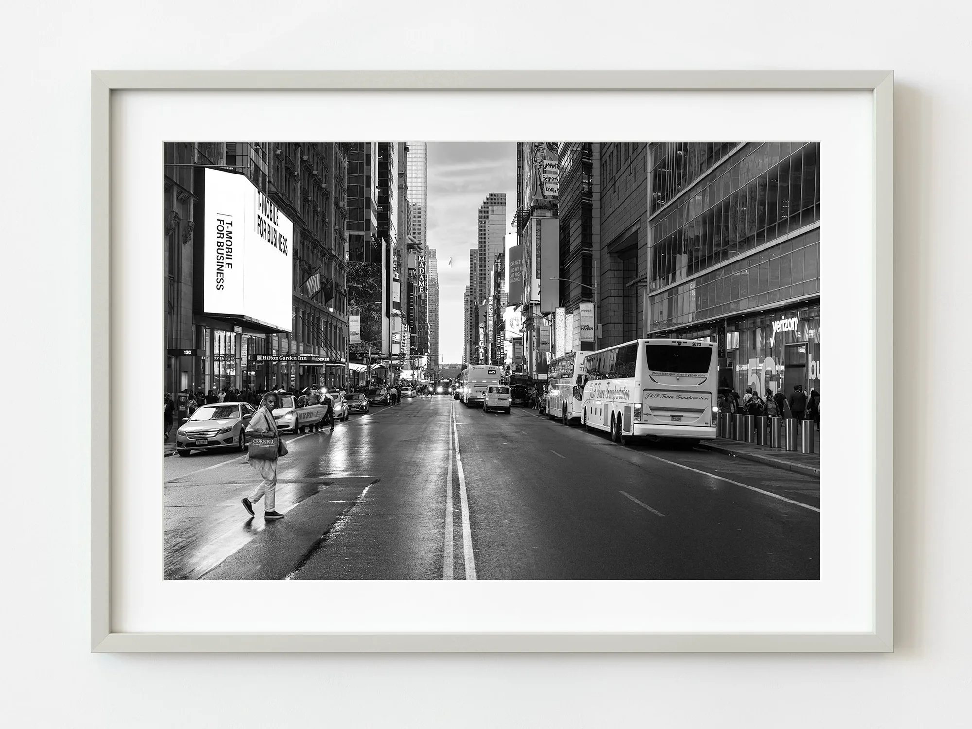
- New York 42nd street early evening | Limited Edition of 10: A black-and-white blue-hour photograph of 42nd Street, with headlights and taillights creating movement and a single figure crossing the road. High-contrast night scenes like this gain depth from a glossy surface, but they also show glare badly if hung opposite a window—so placement matters more than the paper choice here.
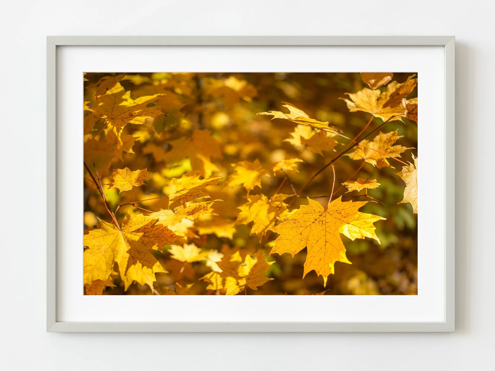
- Soft autumn light on golden maple leaves | Limited Edition of 10: Golden maple leaves in soft autumn light, with delicate veining and warm, muted color. Low-contrast, warm-toned subjects like this tend to read more clearly on matte, where the surface doesn't compete with fine detail in the leaves.
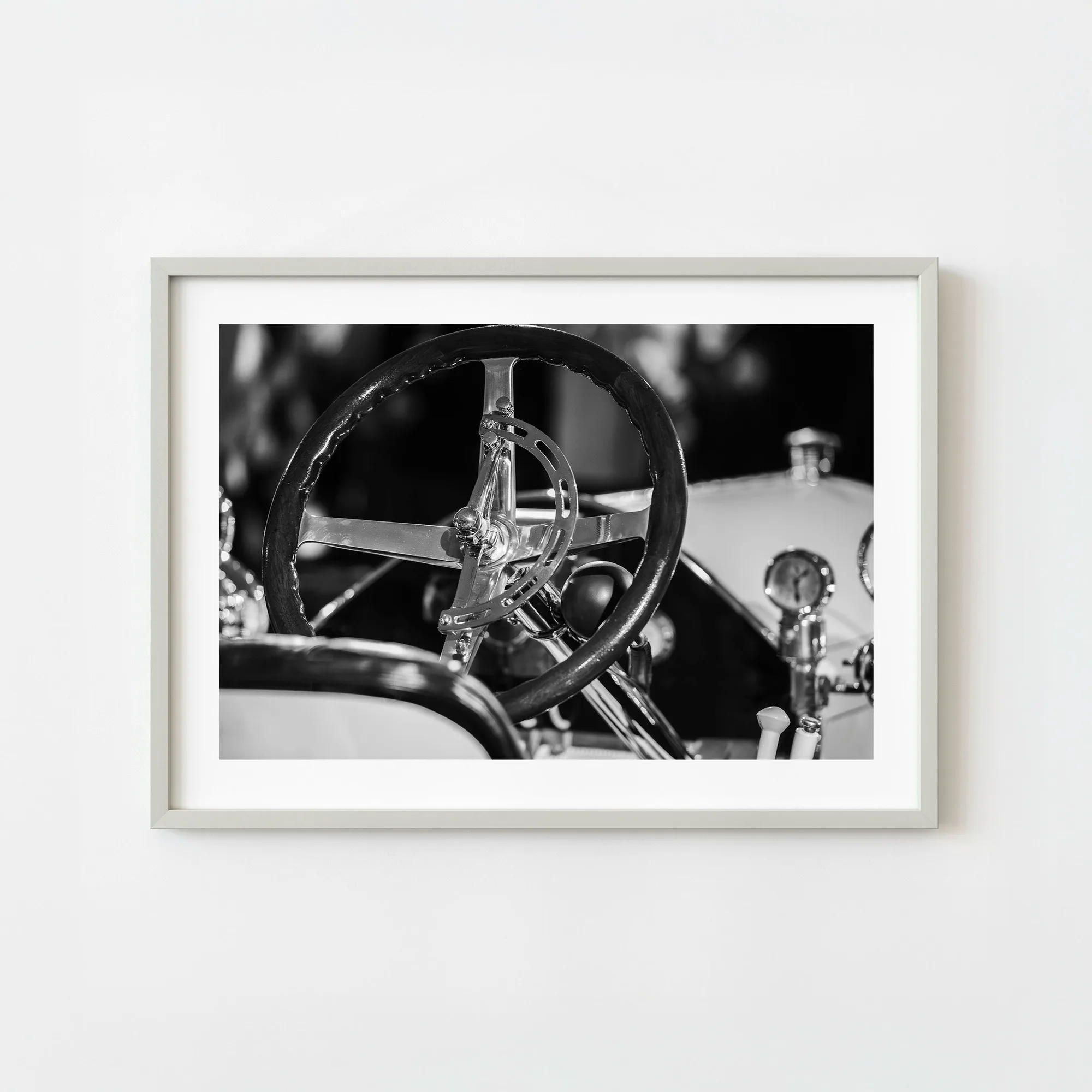
- United States Michigan Cadillac Steering Wheel Interior Monochrome Vintage Car Detail | Limited Edition of 10: A monochrome study of a vintage Cadillac steering wheel, focused on polished metal, smooth curves, and crafted mechanics. Polished metal and smooth curves are exactly the kind of highlights that glossy paper amplifies—but in a bright room, matte keeps those highlights from turning into reflections of your lamp.
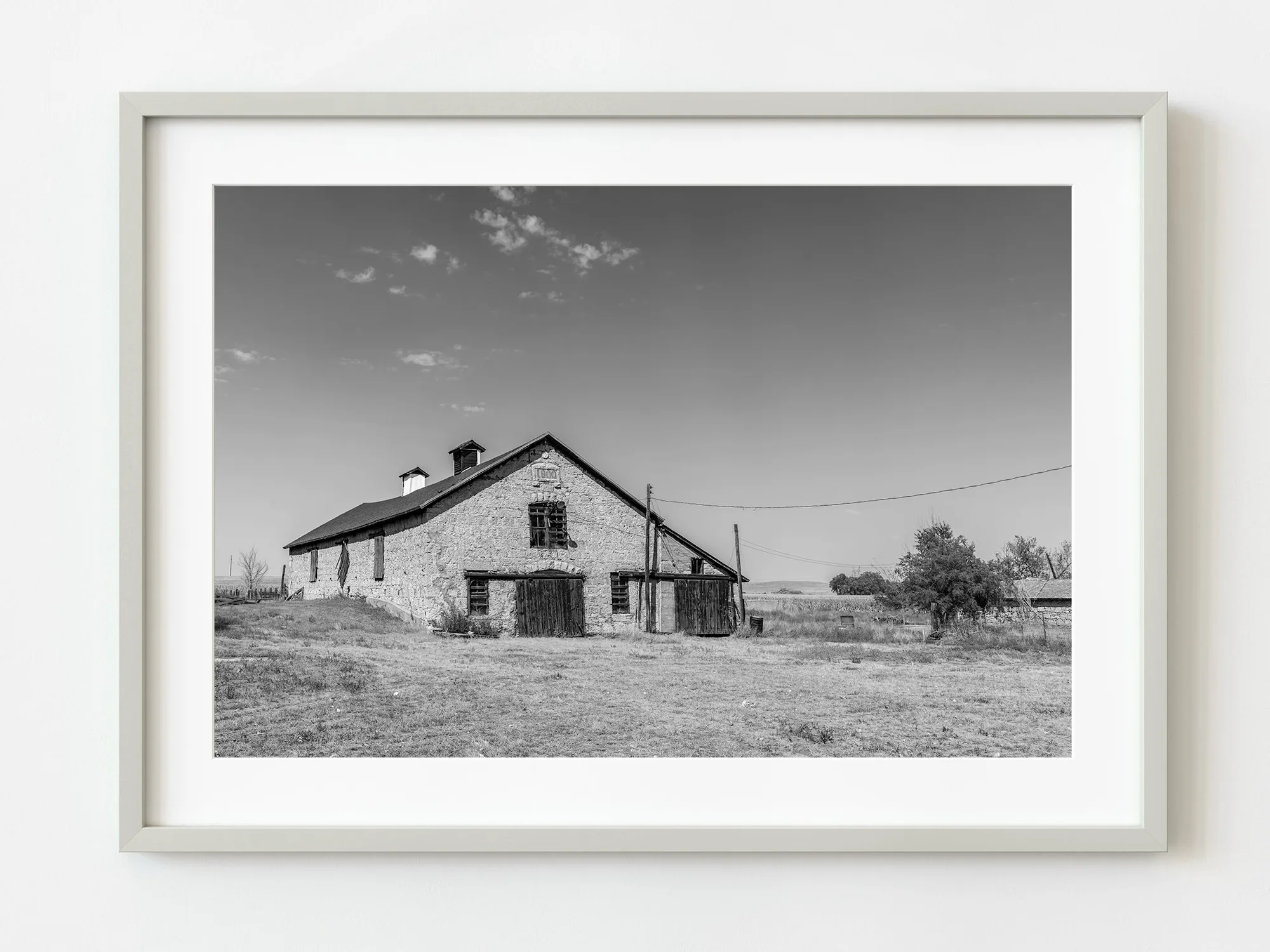
- Century old stone barn in Nebraska | Limited Edition of 10: A century-old stone barn in Nebraska, with weathered stones and aging timbers, photographed as a study in rustic Americana. Weathered texture and mid-tone detail often hold up better on matte, where the paper's slight texture echoes the subject rather than fighting it.
Which finish fits your situation
Choose matte if
- The print will hang in a bright room with windows, lamps, or overhead lighting
- You'll view the art from an angle or walk past it rather than standing directly in front of it
- The photograph has soft, low-contrast detail like foliage, mist, or weathered texture
- You want a surface that's forgiving of fingerprints and minor handling
Choose glossy instead if
- The print will hang in a controlled-light spot with no direct light sources
- You want maximum depth in night scenes or high-contrast black-and-white work
- You're displaying unframed and want the surface itself to add vibrancy
- You don't mind placing the print carefully to avoid reflections