Quick answer
Pair a busy batik with a solid that shares one of its undertones to create a cohesive quilt without visual chaos.
Why batik and solid fabrics work together
Batik fabrics have irregular, hand-drawn-like patterns that can dominate a quilt top. Solids anchor those patterns and give the eye a place to rest. The contrast between a textured batik and a flat solid makes both stand out more than they would alone.
A common worry is that the busy batik will clash with a plain solid. The fix is simple: pick a solid that matches the darkest or lightest color in the batik. For example, a brown batik like Riley Blake Expressions Batiks Elementals: Polka Pop in Espresso pairs naturally with a light solid that echoes its warm undertone.
Choosing the right solid for your batik
Not every solid works with every batik. The key is to look at the batik's background color—not just the print. If the batik has a dark brown base, a medium or light solid in a similar warm tone will blend without fighting.
Kona Cotton solids from Robert Kaufman are a reliable choice because they come in a wide range of colors and have a consistent matte finish. The Kona Cotton Purple, for instance, can work with batiks that include purple or blue accents, but it would clash with a warm brown batik. Always hold the solid next to the batik before cutting.
Steps to mix batik and solid fabrics
- Step 1: Identify the batik's dominant undertone: Hold the batik fabric in natural light. Look past the printed pattern and note the overall color cast—warm (brown, orange, red) or cool (blue, green, purple). This undertone will guide your solid choice. A common mistake is matching the print color instead of the background. The background sets the quilt's mood.
- Step 2: Select a solid that shares that undertone: Choose a solid fabric that is either lighter or darker than the batik's background. For a dark brown batik like the Riley Blake Espresso, a cream or tan solid creates a soft contrast. For a cool batik, a solid in a matching cool tone works best. Avoid solids that are the same value as the batik's background—they will blend in and lose the contrast you want.
- Step 3: Test with a small block before cutting the whole quilt: Cut a 6-inch square of each fabric and sew them together. Step back and see if the combination feels balanced. If the batik overpowers the solid, try a lighter or darker solid. If the solid looks muddy, the undertones may not match. A quick test block saves fabric and frustration. If the test block looks flat, the pairing won't improve at a larger scale.
- Step 4: Use the solid as a spacer or sashing: Instead of alternating every block, use strips of solid fabric between batik blocks. This gives the eye a break and makes the batik patterns pop. Sashing also helps uneven batik edges line up neatly. Don't skip sashing just to save time—it can turn a chaotic quilt into a polished design.
- Step 5: Limit the number of batik prints in one quilt: Stick to one or two batik prints per quilt. Too many busy patterns compete for attention. Let the solid fabric carry the load of providing structure and calm. A common mistake is using three or more batik prints in one project. The quilt ends up looking cluttered instead of coordinated.
Product facts
-
RILEY BLAKE - Expressions Batiks - Elementals: Polka Pop - Espresso - K50163-: Riley Blake Expressions Batiks Elementals: Polka Pop in Espresso is a brown batik with a warm tone and item code K50163-. Its brown background pairs well with light or medium solids in warm neutrals, giving you a clear anchor for your solid fabric choice.
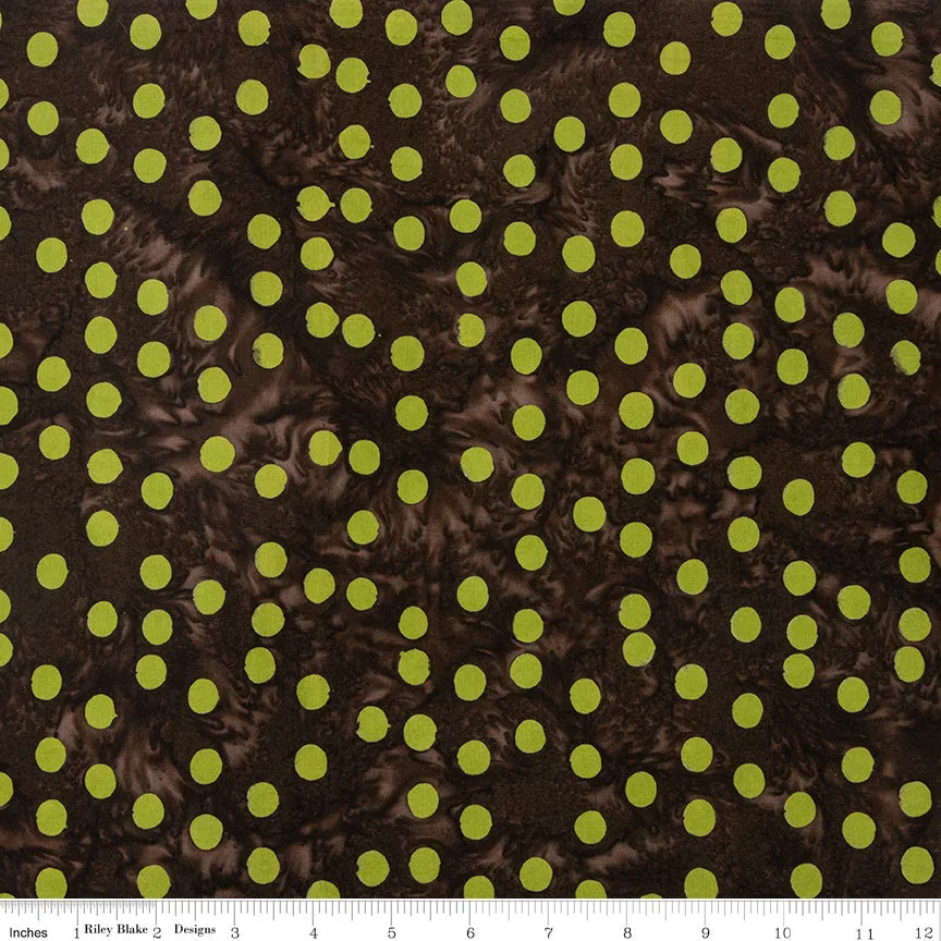
RILEY BLAKE - Expressions Batiks - Elementals: Polka Pop - Espresso - K50163-
-
KAUFMAN - Kona Cotton - Purple: Kona Cotton Purple from Robert Kaufman is a 100% cotton solid known for consistent quality and rich color. Its flat, even surface provides visual rest when paired with busy batiks, but only if the batik contains purple or blue undertones.

KAUFMAN - Kona Cotton - Purple