Quick answer
Yes, you can absolutely mix black-and-white and color prints in one room. The key is to unify them through a consistent framing style, a shared visual theme, or intentional spacing. Done right, the contrast between monochrome and color creates depth and keeps the eye moving across the wall.
Why the myth persists
Many people worry that a black-and-white print will look out of place next to a vivid color photograph. That fear comes from assuming every piece must match in palette—but art curation isn't about matching; it's about conversation. A monochrome cityscape can ground a grouping, while a color street scene adds energy. The real rule is consistency in presentation, not color.
How to make it work with fine art prints
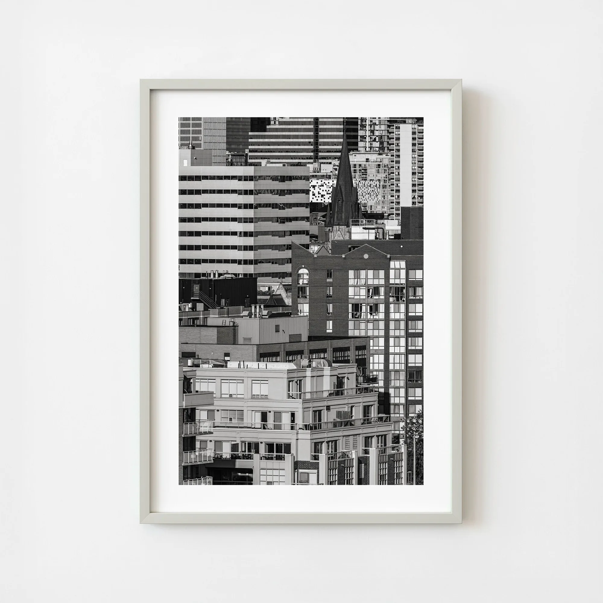
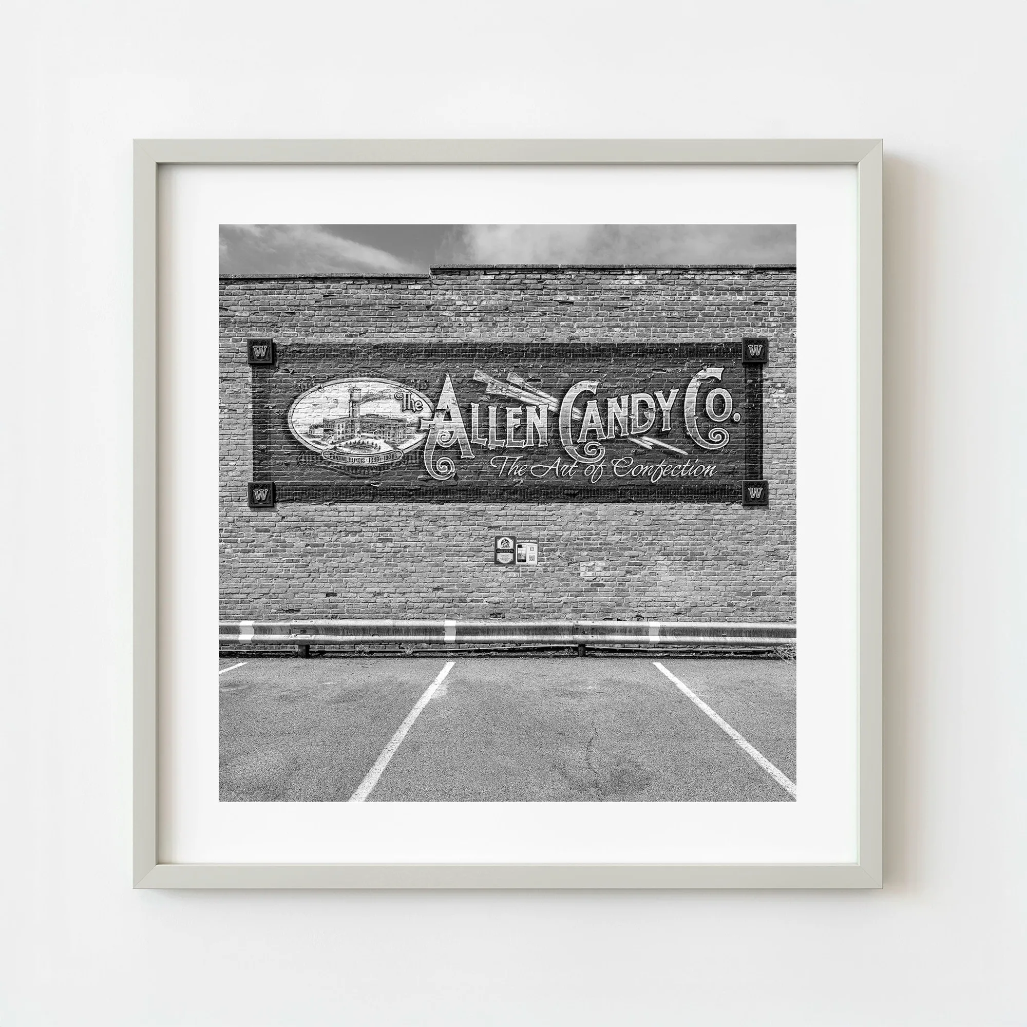
Start with a unifying element: choose prints with similar matting, frame color, or subject matter. For example, the "Canada Ontario Toronto Downtown Architecture Black And White Urban Cityscape Wall Art" shares an architectural focus with a color travel photograph of a historic mural. The black-and-white print emphasizes structure and line, while the color piece draws attention to texture and history. Together they tell a richer story about place.
Verdicts on common concerns
- Will monochrome clash with color?: Not if you use a consistent frame finish (e.g., all black or all natural wood). The frame becomes the visual link, not the artwork's palette. Unify frames, not colors.
- Do I need a theme?: Yes—a shared subject (architecture, travel, portraits) helps the eye connect pieces. The Toronto cityscape and Pontiac mural both explore place, so they belong together. Theme over palette.
- What about spacing?: Give each print breathing room. A 2–3 inch gap between frames lets the eye appreciate each image individually before seeing the whole arrangement. Space lets contrast shine.
Prints that work well together
- Canada Ontario Toronto Downtown Architecture Black And White Urban Cityscape Wall Art | Limited Edition of 10: This black-and-white cityscape pulls Toronto’s downtown core into a tightly layered composition of modern towers, mid-rise apartments, and historic architecture. The image is built on repeating patterns and overlapping lines. Its strong geometric structure makes it an ideal anchor for a mixed gallery wall. The lack of color lets it sit comfortably next to vibrant prints without competing.
- United States Illinois Pontiac Allen Candy Company Historic Mural Black and White Street Scene Wall Art | Limited Edition of 10: This black and white photograph captures the Allen Candy Company mural, a beautifully restored piece of Americana that sits just a few blocks from the heart of the town. Though monochrome, the mural's detailed storytelling and historic subject matter naturally complement color travel photography. It proves that subject can bridge the color gap.