Quick Answer
Choose monochrome photography wall art when the room already has strong color, pattern, or a view you do not want to compete with; choose a color print when the wall is the main event and you want the image to carry the palette. In modern rooms, the deciding factor is usually whether you want the art to blend into the architecture or become its focal color source.
How Each Choice Changes the Room
Monochrome prints work like a visual pause. Because they contain no hue, they let a sofa, rug, or artwork in another medium hold the color conversation. In a modern room with a bold accent chair or a saturated rug, a black and white print keeps the wall from arguing with the furniture. Color prints do the opposite: they introduce a palette the rest of the room can either echo or deliberately contrast. If your walls, floors, and upholstery are all neutral, a color photograph may be the only strong color in the space.
Scale, Detail, and Where the Eye Lands
Black and white images often read as more graphic because contrast does the work that color normally does. That can make a monochrome print feel larger and more architectural on a wall, especially in a room with clean lines. Color prints can carry more information at a glance, which helps in a space where people sit far from the wall and want the image to hold attention across the room. Neither is better; the question is whether you want the print to behave like structure or like a scene.
Practical Constraints You Cannot Ignore
Light changes the answer. A room with strong direct sun will shift how any print reads over the course of a day, and a monochrome image tends to stay more consistent because it has no color to warm or cool. Color prints can look different under morning and evening light, which is worth checking before you commit to a large size. If you are choosing between sizes, order the dimension that matches your viewing distance rather than the one that matches the wall width.
Trade-Offs to Weigh Before You Buy
- Monochrome: calm vs. impact: Black and white prints rarely fight your existing palette, but they also will not add color to a neutral room. If the space already feels flat, a monochrome print may not be enough on its own. Choose monochrome when the room already has color elsewhere.
- Color: energy vs. competition: A color print can anchor a neutral wall, but it competes with strong rugs, upholstery, or art in other media. In a busy room, color prints can make the wall feel crowded. Choose color when the wall is the main event.
- Light and consistency: Monochrome images hold their look more steadily across changing daylight; color prints can shift warmer or cooler from morning to evening. Check your print in the room's actual light before finalizing size. If the room gets strong sun, test a small size first or plan for consistent artificial light.
Two Prints That Show the Difference
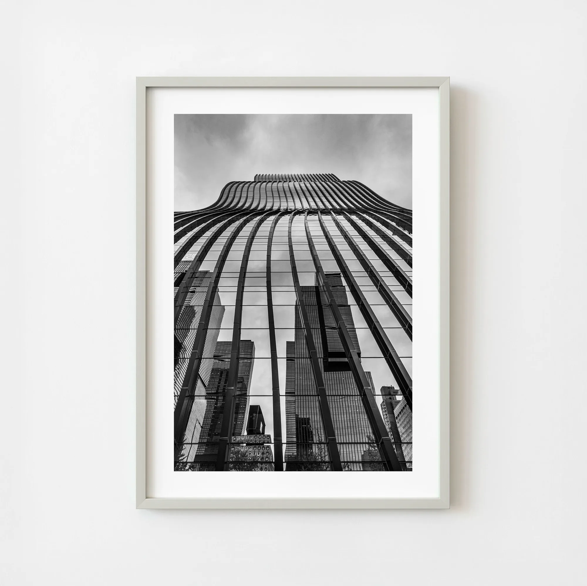
- South Korea Seoul Seocho Modern Skyscraper Reflection Monochrome Architecture Wall Art | Limited Edition of 10: A monochrome architectural photograph of a modern tower in Seoul's Seocho district, where the glass façade reflects surrounding skyscrapers. This is the monochrome choice for a modern room: the reflected city reads as pattern and structure, so the print reinforces clean architectural lines instead of introducing a new color.
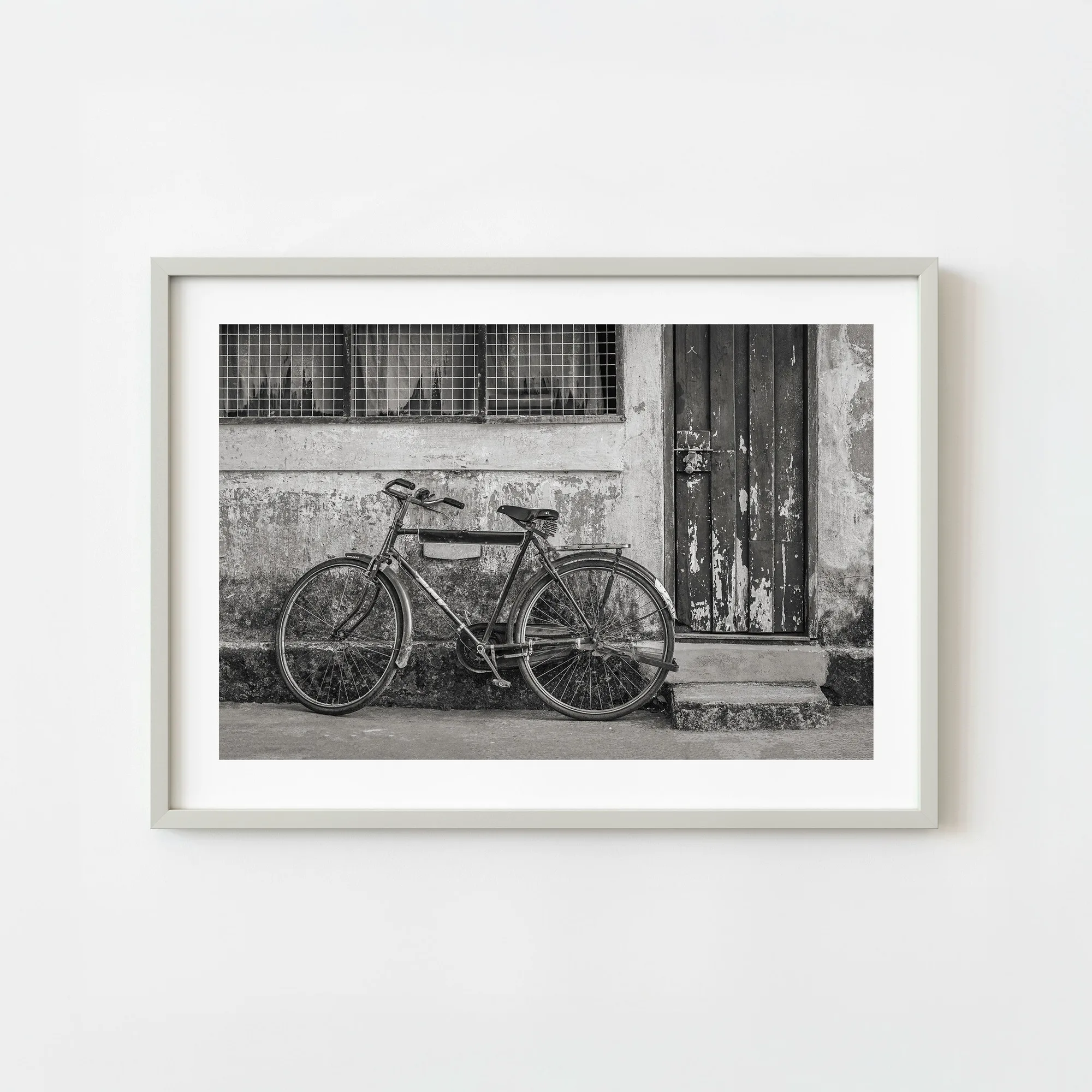
- India Vintage Bicycle Leaning On Weathered Wall Monochrome Street Scene Black And White Wall Art | Limited Edition of 10: A black and white street scene of a vintage bicycle leaning against a weathered wall in India. A quieter monochrome option with texture and everyday subject matter, useful when you want black and white print decor that feels lived-in rather than graphic.
Which Should You Choose?
Best for
- Rooms with strong existing color, pattern, or a view where you want the art to recede
- Modern interiors with clean lines where you want the print to read as architecture
- Collectors building a cohesive black and white print decor scheme across several walls
Not for
- Neutral rooms that need a color focal point — choose a color print instead
- Spaces where the wall must compete with a busy rug or vibrant upholstery and you want the art to dominate
- Buyers who want the image to carry warmth and atmosphere that only color can provide