Quick Answer
A readable dice set combines high contrast between the numbers and the die face, clear and bold font, and a finish that doesn't obscure the pips or numerals.
Why Contrast Matters Most
The single biggest factor in dice readability is contrast. If the numbers are the same color as the die body or blend into the finish, they become hard to spot, especially under dim table lighting. High contrast dice—like dark numbers on a light face or light numbers on a dark face—are almost always easier to read at a glance.
A finish can change contrast too. A matte or lightly textured surface can diffuse light and reduce glare, while a glossy or metallic finish might reflect light and make numbers less distinct. When choosing a set, consider how the finish interacts with the color of the numbers.
Font Style and Size
The font used for numbers affects legibility more than many players realize. Bold, clean numerals with simple strokes are easier to read quickly than ornate or thin fonts. Also, the size of the numbers relative to the die face matters—larger numerals are easier to see from across the table.
Pips (dots) on a d6 can be just as readable as numerals if they are large and well-spaced. Some players prefer pips for their classic look, but others find numerals faster to parse. It's a matter of personal preference, but consistency across the set helps.
Material and Lighting Conditions
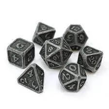
The material of the dice influences how light interacts with the surface. Metal dice, for instance, often have a solid heft and a distinct finish that can either enhance or reduce contrast. A darkened metal finish with unpainted numbers might look stylish but could be harder to read in low light.
Lighting at your game table plays a huge role. If you play in a dim room or under a single lamp, you'll want dice with strong contrast and a finish that doesn't create glare. Testing your dice in your usual playing environment is the best way to know if they'll work for you.
Frequently Asked Questions
What is the most important factor for dice readability?
Contrast between the numbers and the die face. High contrast dice are easier to read quickly, especially in low light. Check the contrast in the lighting you actually play in.
Do metal dice read well?
It depends on the finish and whether the numbers are painted. A dark, unpainted metal finish can be readable if the numbers stand out, but test it under your table lighting. Test metal dice in your game environment before buying.
Are pips or numerals easier to read?
Numerals are often faster to parse, but large, well-spaced pips can be equally clear. It's mostly personal preference—choose what you can read at a glance. Try both styles to see which you prefer.
A Readable Metal Option
-
Die Hard Dice 7-Dice Set - Mythica Dark Iron: The Mythica Dark Iron set uses an unpainted Raw Steel finish, giving a dark but readable look. If you prefer a dark aesthetic, this set shows that a raw finish can still keep numbers legible without needing paint.
Die Hard Dice 7-Dice Set - Mythica Dark Iron