Quick answer
Choose one focal print, then build around it with two or three supporting prints at different scales and at least one solid or near-solid blender. Aim for roughly 60% background or low-contrast fabrics, 30% mid-tone supporting fabrics, and 10% accent, and check value in grayscale before you cut.
Color planning is where most quilts are won or lost. You can follow a pattern perfectly and still end up with a top that feels muddy or frantic, usually because the prints are all the same visual weight or the values sit too close together.
This FAQ answers the questions quilters actually ask while standing in front of a fabric wall or a growing online cart: how many fabrics, how much solid, what scale goes with what, and when to stop adding.
How do I start choosing quilt colors without overthinking it?
Start with one fabric you genuinely love and treat it as the anchor. Pull its colors out one at a time, then look for fabrics that repeat two or three of those colors rather than matching all of them. Perfect matching tends to look flat; partial matching looks collected.
A useful shortcut is to choose a color family, a neutral, and one surprise. For example, warm golds and mustards, a soft eggshell neutral, and a single deep charcoal or near-black for contrast. That structure gives you room to swap individual prints later without rebuilding the whole plan.
- Photograph your pull on your phone, then view it in black and white to check value contrast.
- Step back three or four feet; if everything blurs into one tone, you need more contrast.
How many fabrics should a quilt actually use?
There is no fixed number, but the ratio matters more than the count. A workable default is one focal print, two to four supporting prints, and one or two blenders or solids. Scrappy quilts break this rule on purpose, but they usually keep the value range tight so the variety reads as texture instead of chaos.
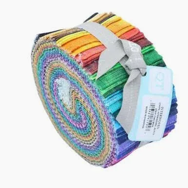
If you are working from pre-cuts, the fabric count is partly decided for you. A jelly roll gives you a coordinated set already chosen to play well together, which removes a lot of the guesswork for strip-based patterns.
- More prints means you need stronger value contrast to keep the design readable.
- Fewer prints means scale variety becomes your main source of interest.
What does fabric color balance mean in a quilt?
Balance is about visual weight, not equal yardage. A large expanse of a pale, low-contrast print reads as quiet background, while a small amount of a dark or saturated print pulls the eye. If your quilt feels heavy on one side, the fix is usually to redistribute the darkest or brightest fabric rather than to add more fabric.
Think in three roles: background, supporting, and accent. Background fabrics are the ones you can look past, supporting fabrics carry the pattern, and accents are the ones you notice first. Assign every fabric a role before you cut, and most balance problems disappear.
- If two fabrics compete for attention, one of them is probably an accent that should be used sparingly.
- Repeat each accent at least three times across the quilt so it looks deliberate.
How do I mix prints and solids without it looking flat?
Solids and near-solid blenders give the eye somewhere to rest, which is exactly why busy quilts need them. Use solids where you want the pattern's shape to be the star, and use prints where you want movement. A crosshatch or textured blender sits in between: it reads as a solid from a distance but adds subtle interest up close.
A common mistake is using a solid that is too close in value to the surrounding prints. It disappears. Either push the solid lighter or darker than its neighbors, or accept that it is acting as background and give it more space.
- Pair one large-scale print with small-scale prints so they do not fight.
- If a print has a strong directional motif, check how it looks rotated before committing.
Why does fabric scale matter so much in quilts?
Scale controls how the quilt reads from across the room. Large-scale prints need bigger pieces to show their motif; cut them small and you lose the design you paid for. Small-scale prints and blenders can be cut into tiny units without turning to mush, which makes them ideal for intricate piecing.
A reliable mix is one large, two medium, and several small-scale fabrics. If every print is medium, the quilt looks uniformly noisy. If every print is tiny, it looks like texture with no focal point.
- Fussy-cut large prints for at least a few blocks so the motif survives.
- Use small-scale prints in sashing, borders, and background areas.
Do I need to buy fabric in person or can I plan online?
Online planning works well if you use the product photos and descriptions carefully. Look for stated designer, collection, colorway, and width, and check whether the listing tells you the cut size. Half-yard cuts are common for quilting cotton and give you a manageable amount to audition before committing to yardage.
The limitation is color accuracy across screens, and many listings do not state exact value or contrast. When a specification is missing, treat it as unknown rather than assuming, and order a small cut first if the color is critical to your plan.
- Buy one half yard of a risky color before buying the full amount.
- Keep a note of designer and collection names so you can reorder the same dye lot family later.
Color planning checkpoints
Value check
Photograph your fabric pull and convert it to grayscale. If the fabrics merge into one tone, add a lighter neutral or a darker blender. Contrast is what makes a color plan readable from across the room.
Scale check
Lay your fabrics side by side and confirm you have at least one large-scale print, one or two medium prints, and several small-scale or blender fabrics. If everything is medium, the quilt will look uniformly busy.
Ratio check
Assign each fabric a role as background, supporting, or accent, and aim for roughly 60/30/10 by visual weight rather than yardage. Accents should appear at least three times so they look intentional.
Buy check
Order a half yard of any color you are unsure about before committing to larger yardage, and note the designer and collection for reordering. Screen color is the biggest unknown in online fabric planning.
Fabric facts that help your color plan
- QT Fabrics Interwoven Jelly Roll (42 pcs): 42 pre-cut strips of 2.5" x 44" fabric in coordinating woven-inspired prints and colorways from the Interwoven collection. A coordinated pre-cut removes much of the color-matching work for strip patterns, so you can focus your choices on value and scale instead of hunting down individual prints.
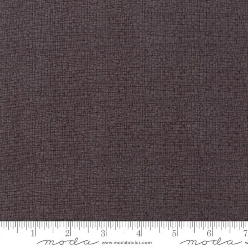
- Thatched – Charcoal 1/2 Yard: A near-black dark gray crosshatch blender by Robin Pickens for Moda Fabrics, sold as a 1/2 yard cut at 44/45" wide quilting weight. This is the kind of dark blender that supplies contrast and weight in a quilt, which is often what a too-soft color plan is missing.
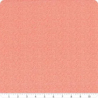
- Thatched – Petal 1/2 Yard: A soft, delicate crosshatch blender by Robin Pickens for Moda Fabrics, sold as a 1/2 yard cut at 44/45" wide quilting weight. Use it as a quiet background or supporting fabric when your focal prints are busy, since the subtle texture adds interest without competing.
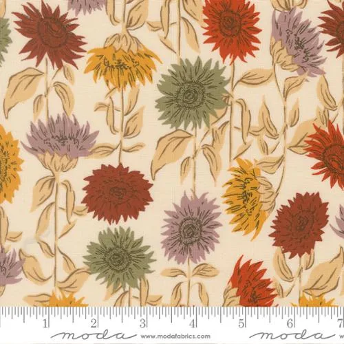
- Moda Windfall - Eggshell Sunflowers 1/2 yd: A 100% quilting cotton print from the Windfall collection by Stephanie Sliwinski for Moda Fabrics, with a soft eggshell background and sunflower motifs. A light-background print like this works as a background fabric in a warm palette and gives you a natural place to pull accent colors from.
Pick one fabric you love, give every other fabric a clear job, and check value and scale before you cut. A simple, deliberate plan almost always beats a bigger pile of pretty prints.