Quick answer
Start with one fabric you love, then build around it using a simple ratio: one dominant color, one secondary color, and one accent. Pull fabrics in different scales and values so the quilt reads clearly from across the room. Test your choices together before cutting, and trust your eye over any rule.
Choosing colors for a quilt is less about memorizing the color wheel and more about learning to see how fabrics talk to each other. A quilt color palette works when there is contrast in value, variety in scale, and a clear leader that tells your eye where to look.
This guide gives you an ordered process you can repeat for any project. You will learn the basics of quilt color theory, how to test a palette before you cut, and where a planned fabric bundle can save you time.
Start with one fabric you love
Every strong quilt color palette begins with a single fabric that makes you happy. It might be a bold print, a solid, or even a scrap from a previous project. That fabric becomes your anchor, and every other choice gets measured against it.
Common mistake: picking five fabrics you like individually but that have no relationship to each other. Instead, pull your anchor fabric and ask what colors are already hiding inside it. A print with pink, teal, and cream gives you three directions to build from.
- Place your anchor fabric on a neutral surface like a gray cutting mat or a white sheet of paper so the colors read true.
- If you cannot decide, choose the fabric with the most colors in it. It gives you more to work with.
Decide on a dominant, secondary, and accent color
A quilt reads best when the colors have a hierarchy. Choose one dominant color that will cover roughly half the quilt, a secondary color for about a third, and an accent for the rest. This ratio keeps the quilt from feeling flat or chaotic.
Common mistake: giving every color equal weight. When all colors compete, the eye has nowhere to rest. Let one color lead, and use the accent sparingly so it actually pops.
- If you want a calm quilt, keep the dominant and secondary colors close in value and use a small accent for spark.
- If you want a bold quilt, choose a dominant and accent that contrast sharply in value.
Use value contrast to make the pattern visible
Value is how light or dark a fabric is, and it matters more than hue in most quilts. Two fabrics can be different colors but the same value, which makes them blur together. Squint at your fabrics or take a phone photo in black and white to check.
Common mistake: choosing fabrics that all sit in the middle of the value scale. Without light and dark, your piecing disappears. Add at least one very light and one very dark fabric to give the design structure.
- A quick test: stack your fabrics and look at them from across the room. If you cannot tell them apart, they are too close in value.
- Solids and low-volume prints are useful for controlling value without adding visual noise.
Mix fabric scales and textures
Color is only half the story. Fabric scale and texture affect how a quilt color palette feels. Pair large-scale prints with small-scale prints and solids so the eye has variety without confusion.
Common mistake: using all large-scale prints. They fight each other and make the quilt feel busy. A few quiet solids or blenders give the bold prints room to breathe.
- A good rule of thumb: for every large print, include a small print and a solid or blender.
- Textured fabrics like canvas can add depth, but they behave differently in piecing. Test a seam before committing.
Test your palette before you cut
Before you rotary cut a single strip, lay your fabrics out together in the order you plan to use them. Step back, take a photo, and look at it in black and white. This catches value problems and clashing colors early.
Common mistake: cutting first and hoping it works. Fabric is not cheap, and a five-minute test saves hours of re-cutting. If something feels off, swap one fabric rather than starting over.
- Cut small squares and arrange them in your planned block to preview the effect.
- If you are short on time, a pre-coordinated bundle removes the guesswork and keeps the palette consistent.
Your step-by-step quilt color selection process
- Pick your anchor fabric: Choose one fabric you love and pull three to five colors from it. This becomes the seed of your quilt color palette. Checkpoint: if you cannot find at least three colors in it, pick a different anchor.
- Assign dominant, secondary, and accent roles: Decide which color will cover about half the quilt, which will cover about a third, and which will be the accent. Write it down so you do not drift. Checkpoint: the accent should be the smallest amount and the most saturated or contrasting color.
- Test value with a black-and-white photo: Lay your fabrics together and photograph them in black and white. You want to see clear light, medium, and dark separation. Checkpoint: if everything looks the same shade of grey, add a lighter or darker fabric.
- Add scale and texture variety: For each large-scale print, add a small-scale print and a solid or blender. This keeps the quilt interesting without visual chaos. Checkpoint: step back and squint. If your eye jumps around uncomfortably, remove one busy print.
- Do a final layout test before cutting: Cut small squares, arrange them in your block, and view from a distance. Adjust one fabric at a time if needed. Next step: once the palette reads clearly, cut with confidence and enjoy the piecing.
Fabric facts that help with color planning
- Lipstick Painter's Palette Solid from Paintbrush Studio Fabrics: 100% cotton, 150GSM lightweight, 44" wide, with 3-5% shrinkage and machine wash cold, tumble dry low care. A solid like this is ideal for controlling value in a quilt palette. Pre-wash if you want to minimize shrinkage before piecing.
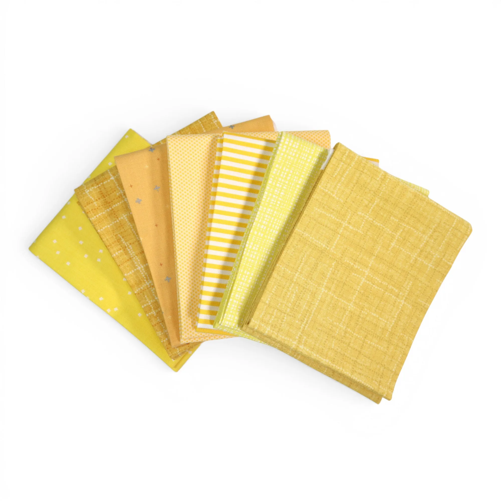
- Yellow (7) Piece Fat Quarter Bundle: Seven fat quarters from Riley Blake Designs in different shades and tones of yellow, each approximately 18" x 22". A single-hue bundle gives you built-in value variety without hunting for matching fabrics, which makes it a fast starting point for a monochromatic quilt.
- Calico Rain Drops by Quilter's Cotton: 100% cotton quilting fabric from Springs Creative, 44 to 45 inches wide, part of the Southwest Calico line. A mid-scale print like this can act as a secondary color or a blender, adding texture without overpowering your dominant fabric.
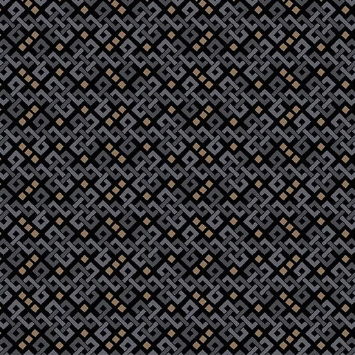
- Mazed Texture Black/Grey from Into the Wild by Benartex: Approximately 44/45 inches wide, style 16569-11. Black and grey prints are useful as a dark value anchor. They add contrast that makes lighter colors read as brighter.
Color selection for quilting gets easier with practice. Start with one fabric, build a clear hierarchy, check your values in black and white, and test before you cut. Your best quilt color palette is the one that makes you want to keep sewing.