Quick answer
For a blue and cream quilt, anchor your palette with one dark blue, one light blue, and two to three cream or off-white prints that differ in scale. If you want a coordinated shortcut, start with a pre-cut bundle like the Awakenings Half Yard Bundle, which already balances soft sky blues, deep navy, gentle greens, and warm neutrals. Add solid cream yardage for background space, and use a wide backing to finish without piecing.
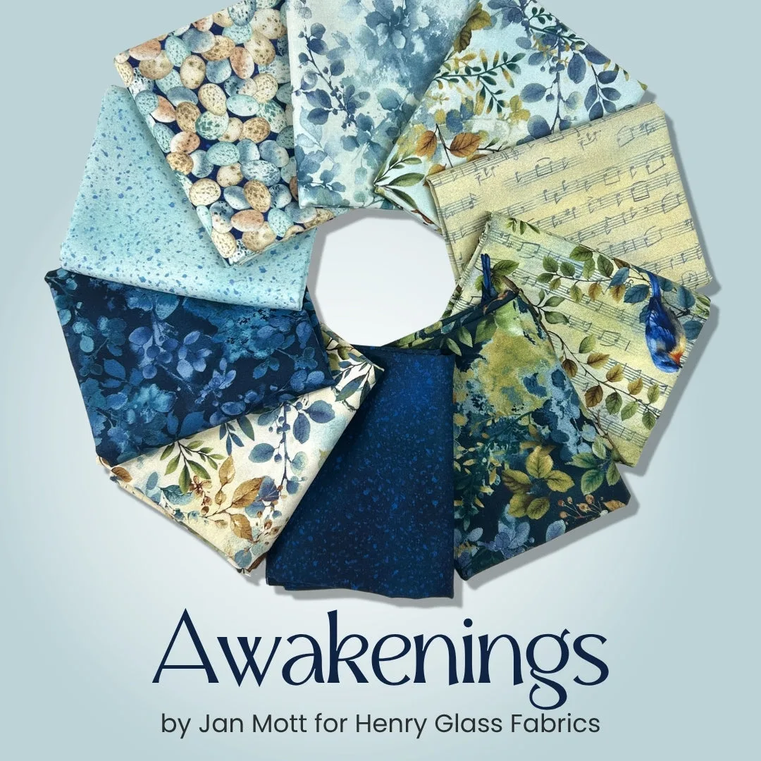
Awakenings Half Yard Bundle
Blue and cream is one of the most forgiving color palettes in quilting, but it can still go flat if every blue sits at the same value or every cream reads as the same shade of white. The trick is treating your fabric selection like a small composition: decide where the eye should rest, then choose prints and solids that support that plan.
This guide walks through the decisions that matter most when you are buying fabric for a blue and cream quilt. You will see how to choose a quilt color palette, when a fat quarter bundle saves time, when yardage is smarter, and how to avoid the muddy middle that makes so many two-color quilts look washed out.
Start with value, not color
Value is how light or dark a fabric appears when you squint. In a blue and cream quilt, the cream acts as your light, and the blue carries the dark. If you pick a light blue and a light cream, the whole quilt turns pale and low-contrast. If you pick a dark navy and a bright white, the contrast can feel sharp and graphic. The sweet spot is usually one clear dark blue, one medium blue, and creams that range from warm ivory to soft white.
A quick test: lay your candidate fabrics on a table and take a phone photo in black and white. If the blues and creams separate into distinct light and dark shapes, your value plan works. If everything blends into a similar gray, swap one fabric for a stronger dark or a cleaner light.
- Use one fabric as your darkest value and repeat it in several blocks to create rhythm.
- Keep cream prints subtle; busy cream prints can compete with blue focal prints.
Choose a fat quarter bundle or build your own
A fat quarter bundle is the fastest way to get a coordinated quilt color palette without second-guessing every bolt. Bundles from a single collection already share a dye lot and design style, so the blues and creams relate to each other. That is a real advantage when you are buying online and cannot hold the fabric. The trade-off is that you get what the designer chose, not exactly what you might have picked yourself.
If you prefer control, buy yardage in the specific blues and creams you love. Yardage is better when you need more than a fat quarter of a background fabric, when you want to repeat one blue throughout a large quilt, or when you are matching an existing piece. Many quilters do both: a bundle for the print mix and extra yardage for the background and binding.
- Check whether the bundle includes enough light cream for your background; if not, add solid yardage.
- If you buy individual cuts, order all blues at the same time so dye lots match.
Mix print scale and texture
A blue and cream quilt feels richer when the prints vary in scale. Pair a large floral or botanical with a small dot, a stripe, or a subtle blender. If every print is the same size, the quilt looks busy but not interesting. If every print is tiny, it can read as a solid from a distance. Aim for one large, one medium, and one small print in each color family.
Texture matters too. Flannel, linen-look cotton, and crisp quilting cotton all reflect light differently. Mixing a soft flannel backing with smooth cotton top is fine, but keep the top fabrics similar in weight so they piece together evenly. If you are unsure, stick with 100% cotton for the top and use a wide flannel for the back.
- Take a photo of your fabric pull from a few feet away to check the mix.
- Add one unexpected accent, like a gentle green or warm neutral, if the blue and cream feels too rigid.
Plan your background and backing early
Background fabric is the quiet space in a blue and cream quilt. It is usually a cream or off-white solid or subtle tonal print. Because you need more of it than any other fabric, buy it first or at least decide on it before you fall in love with a bundle. If your background is too yellow, it can make blues look dull; if it is too blue-white, it can feel cold. A warm cream is the safest middle ground.
For the backing, a wide fabric saves you from piecing a seam down the middle of a large quilt. A 108-inch wide backing is especially useful for bed quilts. Check the required backing size for your quilt pattern before ordering, and remember that wide backing is often sold in fixed cuts.
- Measure your quilt top and add 8 inches to both width and length for longarm quilting.
- If you choose a pieced back, use leftover blue and cream prints to make it a design feature.
Avoid common blue and cream mistakes
The most common mistake is choosing too many mid-tone blues that all look the same. Without a clear dark and a clear light, the quilt loses its structure. Another mistake is using a cream that is too similar in value to a light blue, which makes the pattern disappear. Finally, do not forget the binding. A dark blue binding frames a cream-heavy quilt beautifully, while a cream binding can make the edges vanish.
If you are working from a pattern, read the fabric requirements before you shop. Patterns often list background, accent, and binding separately. If the pattern calls for a fat quarter bundle, check how many fat quarters it needs and whether the bundle you like has enough light values. If a specification is not listed, treat it as a question to ask the shop rather than a guess.
- Lay out your fabrics in the order you plan to use them and squint; adjust any fabric that disappears.
- Buy a little extra of your background and binding fabric; running short mid-project is frustrating.
Decision rules for buying blue and cream fabric
- Rule 1: Buy the background first: Decide on your cream or off-white background before you buy accent blues. You need more of it than any other fabric, and it sets the warmth or coolness of the whole quilt. If you cannot find a background you love, no bundle will fix the quilt.
- Rule 2: Use a bundle for coordination, yardage for control: A fat quarter bundle is best when you want a designer-matched quilt color palette quickly. Buy individual yardage when you need large amounts of one blue or cream, or when you are matching an existing fabric. Many quilters combine both: bundle for prints, yardage for background and binding.
- Rule 3: Check value in black and white: Photograph your fabric pull in grayscale. You should see at least three distinct values: dark blue, medium blue, and light cream. If two fabrics merge, replace one. Value contrast does more for a blue and cream quilt than the exact shade of blue.
- Rule 4: Match backing width to quilt size: For quilts wider than about 80 inches, a 108-inch wide backing like the Blank Quilting Spin Flannel Green saves you from piecing a seam. Check the cut increment before ordering. Measure your quilt top, add 8 inches, and compare that to the backing dimensions.
- Rule 5: Plan binding as part of the palette: A dark blue binding frames a cream-heavy quilt and hides wear. A cream binding can disappear against a cream border. Choose binding after the top is laid out, not before. If you are unsure, buy a half yard of your darkest blue for binding.
Fabric options that fit a blue and cream plan
- Awakenings Half Yard Bundle: This 10-piece half yard bundle features soft sky blues, deep navy tones, gentle greens, and warm neutrals, with delicate florals, leafy botanicals, and artistic textures. It gives you a coordinated blue and cream-friendly palette in one purchase, so you can skip the guesswork of matching dye lots and print styles.
- Heima Pebbles Snow A-1633-L: Heima Pebbles Snow is from the Heima collection by Gudrun Erla of GE Designs for Andover Fabrics, and fabric is cut in 1 yard increments, not continuous. A light, pebble-textured blender like this works as a quiet cream or snow accent that adds subtle movement without competing with your main blue prints.
- Blank Quilting Spin Flannel Green 108" Wide Backing Fabric - 3995F-66 - 3 YARD: This is a three yard cut of 108-inch wide Spin Flannel Green, 100% cotton, and fabric is cut in 3 yard increments. A wide backing lets you finish a large blue and cream quilt without a center seam, and the fixed three-yard cut simplifies ordering for bed-size projects.
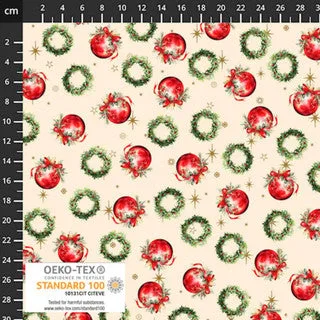
- Vintage Christmas Balls Cream 4504-173: Vintage Christmas is a tossed allover print on a warm cream ground with red ornament baubles, green holly wreaths, and tiny gold stars, at 45 inches wide. If you want a seasonal blue and cream quilt, this cream ground print can act as a focal or border fabric while still keeping the overall palette light.
Is a blue and cream quilt right for you?
Best for
- Quilters who want a calm, classic palette that works in traditional or modern settings
- Anyone building a quilt around a pre-cut bundle who wants a coordinated look without matching every bolt
- Bed quilts and lap quilts where a wide backing and simple color story simplify finishing
Not for
- Quilters who want a high-contrast, graphic look with many saturated colors
- Projects that require exact color matching to an existing room or fabric line not represented in your stash
- Beginners who have not yet checked value contrast and prefer to learn with a single-color fabric pull
A blue and cream quilt succeeds when you treat value as the structure and color as the decoration. Start with a background you love, add blues in at least two values, and choose a bundle or yardage based on how much control you want. If you keep the print scale varied and plan the backing early, the finished quilt will feel calm, intentional, and anything but flat.