Quick Answer
Pull your thread color from the middle tones of your fabric palette, not the loudest print or the lightest background. Then decide how much contrast you actually want: matching thread disappears into the quilt, while a slightly darker or lighter shade creates visible texture. Test your choice on a small quilted swatch before you commit to a full spool or a whole project.
Thread color is one of the quietest decisions in quilting and one of the most visible once the quilt is finished. A shade that matches too perfectly can make your piecing look flat, while a thread that is even one step too dark can turn a soft quilt into a grid of lines.
The good news is that you do not need an art degree to get this right. You need a repeatable process: sort your fabrics, decide how much contrast you want, test on a real swatch, and then match the spool to the job. This guide walks through that process step by step, including the mistakes that trip up most quilters.
Start With the Fabric, Not the Thread Aisle
Before you look at a single spool, lay your quilt fabrics together in the light you will actually sew in. Sort them into light, medium, and dark piles, then look for the dominant undertone: warm (cream, tan, rust, gold) or cool (gray, blue, green, violet). Most quilts have one undertone that runs through the whole palette, and your thread should live in that same family.
This step matters because thread is judged against fabric, not against other thread. A spool that looks neutral on the shelf can read distinctly blue next to a warm cream print. If your palette is genuinely mixed, choose a neutral that leans neither warm nor cool, such as a soft gray or a medium taupe.
- Checkpoint: if you cannot decide whether your palette is warm or cool, squint at it from a few feet away. The undertone that shows up first is usually the right one.
Decide How Much Contrast You Want
Contrast is a design choice, not a rule. Matching thread makes piecing and quilting recede so the fabric pattern does the talking. A slightly darker or lighter thread makes the quilting itself part of the design, which is often what you want on a solid-color quilt or a wholecloth project. High contrast, such as dark thread on pale fabric, is bold but unforgiving: every wobble in your stitching line is visible.
A useful rule of thumb is one step of contrast for everyday quilts, two steps when you want the quilting to be a feature, and zero steps when you want the piecing to disappear. Write your choice down next to the project so you can repeat it if you run short of thread.
- Common mistake: choosing thread to match the darkest fabric in the quilt, which makes every seam line pop against the lighter prints.
Test the Thread on a Real Quilted Swatch
Thread color changes once it is stitched, because it sits in the fabric rather than on top of it. Make a small sandwich from the actual fabrics and batting you plan to use, quilt a few lines with your candidate thread, and step back. Look at the swatch in daylight, in indoor light, and from a distance of a few feet, which is how most people will see the finished quilt.
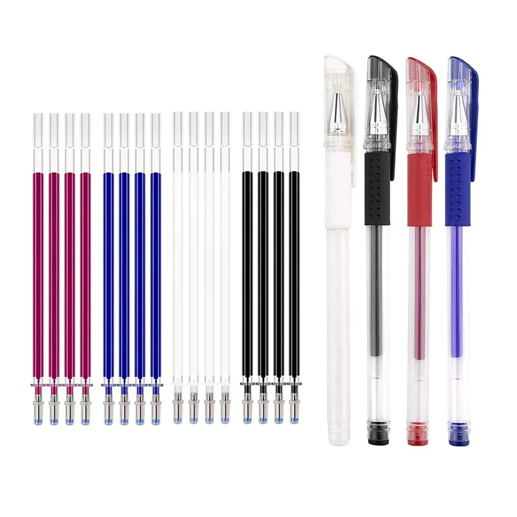
If you are testing several colors, mark each stitching line with a fabric pen so you can tell the samples apart later. https://mrs-quilty.com/products/heat-erasable-pens-for-fabric-4-pieces-28-refills-851158f5f2935054734c5103-1386707Heat Erasable Fabric Pens with Refills are a practical choice here because the marks come out with heat rather than washing, so you can label a swatch and still remove the label cleanly before you use the fabric in the quilt.
- Checkpoint: if two threads look identical on the swatch, choose the one that is slightly darker. It will read as texture rather than as a mismatch.
Match the Spool to the Job, Not Just the Color
Color is only half of the decision. Thread weight changes how visible a color is: a 30wt thread is thicker and bolder, so it shows up more than a finer 50wt in the same shade. That makes 30wt a good fit for decorative quilting, embroidery, and bold stitching where you want the thread to be seen, and a less obvious choice for subtle ditch stitching.
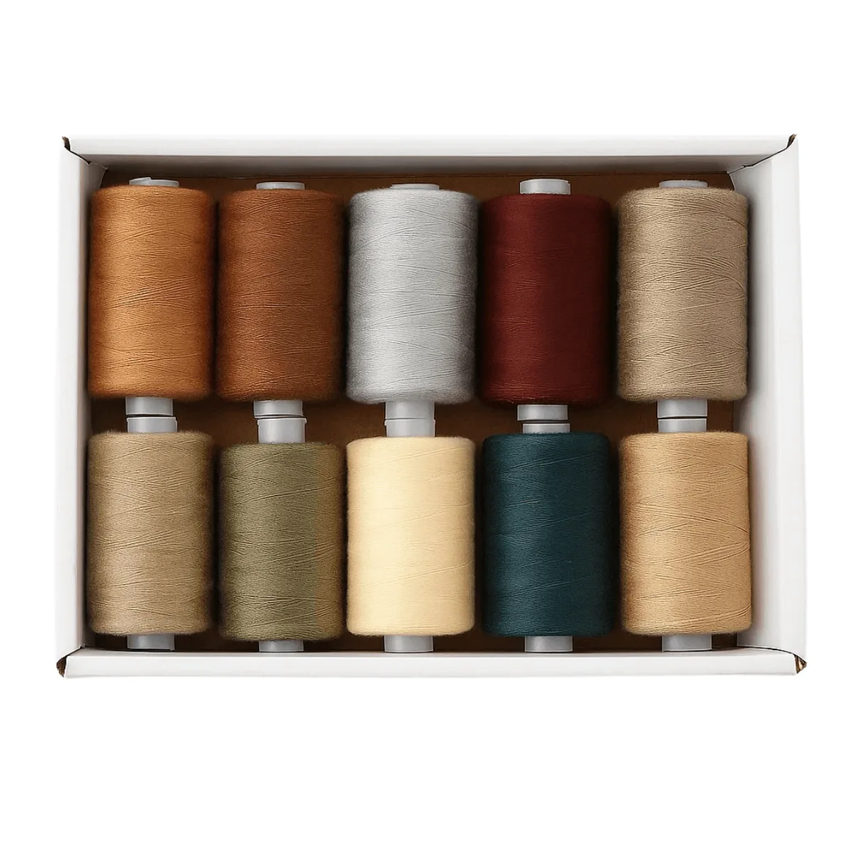
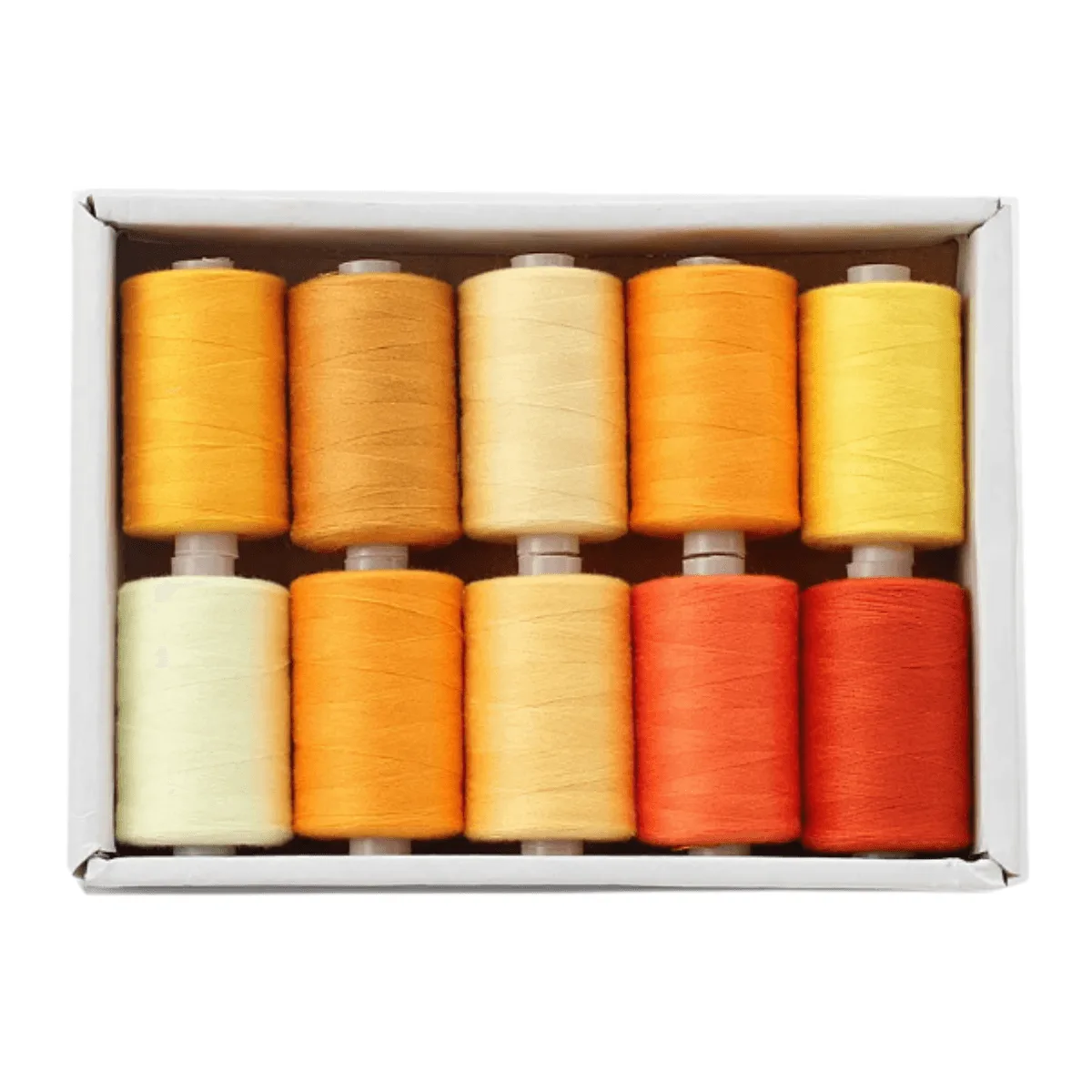
If you want a range of colors to test without buying ten separate spools, a multi-pack is an efficient way to build a working palette. The 30wt 1000yd Earthy Colors - 100% Polyester Thread 10 Pack gives you 1000 yards per spool in natural, grounded tones, which suits warm and neutral quilts. The 30wt 1000yd Warm Color Gradient - 100% Polyester Thread 10 Pack leans warmer and more saturated, so it is a better fit for autumn palettes and projects where the thread is meant to be part of the design.
- Common mistake: assuming a thread labeled the same color name will match across brands. Always test the actual spool you will sew with.
Keep Your Working Palette Organized
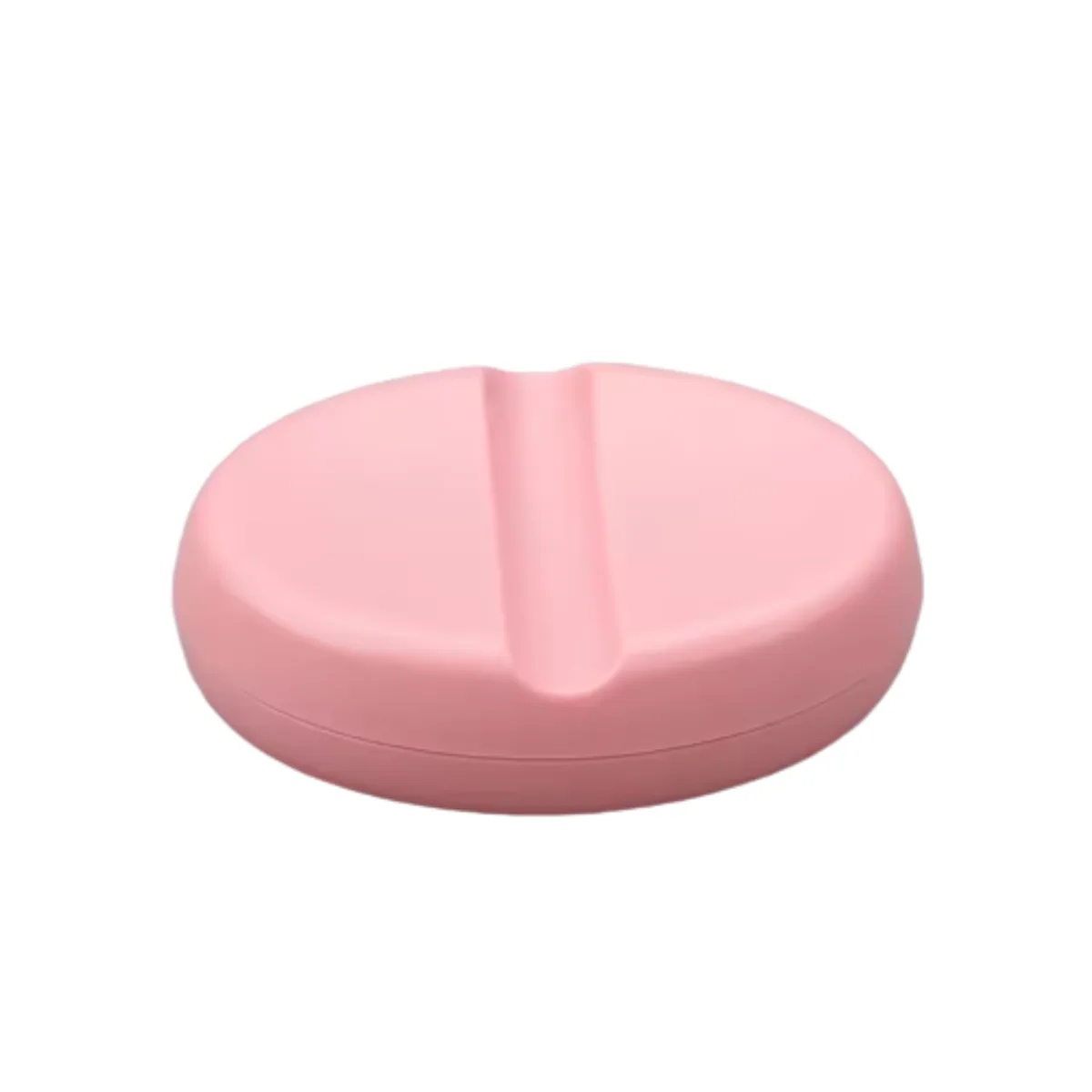
Once you have chosen colors, keep the spools you use most where you can see them. Thread that lives in a drawer gets forgotten, and forgotten thread leads to mid-project substitutions that rarely match. A magnetic pin holder is a small but useful companion here: it keeps pins off the floor and off your cutting mat, so your attention stays on color decisions rather than on hunting for supplies.
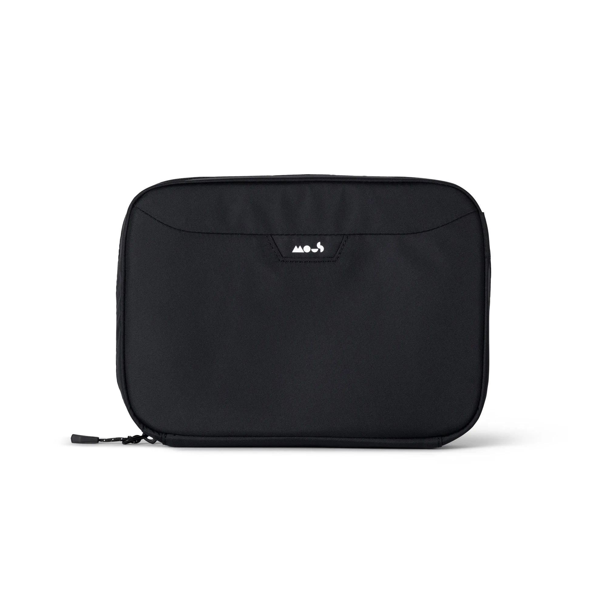
If you travel to classes or sew with a group, a Large Sewing Machine Bag with its wide opening and extra pockets makes it easier to carry your machine, spools, and swatches together, which means you can test colors in the same lighting you will actually sew in.
- Checkpoint: store your test swatches with the spool they were stitched with so you can repeat the exact match later.
Five Steps to the Right Thread Color
- Step 1: Sort your fabrics by value and undertone: Lay out every fabric in the quilt and group them into light, medium, and dark. Note whether the palette leans warm or cool. Checkpoint: your thread should come from the middle of the palette, not the lightest or darkest fabric.
- Step 2: Choose your contrast level: Decide whether you want the thread to disappear (match), add texture (one step darker or lighter), or become a design feature (high contrast). Common mistake: defaulting to high contrast on a busy print, which fights the fabric instead of complementing it.
- Step 3: Stitch a test swatch: Quilt a few lines on a small sandwich made from your actual fabrics and batting, then view it in daylight and from a few feet away. Checkpoint: if two candidates look identical, pick the slightly darker one.
- Step 4: Match thread weight to the job: Use a thicker 30wt thread when you want bold, visible stitching, and a finer thread when you want the quilting to recede. Common mistake: judging color without accounting for weight, since a thicker thread makes any color more visible.
- Step 5: Record and store your choice: Write down the brand, weight, and color name, and keep the test swatch with the spool so you can repeat the match on the next project. Next step: build a small working palette of the colors you reach for most so future projects start faster.
Products That Help With Thread Color Decisions
- 30wt 1000yd Earthy Colors - 100% Polyester Thread 10 Pack: 100% polyester, 30wt, 1000 yards per spool, in a natural earthy color palette. The earthy tones suit warm and neutral quilts, and 1000 yards per spool gives you enough to test swatches and still finish the project without running short.
- 30wt 1000yd Warm Color Gradient - 100% Polyester Thread 10 Pack: 100% polyester, 30wt, 1000 yards per spool, in a warm gradient of colors. A warm gradient lets you move from one shade to the next across a quilt, which is useful when you want the thread color to shift with the fabric rather than stay uniform.
- Heat Erasable Fabric Pens with Refills: Fabric marking pens that remove with heat, supplied with refills. They let you label and compare multiple thread swatches on the same piece of fabric, then remove the marks cleanly before the fabric goes into the quilt.
Choosing quilting thread color comes down to a repeatable habit: read the fabric first, decide your contrast on purpose, and test before you commit. Do that, and the thread becomes one more tool for shaping how your quilt reads, rather than a gamble you only judge after the binding is on.