Quick Answer
Start by identifying your planner's dominant accent color, then pick washi tapes that fall within the same hue family or a complementary one. Use a 60-30-10 rule for color distribution to keep layouts balanced without overwhelming the page.
Why Color Matching Matters for Planner Layouts
When washi tape colors clash with your planner theme, the page can feel chaotic rather than curated. Matching colors doesn't mean using only one shade—it means choosing tapes that share an undertone (warm, cool, or neutral) so the overall spread feels intentional. This approach works whether you're following a monthly color scheme or a seasonal palette.
A common mistake is grabbing tapes that look pretty on the roll but don't relate to any color already on the page. Before you stick anything down, take a moment to identify the dominant color in your theme—often the one you use for headers or borders—and let that guide your tape selection.
Tools and Techniques for Testing Tape Colors
If you're unsure how a tape will look against your planner paper, try laying a short strip on a scrap page first. The 160gsm pages in most bullet journals handle light repositioning without tearing, so you can test a few options before committing. Another trick is to group tapes by color family before starting a spread—this helps you see which combinations naturally harmonize.
Keep in mind that metallic or shimmer accents (like those in the Berries & Vines set) can read as neutrals, so they pair well with both warm and cool palettes. If your theme is heavily pastel, avoid tapes with high-contrast dark backgrounds unless you plan to use them as small accents.
Step-by-Step Guide to Matching Washi Tape Colors
- Identify Your Theme's Anchor Color: Look at your planner spread and find the color you use most—often the one for headers, dates, or major dividers. That's your anchor. Every tape you add should either match this color closely or sit opposite it on the color wheel for a complementary pop. Common mistake: choosing an anchor color that's too neutral (like light gray) can make the spread feel flat. Pick a hue with some saturation.
- Select Tapes Within the Same Hue Family: Once you have your anchor, pick washi tapes that share its undertone. For a warm anchor like coral, look for tapes with peach, gold, or terracotta notes. For a cool anchor like teal, lean toward blues, silvers, or soft greens. This keeps the palette cohesive without being monotonous. Checkpoint: hold the tape roll next to your anchor pen or marker. If the colors look related in natural light, you're on the right track.
- Apply the 60-30-10 Color Distribution: Use your anchor color for about 60% of the tape elements, a secondary color for 30%, and an accent color for the remaining 10%. This ratio prevents any single color from overwhelming the layout while still giving you room to incorporate fun patterns or metallics. Common mistake: using equal amounts of two bold colors can create visual competition. Let one color clearly lead.
Products That Make Color Matching Easier
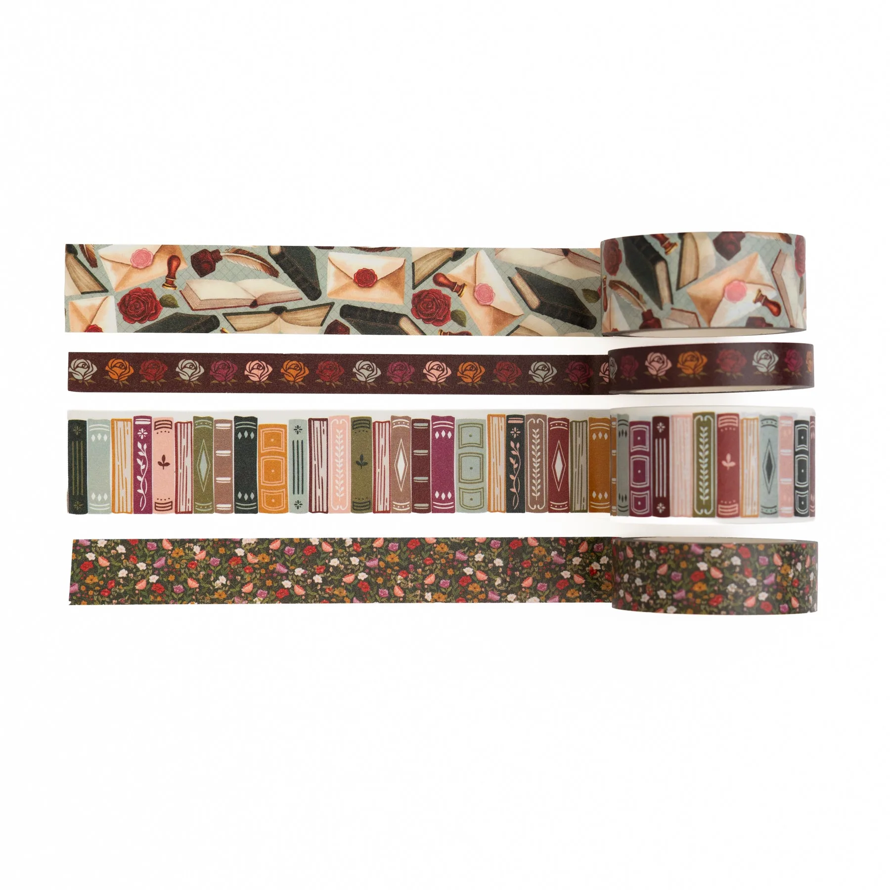
- Berries & Vines | Washi: Berries & Vines | Washi is a coordinated set of decorative tapes inspired by trailing vines, ripe berries, buzzing bees, and elegant botanical details. It features lush berry clusters, delicate blossoms, ivy leaves, vintage patterns, and shimmering metallic accents. Because the set is already color-coordinated around a berry-and-vine palette, you can use multiple rolls together without worrying about clashes. The metallic accents add texture while staying neutral enough to fit into most planner themes.
- Fairy House | Washi: Fairy House | Washi is a whimsical set of decorative tapes filled with enchanted garden scenes and storybook charm. It includes fairy cottages, butterflies, mushrooms, woodland florals, soft pastel landscapes, and delicate nature details. The soft pastel palette in this set makes it a natural fit for spring or fantasy-themed planners. If your theme leans toward muted, dreamy tones, these tapes will blend rather than compete.