Quick answer
Start with one solid that matches the lightest or darkest note in your print, then audition a second solid one value step away. Confetti Cottons and Kona Loomworks are both 100% cotton quilting solids, so the real decision is value and temperature, not brand. If you are unsure, buy a swatch book first and sew one test block before cutting the whole quilt.
Why solid fabric pairing changes the whole quilt
Prints carry pattern, but solids carry the structure. A busy print surrounded by a solid in the same value can look flat, while a solid one or two steps lighter or darker makes the print read as deliberate. This is why solid vs print quilt fabric is less about which is better and more about which job each one does. Solids also give the eye a place to rest, which matters when you are working with several prints in one top.
How to read value before you read color
Value is how light or dark a fabric looks, and it matters more than hue when you are planning a quilt color palette. Squint at your fabrics together or photograph them in black and white. If two fabrics blur into one gray shape, they are too close in value to create contrast. A common mistake is choosing solids by name alone, such as assuming any blue will work with any blue print. Moonstone, for example, is a soft neutral solid, so it can sit next to a wide range of prints without competing.
Build a palette in threes, not in ones
A workable solid fabric pairing usually has three roles: a background, a mid-tone, and an accent. The background is often the lightest solid, the mid-tone supports the prints, and the accent is the darkest or most saturated. If you only buy one solid at a time, you risk ending up with five fabrics that all sit in the same middle range. Lay out your prints first, then place candidate solids between them and remove any solid that does not change the way the print reads.
Use a swatch book to test before you commit
A swatch book lets you hold real fabric next to your prints without buying yardage you may not use. This is especially useful when you are ordering online and cannot see the fabric in person. Check the swatch in daylight and in indoor light, because a color that looks neutral in one can look cool or warm in the other. If a swatch book does not include the exact color you need, treat that as a limitation of the book rather than a sign the color does not exist.
Sew one test block before cutting the quilt
A single test block costs little and answers the questions a fabric stack cannot. Sew one block with your chosen solids and prints, then step back and look at it from a few feet away. If the solids disappear, increase the value contrast. If the solids shout over the prints, move them closer in value or choose a softer neutral. This is also the point to check how the fabric behaves under the needle, since a soft hand and a stable weave both affect how accurately your pieces go together.
Your solid-to-print matching steps
- Pull your prints and sort by value: Lay every print you plan to use on a neutral surface and arrange them from lightest to darkest. Photograph the group in black and white to confirm the order. Checkpoint: if two prints land in the same value, decide now which one will be the focal print.
- Pick one solid for the background: Choose a solid that is clearly lighter or darker than most of your prints. Confetti Cottons in Moonstone is a soft neutral that can serve as a background without pulling attention. Mistake to avoid: choosing a background solid that is the same value as your prints, which makes the quilt look muddy.
- Add a mid-tone solid: Bring in a second solid that sits between your background and your darkest print. Kona Loomworks in Sky is a light blue woven that can bridge cool prints and warm neutrals. Checkpoint: step back three feet. If the mid-tone disappears, it is too close to the background.
- Test with a swatch book: Hold real swatches next to your prints in daylight and indoor light. The Windham Swatch Book in Ivory is useful for checking an ivory palette before you buy yardage. Mistake to avoid: trusting a screen color alone, since monitors shift blues and neutrals.
- Sew one test block: Cut and sew a single block with your final fabric combination. Press it and view it from a distance before cutting the rest of the quilt. Next step: if the block works, cut the full quilt. If not, swap only the solid that is causing the problem.
Solid fabrics worth auditioning
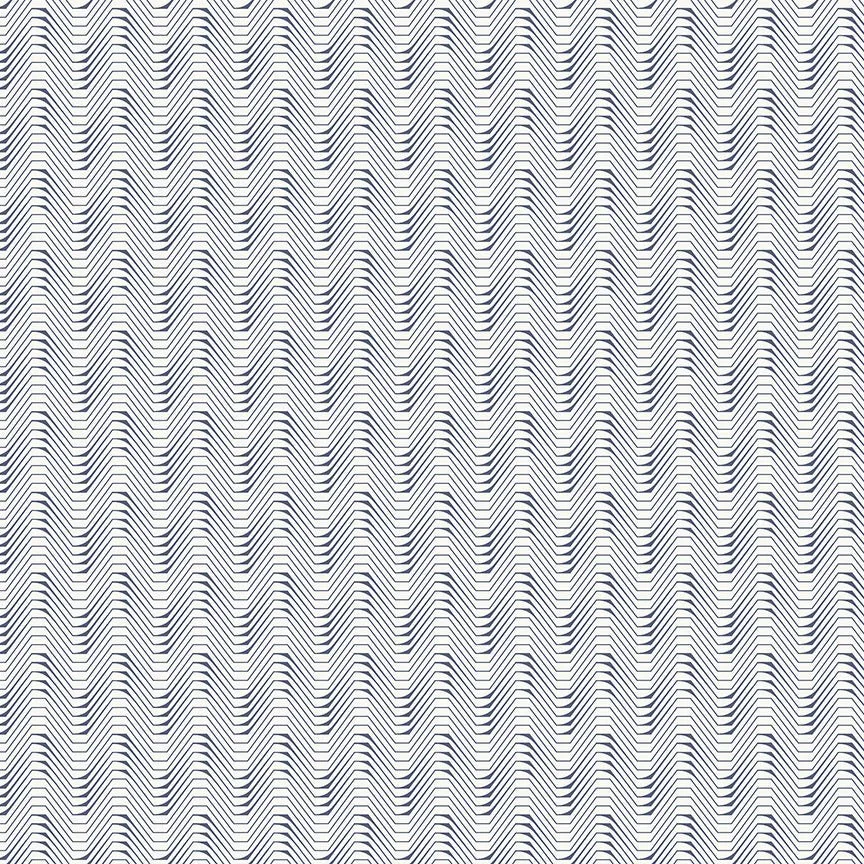
- RILEY BLAKE - Confetti Cottons - Moonstone: Riley Blake Designs Confetti Cottons in Moonstone is a 100% cotton solid, 43/44 inches wide, with a soft hand and machine wash cold, tumble dry low care. Moonstone works as a quiet neutral background, so it lets prints lead without adding a competing pattern.
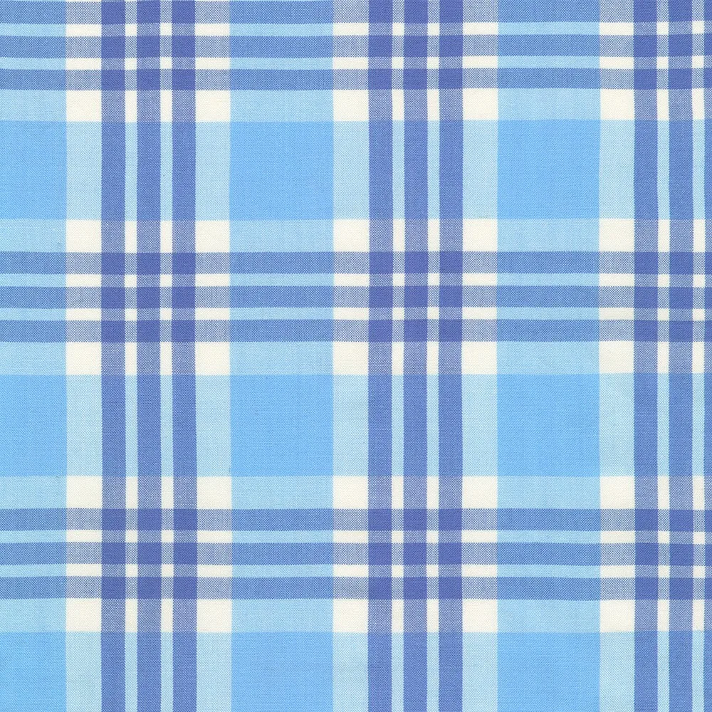
- KAUFMAN - Kona Loomworks-Summer Breeze by Studio RK - Woven - Sky: Kona Loomworks-Summer Breeze by Studio RK for Robert Kaufman is a 100% cotton woven in a Sky light blue colorway, 44 inches wide. A woven solid in a light blue gives you a mid-tone option that can bridge blue prints and warm neutrals in the same quilt.
- WINDHAM - Swatch Book by Iowa Quilt Museum - Wavelengths - Ivory: The Windham Swatch Book from the Iowa Quilt Museum Wavelengths collection in Ivory contains a variety of 100% cotton quilting fabric swatches in an ivory palette, approximately 44/45 inches wide. It lets you test an ivory-based palette against your prints before buying yardage, which reduces color-matching guesswork.